Foil Blocking
Sigma by Stockholm Design Lab
You could argue that there’s a fair few similarities in terms of Japan and Sweden’s approach to design, and the aesthetics of life more generally. Both are known often for a specific kind of minimalism – a tastefulness that eschews fluff, luxuriates in crisp whites and keeps its edges, everything in its right place, rules and order and form following...

Tigre by Triboro
LES Tigre – not to be confused with seminal electroclash/riot grrrl combo Le Tigre – is a cocktail lounge in Manhattan’s Lower East Side area, which opened at the end of last year and apparently combines ‘sophistication and refinement in drink, sound and ambiance’ with an entrance that boasts ‘an original graffiti-worn door’. So far, so hip, amirite? It all...
Dirty Vegan by Jens Nilsson
Having been a vegan for almost 20 years now, various tropes have come and gone. In the early days, for the health conscious it was pretty much all about brown paper packaged Holland and Barrett goods, and references to the Young Ones cooking lentils. For the not so health conscious (hello!) it was ketchup sandwiches. Gradually the Quorn contingent came...

Ginori 1735 by AUGE
Florentine design studio AUGE has created a sumptuous range of packaging for Italian luxury homeware brand Ginori, which was founded in 1735 as the Manifattura di Doccia by Marquis Carlo Ginori on the grounds of his villa at Doccia. Nearly three hundred years later, the venerable brand finds itself owned by Gucci, following a merger with Società Richard (and subsequent...
Kettle Kids by Two Times Elliott
The once laudable claim to have started a thriving business with ‘a small loan’ from a doting family member may have been muddied beyond recognition by the truth-stretching of serial tax-offender and part-time Presidential candidate Donald Trump. Despite this, turning ‘one thousand pounds from nan’ into a luxury watch and diamond dealership with a sparkling flagship store in Mayfair remains...

Sucre by DutchScot
It’s always satisfying to see smart, bold new identity designs for a household name brand, often by one of the big name studios: things like the still-hyped 2021 JKR Burger King rebrand; Collins’ Girl Scouts revamp in 2022; Springetts’ fresh look for Ryvita that same year, which makes the much-maligned crispbread seem a lot more palatable. And while such projects...
Stereoscope by Olssøn Barbieri
Oslo-based multi-disciplinary design studio Olssøn Barbieri has created the brand identity for Los Angeles-based speciality coffee roastery Stereoscope, working across its packaging design and printed materials with a typography-led approach that celebrates tactility. According to Olssøn Barbieri, Stereoscope is underpinned by a philosophy that sees coffee as a living organism rather than a commodity, and which takes its responsibility to...

LCBA by Studio Bergini
Not a new project, but a lovely one nonetheless; it seems there couldn’t have been a more perfect fit for London Centre for Book Arts than Studio Bergini when it was looking for a design team to task with creating its new visual identity. Formed by two Central Saint Martins grads – Norwegian Kristian Hjorth Berge and Italian Francesco Corsini (hence...
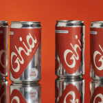
Ghia Non-Alcoholic Aperitif by Perron-Roettinger
In case you’ve missed it, low and no-alcohol drinks are a thing. With over 20% of adults in the UK claiming to be teetotal, abstinence is cool: Brewdog is now Punk AF (that’s ‘alcohol free’), Thomson & Scott’s Noughty is (fairly) nice, and Seedlip is sexy. This sobriety revolution is driven, in part, by the mindfully sceptical Gen Z, turned...
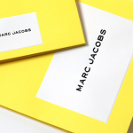
Marc Jacobs by Triboro
Fashion designer Marc Jacobs heads his own eponymous fashion brand, as well as diffusion lines The Marc Jacobs and Heaven by Marc Jacobs. He was also creative director at Louis Vuitton from 1997 to 2014, where he created the company’s first ready-to-wear clothing line. In his own words, Jacobs’ work is ‘a little preppy, a little grungy, a little couture’, and this...
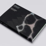
Leandro Erlich: Both Sides Now Catalogue by Studio fnt
Both Sides Now was an exhibition of works by Argentinian contemporary artist Leandro Erlich. This took place at the Seoul Museum of Art between December 2019 and March 2020. Erlich’s installations employ mirrors, reflective surfaces, water and other materials to form optical illusions with the intention of transforming familiar, everyday spaces. Studio fnt worked to develop an identity for the exhibition that would...
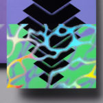
Leandro Erlich: Both Sides Now by Studio fnt
Both Sides Now, a title borrowed from Joni Mitchell’s famous song, is a solo exhibition of Argentinian contemporary artist Leandro Erlich’s work that took place at the Seoul Museum of Art between December 2019 and March 2020. Erlich’s installations, often receiving international acclaim, mirrors, reflective surfaces, water and other various materials to create optical illusions to transform familiar, everyday spaces such as...