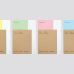
Folder Design
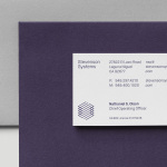
Stevenson Systems by Socio Design
Stevenson Systems is an American business that specialises in ‘space accounting’, an industry that measures architectural spaces using a variety of laser scanning and measuring devices, goes on to classify areas within larger spaces and produces reports and offers consultation on how to draw the most value from these. Stevenson Systems pride themselves on their ability to add value, rather than...

FR-EE by Pentagram
Fernando Romero Enterprise (FR-EE) is an architecture and design firm with offices in New York and Mexico City. The firm was founded by award-winning architect Fernando Romero, and is recognised internationally for their work on projects such as the new Mexico City International Airport and Museo Soumaya. FR-EE worked with Pentagram partner Natasha Jen, plus team, to help them capture and convey their innovative and pioneering spirit and democratic...

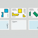
Marquez Quevedo by La Tortillería
Márquez Quevedo is a San Pedro based architectural practice that balances space, proportion, materials, form and colour to compose creative spaces filled with movement. Drawing on what is described as the practice’s sophisticated style and vision Mexican graphic design studio La Tortillería developed a new brand identity for Márquez Quevedo with a sense of space, structure and materiality, both in image and physical texture, that links business cards, stationery...
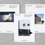
Obra Blanca by Savvy
Obra Blanca is an architecture studio, established in 2013, with offices in the Mexican city of Veracruz. The studio looks to transcend Mexico’s architectural landscape, remain independent and resistant to trends, and free to experiment and explore. It attributes a building’s value to its coherence, craftsmanship, materiality, functionality and context. Obra Blanca represents the last step in construction, the stage at which a building stops being just a structure and...
4B Arkitekter by Commando Group
4B Architects is an architecture studio with offices in Oslo, Norway, an experienced team and a holistic approach. It has a particular interest in low energy and sustainable projects, and has built a portfolio of restorations, public, cultural and commercial buildings, private housing and outdoor spaces. The studio’s team of founding partners (from its inception in 1971) and a generation of...
K. Apeland by Bielke&Yang, Norway
K. Apeland is a Norwegian independent civil engineering consultancy that specialises in construction technologies, and applies its experience to new builds, remodelling projects and renovation. It has a favour for steel-wood and concrete structures, which has won the consultancy a number of awards, and has a broad portfolio that covers public infrastructure, private offices and housing, as well as viewing platforms,...
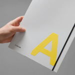
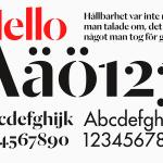
FS Silas Launch Campaign by Believe In
FS Silas is a new sans-serif and slab-serif font family from British type foundry Fontsmith, each available in five weights and an italic. The family is described as having a squareness of rounded forms with dynamically angles terminals and slabs capable of offering contemporary brands the opportunity to employ different voices with one typographic system. Fontsmith worked with graphic design studio Believe In to...
Poseidon Helsinki by Kokoro & Moi
Poseidon Helsinki centralises the tasks of architect and builder with the intention of delivering higher quality construction projects based around visionary and uncompromising design solutions. Poseidon’s values are deeply rooted in a love for Helsinki, a belief in aesthetically ambitious architecture and expansive urban spaces, and improving the capacity and quality of the city through sensitive renovation and attic conversions. Poseidon’s visual identity, inspired...
Essem Design by Bedow
Bedow worked with Essem Design, a Swedish manufacturer of ‘artisanal hallway interiors’ to develop a new brand identity treatment. This included logotype, advert, catalogue, product sheet and stationery design based around “Hej—Hej då”, hello and goodbye in Swedish, a reference, Bedow explain, to the most common phrase used in the hallway....

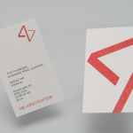
Anthem by Anagrama
Anthem will be a scouting and transfer business within the professional football market working predominantly across Spain, Switzerland and Mexico. Anthem will also be responsible for organising and promoting a variety of sporting events. Design agency Anagrama were recently commissioned to develop a new brand identity for the company—which included a logo, logotype and stationery set—that would communicate the prestige,...

Meteorologisk Institutt by Neue
Meteorologisk Institutt provides meteorological data to Norway’s military, civil services and the general public with the intention of safe guarding life, property and the environment. Design agency Neue developed a new visual identity solution for the institute that mixes geometric shapes, material and print choices and the humanistic and environmental detail of photography to achieve communicative and aesthetic contrast and capture the data drawn from...
Valentto Olive Oil by Anagrama
Valentto is a Mexican cold-pressed virgin olive oil produced by Olivarera Italo-Mexicana – a Mexican Italian collaboration – created for commercial kitchen and restaurant use. Multidisciplinary design agency Anagrama recently developed a new brand identity and packaging solution for Valentto that juxtaposes the natural detail of Italian landscapes alongside the industrial utility of a square tin structural choice, described by Anagrama as being...