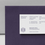
Stevenson Systems by Socio Design
Stevenson Systems is an American business that specialises in ‘space accounting’, an industry that measures architectural spaces using a variety of laser scanning and measuring devices, goes on to classify areas within larger spaces and produces reports and offers consultation on how to draw the most value from these. Stevenson Systems pride themselves on their ability to add value, rather than...
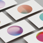
Primary by DIA
Primary is a new co-working space in New York that introduces health and wellness into the workplace. This can be seen in the approach to interior design; a mix of wood, contemporary soft furnishings and greenery, experienced in the fusion of office space, business events and relaxation classes, and expressed throughout Primary’s brand identity, created by graphic design studio DIA. DIA were tasked...
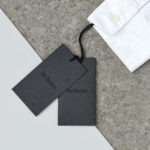
Helbers by Only
Helbers is a Parisian menswear label created by Paul Helbers, the former Head of Menswear at Maison Margiela and ex-Menswear Director at Louis Vuitton. The label has a carefully curated lookbook of garments and footwear with an unpolished elegance, and feature a subtle contrast of materials. Helbers has secured early acclaim for his AW16 collection, and is due to appear in stores around the world in the coming weeks. Paul worked with Leeds-based...
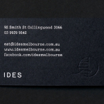
IDES by Swear Words
IDES began as a monthly pop-up restaurant with an inventive approach to cuisine, created by former Attica sous chef Peter Gunn. A year into the business, and to coincide with the development of a permanent space in the Melbourne suburb of Fitzroy, Peter Gunn worked with graphic design studio Swear Words to develop a new visual identity that would more effectively express the level of...
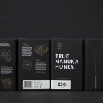
The True Honey Co. by Marx Design
The True Honey Company (TTHC) dedicates itself to the production of mānuka honey, a monofloral variety produced in Australia and New Zealand from the nectar of the mānuka tree. It has a unique colour and texture, and a high level of Dietary Methyglyoxal, an organic compound with antibacterial and antiviral properties. With a price range starting at 60.00AUD and rising to 230.00AUD per jar,...
Smithey Ironware Company by Stitch
Smithey is an ironworks producing kitchenware from its location in Charleston, South Carolina. Smithey’s first product, a 10 inch skillet, features a smooth, non-stick cooking surface, created using a handcrafted method of finishing and polishing. This process was developed in response to the rough, coarse and sandpaper-like finish that proliferates the ironware market, which creates an uneven surface temperature, makes it...
Linden Staub by Bibliothèque
Linden Stuab is a UK-based model agency challenging industry conventions with their mantra ‘Empowering Women’, and by acting as a mother agency to all of their models. The name Linden Staub, derived from the maiden names of the two founding partner’s mothers, is an expression of this, and alongside the agency’s strong human-focus, was the basis for their new brand identity, created...
Rattis Books by The Counter Press
Rattis Books is a new London-based independent publisher that celebrates the convergence of traditional and modern print processes and has a firm belief that the book is an art object. To help convey this, the publisher worked with design studio, private press and typography workshop The Counter Press to create their brand identity, and the design for their first book Tiro, a collection of football writings....
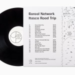
Boreal Network, Itasca Road Trip by Bedow
Nicole Johnson is a Seattle-based Minnesotan creating what Miles Bowe of Fact Magazine describes as “sun-drenched, foggily nostalgic electronica” under the name Boreal Network. Itasca Road Trip is a limited edition vinyl rerelease and trimmed down version of an earlier album by Boreal Network, distributed by More Than Human Records and featuring artwork by Swedish graphic design studio Bedow. Where the album takes an aural tour...
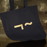
Collected Coffee by Fivethousand Fingers
Collected Coffee is a New York-based coffee subscription service committed to sourcing the world’s best coffee beans, prepared by speciality roasters. The service worked with Canadian design studio Fivethousand Fingers to develop a brand identity, which included logo, packaging, tote bag and web design, that would be perceived as intelligent, cultured and curious to a sophisticated coffee enthusiast. This was achieved through a contemporary gallery-like...
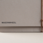
Wagon Wheel by Perky Bros
Wagon Wheel is a Nashville-based boutique real estate title and escrow company established by three partners with substantial experience working for larger corporate law offices who wanted to establish a company with a more casual corporate culture and client experience. This, and Wagon Wheel’s Nashville roots, is expressed throughout its new brand identity, designed by graphic design studio Perky Bros, using...
Arco by Raw Color
Arco is a family run contemporary furniture design and manufacturing company that currently rests in the hands of fourth generation family members, and has a respectable 110 year history. Arco has tables and chairs at the heart of its collection and specialises in woodwork, a reflection of its location in Winterswijk, an area of dense natural woodland in East Netherlands. Eindhoven-based graphic design studio Raw Color worked with Arco Creative...