Form Language
FitzJohn’s by DutchScot
When my partner and I first moved to London in 2014, surviving on scarcely more than minimum wage, it obviously seemed like a sensible idea to rent in Hampstead. We’d heard of the Heath, and were familiar with the Northern Line. The flat, apparently once a Sex Pistols’ squat, was tiny and hadn’t improved much since the 70s. Back then...
The Art Gallery of New South Wales by Mucho
The Art Gallery of New South Wales, founded in 1872 as the New South Wales Academy of Art, suffered from a fragmented brand architecture. Addressing this through a rationalised and simplified system, and reinforcing the master brand across all Gallery collateral became a central part of developing of a new brand identity which would support a repositioning strategy that moved...
Autex Acoustics by Marx Design
With manufacturing and sales teams throughout Australia, UK and the USA, Autex has grown to become the market leader in interior acoustic products in New Zealand, and the go to choice for leading architects aspiring to reduce the amount of atmospheric noise within cutting-edge residential and commercial spaces. Their products are innovative, produced in a variety of forms and colours,...
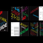
Piedmont Art Walk by Mucho
Piedmont is a small city in California named after the European region in the shadow of the Alps (from the Italian piemonte, meaning ‘foothill’). Surrounded on all sides by Oakland, the neighbourhood has a population of roughly 10,000 people and an active charity scene. This includes the Piedmont Arts Fund, a nonprofit group that promotes and supports visual and performing...

Ediya Beanist by Studio fnt
EDIYA is a well-established South Korean coffee brand, with franchised stores and array of drinks and branded products. It has the largest number of stores, exceeding that of Starbucks and any other international brands, opening its 3000th store at the end of 2019. With such a strong foothold in the market, and with the rise of at-home and ready-to-drink variations...

One Wellington St Kilda by Studio Ongarato
One Wellington, a partnership between LAS Group and Qualitas, is a new property development located in the Melbourne suburb of St Kilda, not far from eclectic Fitzroy Street. The building’s architecture—designed by KPDO and comprised of 181 apartments across two buildings of 26 and 10 floors—features flowing curves inspired by its bayside location, highly-customisable interior options and unobstructed sky views. One...

Atlantic Theater 2019 – ’20 Season by Pentagram
Atlantic Theater Company was founded in 1985 by playwright David Mamet and actor William H. Macy and, since then, has established itself as an influential Off-Broadway theatre group. It is also known for having a bold and original voice, producing groundbreaking new works by both emerging and established playwrights. This bold and original voice was central to the design of the theatre’s...
CareerTrackers Awards by Garbett
CareerTrackers is an Australian charitable organisation that addresses Indigenous disadvantage by developing professional career pathways, internship programs and links with private sector employers for Indigenous university students. It does this through a model adapted from an African-American internship program that has been tackling disadvantage for over 45 years. This model sees students intern with sponsoring companies with the intention of converting them...

The Architect’s Bookshop by Garbett
The Architect’s Bookshop is a new design-focused retailer, located in Sydney’s Surrey Hills, devoted to the books of architecture and interior design, landscaping and urban development. The space was conceptualised as being more than a bookshop but a place to take time out to browse, a chance to engage with the material and form of the books, and as a place...
A’18 by Pentagram
AIA Conference on Architecture is an annual three-day event that explores what is new and now in architecture and design. In 2018 this took place between June 21st and 23rd at Manhattan’s Javits Center, a pioneering modernist space frame structure designed by architect James Ingo Freed. The event is made up of workshops, seminars and city tours across the five boroughs of New...

Espelma by Commission
Espelma is a clean-burning natural wax candle company. They have an online store and have hosted pop-ups in London and New York. Each candle comes in a refillable glass vessel, designed by Espelma founders Clara and Claudia, and handmade on the Italian island of Murano. Espelma is distinguished by its mix of glass craft, distinctive colour and form, the clean-burning nature...

Heyday by Collins
Heyday is a range of 150 moderately-priced high-quality own-brand consumer tech products from American retailer Target and their first foray into the electronics and tech accessories sector. The range includes battery packs and chargers, cables, covers and wireless speakers amongst many other products. These share a form language that balances an everyday simplicity, robustness and utility with novelty and cheerfulness by...