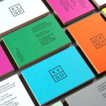
KVGD by Kerr Vernon
KVGD is a Glasgow based graphic design studio run by Kerr Vernon that works within the fields of brand identity design and print, has a ‘be nice, do good work’ philosophy, and a reputation for producing engaging, thoughtful and crafted projects. The studio’s client base is diverse, local and national, and includes businesses such as gallery, event and creative workspace The Whisky Bond,...

Triumph & Disaster – On The Road by DDMMYY
Triumph & Disaster (T&D) is a male skincare and accessory brand that appropriates the traditional grooming experience associated with the past and fuses it with the high quality, natural and scientifically formulated expectations of today’s market. T&D’s packaging, created by New Zealand based design studio DDMMYY, references and confidently brings the type-heavy, heraldic detail, and traditional structural and material choices of the past into the...
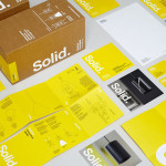
Terence Woodgate by Charlie Smith Design
Terence Woodgate is a lighting design and manufacturing business, founded by industrial designer Terence Woodgate in 2014, that looks to “fully optimise the benefits of LED technology”. Charlie Smith Design recently worked with Terence Woodgate to develop a visual identity for the business and modular packaging treatment for its first line of products as well as manuals, fitting instructions and website....
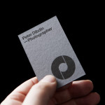
Peter Dibdin by O Street
Peter Dibdin is a photographer who brings creativity, technical knowledge, professionalism and a personal approach to both studio and location shoots for clients working within the commercial, private, arts and editorial sectors. Following a recent move to a studio in Edinburgh’s creative hub of Summerhall, Peter commissioned long-term collaborator O Street to refresh his brand identity in a way that would reflect his...

Casa Virginia by Savvy
Casa Virginia is a restaurant and culinary project in Mexico City, created by chef Mónica Patiño, that mixes the highest quality cuisine and meticulous processes with the familiarity of eating at home. This fusion of restaurant quality and easiness is perhaps most acutely manifested throughout its interior design, a space that juxtaposes the modesty and simplicity of wooden and basketweaved furniture...
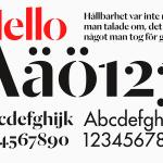
Essem Design by Bedow
Bedow worked with Essem Design, a Swedish manufacturer of ‘artisanal hallway interiors’ to develop a new brand identity treatment. This included logotype, advert, catalogue, product sheet and stationery design based around “Hej—Hej då”, hello and goodbye in Swedish, a reference, Bedow explain, to the most common phrase used in the hallway....

Iona Brown by Sam Flaherty
Iona Brown is a London based contemporary jewellery designer who favours classic simplicity, understated detail, precise finishes and minimalist lines, shapes and materials. Graphic designer and art director Sam Flaherty recently worked with Iona to develop a new visual identity for her expanding collection. Built around a customised logotype and a simple print and packaging treatment that uses few but good quality and contrasting...
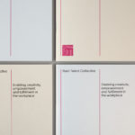
Rush Talent by Bunch
Design studio Bunch worked with Rush Talent, a London based public relations company, to develop a visual identity, this included monogram, logotype and stationery design. Rush Talent describes itself as at forefront of the factual and lifestyle television scene and represents emerging UK broadcasters working within the fields of fashion history, sports, science, architecture, food and art, and includes the likes of Amber...
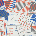
Lucky 21 by Blok
Lucky 21 is a film production company, located in the US city of Dallas, who bring a “contagious energy and tireless drive” to the industry and have a production team and director roster that includes the talents of Jeff Bednarz, The Chartrands, and Tom Ryan, some of whom have worked for big brands such as TGI Fridays, AIG and Home Depot. Lucky...
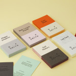
G . F Smith by Made Thought
G . F Smith is an independent British paper merchant with a heritage dating back to 1885 and a loyal staff, some of whom have provided over 20 years of loyal service. Made Thought, the design studio behind the visual identity for G . F Smith’s distinctive Colorplan range, were recently commissioned to develop a new brand identity for the company that would better...
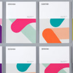
Cerovski by Bunch
Cerovski is a young Croatian print production studio that revels in the challenge of “nebulous finishing, microscopic editions, absurd materials and crazy deadlines”. Bunch worked with Cerovski to develop a new brand identity for the studio—which included a custom logotype and typeface, website, and a variety of printed collateral—that delivers a distinctive contrast of utility and creative flourish, technology and individualised service...
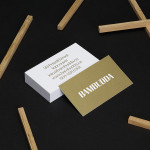
Bambudda by Post Projects
Bambudda is a contemporary Chinese restaurant, located in Vancouver’s Gastown district, with a menu that mixes Hong Kong and southern Chinese cuisine with a modern interpretation of Dim Sung. Design agency Post Projects recently developed a brand identity for the restaurant—which included a logo, menus, stationery and website design—based around a simple but unexpected logotype set in Timonium....