Hand Lettering
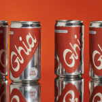
Ghia Non-Alcoholic Aperitif by Perron-Roettinger
In case you’ve missed it, low and no-alcohol drinks are a thing. With over 20% of adults in the UK claiming to be teetotal, abstinence is cool: Brewdog is now Punk AF (that’s ‘alcohol free’), Thomson & Scott’s Noughty is (fairly) nice, and Seedlip is sexy. This sobriety revolution is driven, in part, by the mindfully sceptical Gen Z, turned...
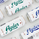
Agder Bryggeri by Frank
Agder Bryggeri is a well-regarded and historical name amongst breweries throughout Norway. It was first established in 1900 but was closed down in 1904 due to operational problems. Recently, the brewery has been resurrected as part of Norsk Bryggerier’s commitment to local beer brands, and is now sold throughout the Agder counties of southern Norway. As part of this resurrection...
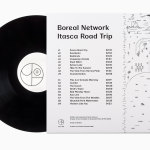
Boreal Network, Itasca Road Trip by Bedow
Nicole Johnson is a Seattle-based Minnesotan creating what Miles Bowe of Fact Magazine describes as “sun-drenched, foggily nostalgic electronica” under the name Boreal Network. Itasca Road Trip is a limited edition vinyl rerelease and trimmed down version of an earlier album by Boreal Network, distributed by More Than Human Records and featuring artwork by Swedish graphic design studio Bedow. Where the album takes an aural tour...
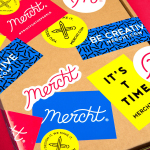
Mercht by Robot Food
Mercht is a UK based custom merchandise business, created by the team at Awesome Merchandise, that offers its customers a risk-free way to design, sell and ship customised t-shirts and wearable accessories, through an online showcase and print on demand service. It is a platform where, if designs sell well, both parties profit, with neither loosing if they do not. Leeds based graphic design...
Farah by Post
Farah is a men’s fashion brand with a seasonal catalogue of shirts, polo shirts, knitwear, jackets, footwear, bags and accessories available online and from high street and department store premises in the United Kingdom. Following two years of collaboration, London based graphic design studio Post were commissioned by Farah to refresh its visual identity, from tags, retail concept, internal communications and art...
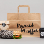
Coffee & Co. by Bond
Coffee & Co. is a new cafeteria and coffee shop concept onboard the Finnish cruise ship the MS Silja Serenade. It offers freshly prepared sweet and savoury snacks, has a light interior design of tiles and wood, and features a visual identity of hand lettering and sans-serif typography created by graphic design studio Bond. This runs throughout the cafe, linking signage, packaging, interior communication and graphics....
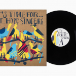
The Hope Singers by Bedow
Scandinavian graphic design studio Bedow have recently completed work on the record sleeves for The Hope Singers debut album It’s Time For…, which will be released on the Sing a Song Fighter label as a limited edition LP. Bedow mix a well-illustrated approach with loose hand drawn typography, and applied these using a four colour screen print process across uncoated and unbleached board. The result is...