Frozen Yoghurt & Ice Cream
Coolhaus by &Walsh
Dessert-centric power couple Natasha Case and Freya Estreller met in around 2008, soon forming a partnership in both life and business: Coolhaus, a range of ice creams and other frozen treats that looks to inspire other female and LGBT+ founders. For those thinking, ‘what, like Rem Koolhaas?’ – yes, you’re right. Estreller originally trained as an architect, and before Coolhaus-proper...
La Mia by Papanapa
In recent years, we’ve seen artisanal ice cream brands make an obvious departure from the maximalist, saccharine branding that their mainstream counterparts are so known for. In particular, the typeface-heavy, superimposed ice cream tubs of US-based brands have become a benchmark for exactly the kind of branding that more gourmet confectioners are keen to avoid. While Ben & Jerry’s iconic...

Pirkkalan by Werklig
It’s been years since millennials were first accused of buying too many avocado toasts and expensive coffees. The stereotype of young people loving handmade, refined and artisanal products holds true in their spending patterns, and today, that generation has matured into business leaders, reshaping the world’s mindset to align with these priorities. As consumers, Gen Z seem to be picking...
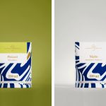
Suomen Jäätelö by Werklig
Suomen Jäätelö is a super-premium ice cream brand currently available in five flavours and a sorbet. These include Milk, Pistachio, Vanilla and Chocolate made from Finncattle milk, a Rhubarb sorbet and Spruce created in collaboration with iconic furniture maker Artek. Although ice cream is internationally ubiquitous, Suomen Jäätelö is described as having a distinctively Finnish character. This is expressed throughout its packaging design, developed by...
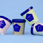
Mister by Brief
Mister crafts all natural, artisanal and seasonal ice cream from its location on Mainland Street, Vancouver, using a liquid nitrogen technique that rapidly freezes products to create less ice crystals and air compared to traditional ice creams. This gives Mister’s ice cream a richer, creamier and denser quality that does not require stabilisers or fillers. Mister worked with local graphic design studio Brief to develop a...
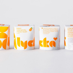
Lycka by BVD
Lycka is a 100% natural hand filled frozen yoghurt brand from Germany that donates 11 cents from each sale to Welthungerhilfe, a humanitarian aid project tackling issues such as world hunger, land grabbing in Cambodia and displacement across Syria and Iraq, amongst many other issues. Lycka’s brand identity and packaging, a mix of bright geometric forms which appears to draw some of...
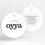
Oyya by Skinn
Oyya is an ice bar located in the Belgium city of Bruges that retails a variety of frozen yoghurts, yoghurt drinks, waffles and 28 ice creams — the most in the city. Its brand identity, which included logotype, print, signage, uniforms and interior design created by local studio Skinn, while largely logo-centric and having a strict consistency across stickers, tubs,...