Interior Design
Petit Planet by Studio fnt
The Hyundai is one of the three major department stores in South Korea, with its 15 branches across the regions of Seoul, Yeongnam and Hoseo accruing more than $6 billion in annual sales. Petit Planet is the Hyundai’s new specialised children’s division, presenting premium brands in an environment designed to stimulate young imaginations. This post includes Extended Insights for BP&O...

David Collins Studio by Bibliothèque Design
David Collins Studio is an award-winning interior architecture practice working with brands, businesses and private clients who share their passion for detail, craft and refinement. These include Harrods, Nobu Berkeley, The Connaught Bar and those working within the hospitality, residential and retail sectors. The studio’s work is described as being iconic, timeless and having a dramatic glamour rooted in a...
Christopher Hall Somata Collection by Two Times Elliott
Christopher Hall is an internationally renowned furniture and interior designer from New Zealand with studios in London and Istanbul, with a third due to open in Barcelona soon. His interiors and bespoke furniture collections are characterised by a sensitive integration of the classical and the contemporary, a material refinement and sculptural elegance. Somata, his latest collection of 32 handcrafted pieces, is an...

Tale London by Two Times Elliott
Tale London creates photorealistic renderings for both interior design and architectural clients across a diverse range of projects, from the traditional and rich to the modern and simple. Their sensitivity to both exterior structure and interior materiality, as well as associated considerations and a stylistic breadth is expressed by Tale London’s visual identity, designed by Two Times Elliott, in the graphic...

2LG Studio by Two Times Elliott
2LG is an award-winning London-based interior design studio, offering residential and commercial interior design, styling and consultation services, founded by creative duo Jordan Cluroe and Russell Whitehead. The studio’s work is characterised by a use of signature colour, high quality material texture and moments of significant contrast, and emerges from a process rooted in creative partnership and a sensitivity to both...
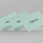
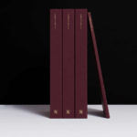
Trika by Bunch
Trika is an interior design company, working on both public and private spaces, with a showroom and studio in the Croatian capital of Zagreb. They represent furniture and equipment manufacturers such as Billiani, Enea and Federicia, amongst many others, whose brand names are described as being synonyms for quality, comfort and design. Graphic design studio Bunch worked with Trika to develop a new brand identity....

InsideSource by Mucho
InsideSource is an American office space planning, design and installation business with 25 years experience and past clients that have included Facebook, Box, Shutterfly and Tango. InsideSource worked with graphic design studio Mucho to help them better express who they are and what they do through a new visual identity. This was achieved using a modular and custom type-based system that runs across tote bags,...
Mamen Diego by Atipo
Spanish graphic design company Atipo recently worked with Madrid based architecture and interior design studio Mamen Diego to create a new brand identity treatment that would extend across and unite a variety of print and digital assets. These included business cards, stationery, brochure and website. Although there is not much information about the philosophies or positioning of Mamen Diego—their new website is yet to launch...
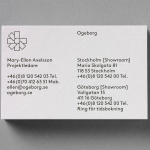
Ogeborg by Kurppa Hosk
Ogeborg is a Swedish, family-owned, manufacturer and supplier of high-quality carpet to the commercial sector, partnering with real estate owners, architects and interior designers since 1968. Stockholm based graphic design studio Kurppa Hosk worked with Ogeborg to develop a new strategy, visual identity treatment and website that would not only reflect some of the culture of the business but would help them...
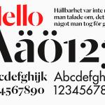
Essem Design by Bedow
Bedow worked with Essem Design, a Swedish manufacturer of ‘artisanal hallway interiors’ to develop a new brand identity treatment. This included logotype, advert, catalogue, product sheet and stationery design based around “Hej—Hej då”, hello and goodbye in Swedish, a reference, Bedow explain, to the most common phrase used in the hallway....

Penson Group by She Was Only
Penson is an award-winning interior design firm that help businesses to achieve their “cultural and commercial ambitions” by replacing dull and inefficient spaces with those that are beautiful and intelligent. Penson’s new visual identity, developed by London based design studio She Was Only to coincide with the firm’s 10th anniversary, delivers what the studio describe as a “clean and confident solution”, consistently executed, that better...

Mellbye by Heydays
Mellbye is a Norwegian architecture firm founded in 1954 with a “mindset anchored in modernism”. Design studio Heydays created a new brand identity for the firm based around a geometric M symbol built from the initials of their two main services, architecture and interiors. Executed as a combination of blind deboss and die cut detail across a earthy and urban...