Mamen Diego by Atipo
Opinion by Richard Baird Posted 5 November 2015
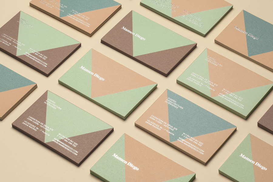
Spanish graphic design company Atipo recently worked with Madrid based architecture and interior design studio Mamen Diego to create a new brand identity treatment that would extend across and unite a variety of print and digital assets. These included business cards, stationery, brochure and website.
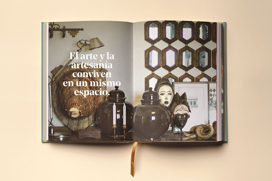
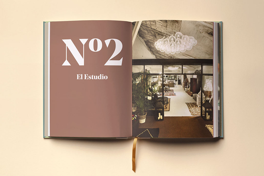
Although there is not much information about the philosophies or positioning of Mamen Diego—their new website is yet to launch and Atipo’s documentation is short on words—the one image online and the two images in the brochure suggest that the studio plays with tradition and modernity, favours ornament and exposed architectural materials, and utilises both geometric and organic detail.
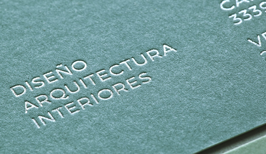
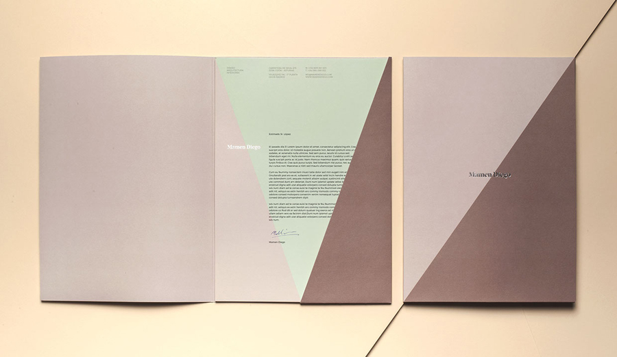
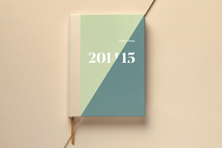
This is conveyed through Mamen Diego’s new brand identity using typographical idiosyncrasy, block foil print finish, an uncoated and tactile material choice, colour contrast, bold form, finer detail and more directly through photography.
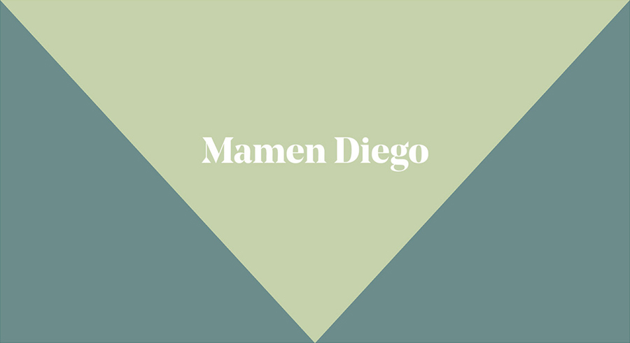
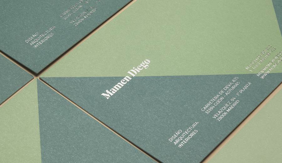
The wedge serifs, high stroke contrast, broad stems, full bowls, sharp terminals and engraved qualities of the Mamen Diego logotype, drawn from what looks like Schick Toikka’s typeface Noe Display, sets a bold and robust but also a traditional and crafted tone. This feels well-suited to the interior design element of the studio, and its apparent preference for wood, hand made furniture and cultural artefacts.
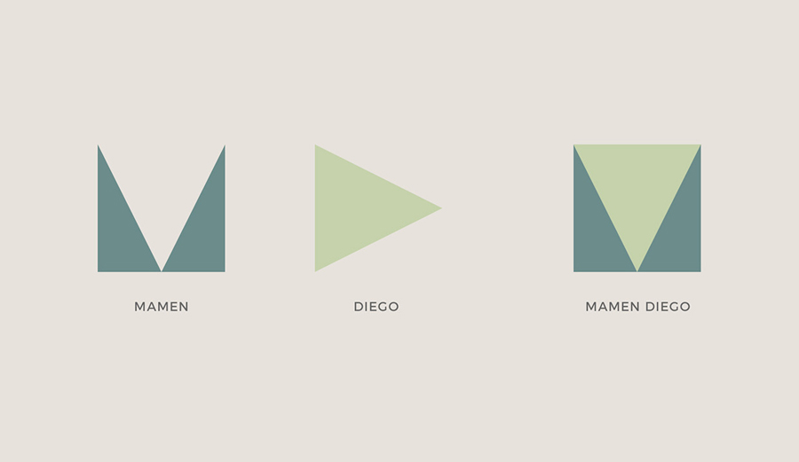
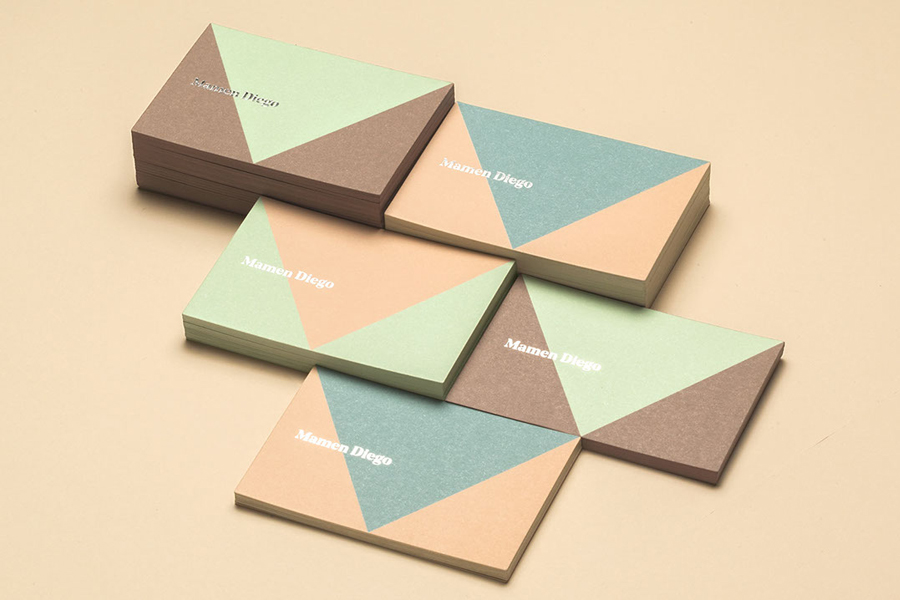
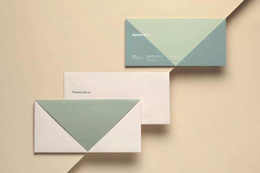
Although the logo is attributed monogrammatic qualities, it is a bit of reach. It does, however, provide a solid foundation for some strong and impactful colour contrast in print, makes a connection with basic architectural principles of load, clearly appears like an M, and draws out the small geometric details of the logotype. The way this has been applied to the envelope and the slot of the folder is simple but thoughtful.
Like the traditional qualities of the logotype and the reductive modernity of the monogram, colour mixes the earthy with the more current. While the shape, and the way this has been applied across stationery is not unfamiliar, check out Bunch’s work for Sebazzo, colour choice appears distinctive and rooted in the aesthetic of Mamen Diego’s work.
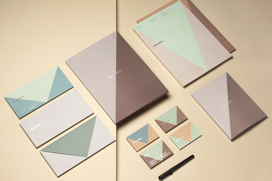
The ornament of the logotype and simple forms of the monogram, and the interior furnishing of architectural structure, also plays out through the glossy flourish and perceived value of a silver block foil print finish and the rougher surface texture of an uncoated board.
Other details of note include proportion, the relationship between logotype and the large application of the monogram, and small and oversized type, the sense of structure inherent to grid-based layouts, and a secondary type choice that, in opposition to the logotype but similar to monogram, favours simplification and geometry.
Design: Atipo. Print: Minke. Opinion: Richard Baird. Fonts Used: Noe
