Letterpress
Maldini Studios by Jens Nilsson
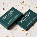
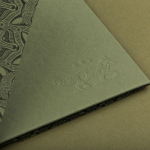
Maldini Studios is a Stockholm-based interior design and carpentry studio made up of project manager and carpenter Rasmus Moberg, interior designer Elina Johansson and carpenter Theo Klyvar. The studio’s work often uses precise lines and geometric forms to elevate the irregular detail and texture of natural materials. There are moments of utilitarian and ornamental juxtaposition, times at which this feels subtle and transitional,...
Raw Wine by The Counter Press
Raw Wine is an international two-day wine fair that takes place in the cities of LA, London, Berlin and New York. It was founded by Deborah Lambert and Isabelle Legeron MW, France’s only female master of wine, and provides an opportunity for growers, makers and buyers to get together. Raw Wine is also a celebration of the best organic, biodynamic and...
Rattis Books by The Counter Press
Rattis Books is a new London-based independent publisher that celebrates the convergence of traditional and modern print processes and has a firm belief that the book is an art object. To help convey this, the publisher worked with design studio, private press and typography workshop The Counter Press to create their brand identity, and the design for their first book Tiro, a collection of football writings....
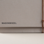
Wagon Wheel by Perky Bros
Wagon Wheel is a Nashville-based boutique real estate title and escrow company established by three partners with substantial experience working for larger corporate law offices who wanted to establish a company with a more casual corporate culture and client experience. This, and Wagon Wheel’s Nashville roots, is expressed throughout its new brand identity, designed by graphic design studio Perky Bros, using...
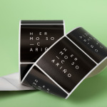
Hermoso Cariño by La Tortillería
Hermoso Cariño, a name taken from the title of a Mexican love song, is a gift shop with unique line of products. These are described as Mexican in the least expected way, leaning more towards the contemporary, but not forgetting tradition, and crafted by a new generation of designers. This is expressed throughout Hermoso Cariño’s brand identity, created by La Tortillería, through a mix of type,...
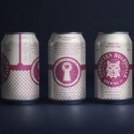
Forgotten Boardwalk Brewing by Perky Bros
Forgotten Boardwalk is a New Jersey microbrewery producing uniquely flavoured, year-round and seasonal craft beer. It was set up by Jamie Queli, one of the youngest female brewery owners in the US, and draws its name from the folklore of the Jersey Shore Boardwalk. This is the foundation of an extensive new brand identity, designed by Tennessee based Perky Bros, which brings to life the sideshow...
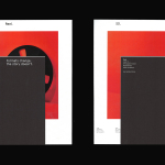
Bearleader Chronicle by The Studio
Bearleader describes itself as being dedicated to seeking out spectacular events, simple pleasures, awe-inspiring landscapes, hidden gems, and regions where traditions are meticulously maintained. They share these with their readers through an online magazine, which also includes insight into the people they meet and places they come across, with the intention of inspiring others to follow in their footsteps and chart their own adventures. Bearleader draws its name...
Reel by Richards Partners
Reel, formerly Reel Good, is a digital production company telling memorable stories and crafting digital experiences from its offices in Auckland, New Zealand. It has positioned itself at the intersection between new technologies and established filming techniques, and delivers both creative and distribution services. These include providing direction, production, post-production, animation and music to clients such as New Zealand Air, Casio, Warner Music...
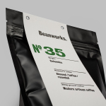
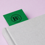
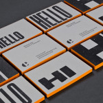
Beanworks by Paul Belford Ltd
Beanworks is a UK wholesale coffee roaster and supplier, coffee machine specialist and barista training school. It prepares its beans using a customised vintage Italian drum roasting machine that allow it to digitally monitor process, and produces a range of single and multi-origin coffee varieties. Although the roaster embraces contemporary artisanal coffee culture, when it comes to naming conventions it favours the utility of numbers,...
Woodland Wine Merchant by Perky Bros
Woodland Wine Merchant is described by Perky Bros, the design studio behind its new visual identity, as a tidy and eclectic wine store in Nashville, Tennessee that carefully curates wines from artisan producers practicing natural and sustainable methods, and hunts for and gathers the best value wines from around the world. Perky Bros’ identity solution was inspired by the collision of two worlds—the...
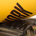
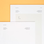
The Counter Press by The Counter Press
The Counter Press is a letterpress studio and workshop located in an old chocolate factory in the East End of London. They work exclusively with hand set wood and hot metal type on antique presses to create contemporary typographic design, artwork and limited edition prints. While taking on small outside projects, founders David Marshall and Elizabeth Ellis are keen to stress they are not...
Peter Ahrens by Studio Jubilee
Independent London-based design agency Studio Jubilee have recently updated their website and portfolio. Their brand identity work for South Australian photographer Peter Ahrens—which included a new logo-type, website and stationery set—really stood out for its use of a weighty fluorescent white material choice and tactile print process to enhance a reductionist single font approach. The project is accompanied by a great write-up, published...