Reel by Richards Partners
Opinion by Richard Baird Posted 18 July 2015

Reel, formerly Reel Good, is a digital production company telling memorable stories and crafting digital experiences from its offices in Auckland, New Zealand. It has positioned itself at the intersection between new technologies and established filming techniques, and delivers both creative and distribution services. These include providing direction, production, post-production, animation and music to clients such as New Zealand Air, Casio, Warner Music and Vodafone, amongst others. To coincide with the name change graphic design studio Richards Partners were commissioned by Reel to create a new brand identity treatment, which extended across business cards, posters, brochure and responsive website, that would help move it from start-up to respected production house.
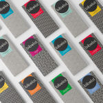
Based around the concept ‘Formats change, the story stays the same’, Richards Partners created a brand identity built from a variety of recording formats visualised as icons and cut outs photographed on red, green and blue backgrounds.
Where visual identity can often focus on the distinctive form of a single asset such as a logo, Reel’s leverages the familiarity of a few, drawing uniqueness from their built qualities within the context of an industry of intangible digital formats and cloud based storage. This shared aesthetic makes the older and larger formats appear less like historical artefacts and more like tools with current value alongside the more recent, and within an identity system, own-able assets.


The RGB colour palette is on the nose but works well. It remains relevant, even with the invention of new colour technologies, is used sparingly to punctuate white space in print and online, and contributes to the timeline-like narrative of the panels above. These panels move between the ornamental and the functional, binding office space, website and printed communication, much like a logo or wordmark. Collectively, these effectively utilise colour, form, contrast, proportion and the egality of their production to communicate a philosophy that employs the format or approach best suited to the story, as well as securing relevant visual impact and interest.

Other highlights include a scroll-induced reel rotation online – a playful aesthetic flourish, expanding details below videos, the large window decals of Reel’s office space and letterpress business cards. These have a tactile and physical quality similar to the made nature of the images, and also a reflect the continued favour for past technologies.
The use of Grilli Type’s Cinetype, a font based on a design engineered for cinema subtitling machines is a neat and subtle nod to both moving image and communication. Much like letterpress being used in the context of digital services, a screen based font makes its way into print. Although not explicit in its reference, these crossovers layer the identity with a neat subtext.


As you might expect for a digital production studio, broader and more emotive communication is delivered through showreels with identity acting as a complimentary and uniting factor that frames technical merit, a preference for storytelling, clear aesthetic sensitivities and the diversity of Reel’s portfolio. This is acknowledged by Richards Partners approach to web design, characterised by simple layouts, plenty of white space, a single font choice, a stream of video content and the hiding of copy. More from Richards Partners on BP&O.
Design: Richards Partners. Opinion: Richard Baird. Fonts Used: GT Cinetype