Metallic Spot Colours
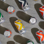
Detour Beer Co. by Weave
Craft beer has become a hugely competitive market to enter. It seems a rather obvious thing to write, but it’s quite something to have been part of the generation that saw its rise. It’s also provided a lot of great imagery for design blogs, and moved freely between both brand building and just plain visual delight. To see large fridges within...
Napier Street by Studio Hi Ho
231 Napier Street is an eleven apartment building, now sold out, created by property developer Milieu, set with the culturally rich part of Fitzroy, Melbourne. It is their first collaboration with architect Edition Office—an innovative practice with a strong conceptual focus—and part of the developer’s ongoing enquiry into and interrogation of the dialogue between architecture and place. This interrogation forms...
andSons Chocolatiers by Base Design
andSons is a second generation chocolatier and retailer run by Marc and Phil Covitz, two brothers who learned everything there is to know about fine chocolate from their mother. Seeking to offer something new to the world of artisanal chocolate, driven forward by Top 10 Pastry Chef Kriss Harvey who joins the brothers, andSons thrashes out a liminal space between...
Rare Harvest by Marx Design
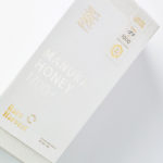
The True Honey Company (TTHC) dedicates itself to the production of mānuka honey, a monofloral variety produced in Australia and New Zealand from the nectar of the mānuka tree. It has a unique colour and texture and a high level of dietary Methyglyoxal, an organic compound with antibacterial and antiviral properties. With a price range starting at 60.00AUD and rising to 230.00AUD per jar,...
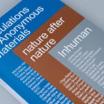
Speculations On Anonymous Materials by Zak Group
Speculations on Anonymous Materials (2013), nature after nature (2014) and Inhuman (2015) is a trilogy of exhibitions, curated by Susanne Pfeffer, that took place at Fridericianum, Europe’s oldest public museum, located in the German city of Kessel. The exhibitions, which mark the institution’s turn towards post-humanist thinking, intended to demonstrate how current artistic practices shift the theoretical boundaries separating the...

Mies In London by OK-RM
Mies In London is a project by Real Foundation that seeks to document modernist architect Mies van der Rohe’s only design for the United Kingdom, Mansion House Square; a bronze tower and grand plaza located at the heart of London opposite the bank of England and commissioned in 1962 by Lord Peter Palumbo. Following a long struggle with Royal and...
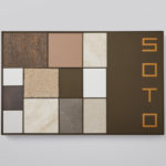
Soto by Richards Partners
Southside Group and Colliers International worked with New Zealand based studio Richards Partners to develop a graphic identity for their new property development, located in between Auckland’s Meadowbank and Remuera, which is made up of 58 ‘Residences’ and 7 exclusive ‘Pavilions’ designed by architects Monk Mackenzie and Hare Interiors. The Soto name and graphic identity designed by Richards Partners functions as a way...
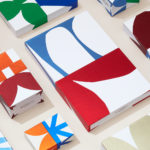
Allsorts Black & White Edition by Bond
Bond continue to work with Scandinavian confectionery brand Cloetta, owner of liquorish brand Allsorts, on the packaging for their Allsorts Black & White edition. The packaging for Allsorts’ originals range looked to bring the distinctive shapes and colours of the liquorice to the forefront using geometric forms and bright colour, enhanced by the black background of a simple card box. It was an approach rightly described...
The International by Studio South
The International is a new apartment complex, located not far from Auckland’s Albert Park, with 88 luxury residencies. The building, a repurposed former office, is currently being transformed into an iconic structure with a contemporary exoskeleton of elongated beams. To promote the building and help sell apartments off-plan, the graphic designers at Studio South worked with the developer behind The International...
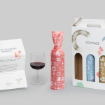
Sommos by Mucho
Summos is an online platform that gathers together and shares the knowledge of the six best sommeliers of the Netherlands and offers a seasonal subscription service that sends out a selection of some of the country’s best wines once every two months. Sommos worked with graphic design studio Mucho to develop name, brand identity and packaging. Based around the concept of group and innovation, and clearly informed...
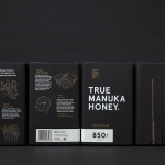
The True Honey Co. by Marx Design
The True Honey Company (TTHC) dedicates itself to the production of mānuka honey, a monofloral variety produced in Australia and New Zealand from the nectar of the mānuka tree. It has a unique colour and texture, and a high level of Dietary Methyglyoxal, an organic compound with antibacterial and antiviral properties. With a price range starting at 60.00AUD and rising to 230.00AUD per jar,...
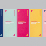
Frameline 40 by Mucho
Frameline is a San Francisco-based nonprofit arts organisation and LGBTQ film festival that intends to change the world through the power of gay cinema, and to connect filmmakers with audiences locally and internationally. Graphic design studio Mucho worked with Frameline on its brand identity and campaign for its 40th LGBTQ film festival, delivering a system based around a framing device, a bright and diverse colour palette and...