Minimalist Brand Identities
Spudos by Paul Belford Ltd
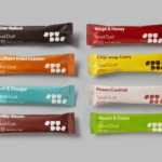
We live in chaotic and excessive times. Brands and politicians alike demand attention, clamouring for consideration and creating – quite frankly, for me at least – an unwelcome cacophony of competing voices and issues. All too often, the lines between competing interest are blurred, and even absurd. I crave clarity and simplicity, particularly when it comes to basic consumables. What’s...

Hello Klean by Two Times Elliott
Beauty is, of course, in the eye of the beholder, but there’s no denying that objectively, its branding and identity design has undergone some huge changes over the past decade or so. Gone are the days of faux-luxurious designs that were all about swathes of abstract silk; women coiffured to within an inch of their life; a microscopic lens on...
Trulli Ulivi by Here Design
Most people have likely never played the game ‘Italian Food or Italian Celebrity’; but trust me, it’s a pretty fun game – great for car/tube/bus journeys, or whiling away a bit of time after Christmas between gorging on something and watching Eastenders Omnibus. The premise is simple: someone says a name, the others guess if it’s an Italian food, or...
Quality Experience (QX) by &Walsh
Even the most fleeting scan through &Walsh’s portfolio makes it wholly unsurprising how Jessica Walsh’s semi-eponymous studio has achieved such a brilliant reputation. While Walsh herself has garnered countless design press column inches – as partner at Sagmeister & Walsh; one half of the 40 Days of Dating project; a creative conference regular; and an advocate for women in design...
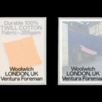
Ventura Foreman by Studio Blackburn
Founded by Robert Ventura and Sophie Foreman, Ventura Foreman is a design and manufacturing studio based in Woolwich, south London, which specialises in quality workwear pieces for clients like Paul Smith, Matches, and much-hyped North London ‘liberal metropolitan elite’ take on the greasy spoon, Norman’s Cafe. Having been around for a while without a ‘brand’, there came a point in...
Recchiuti by Manual
Recchiuti Confections is a San Francisco-based gourmet chocolatier that creates chocolates with unique flavour combinations. Using traditional European techniques, with locally sourced ingredients from Northern Californian farms and markets, Recchiuti’s chocolates have earned a loyal customer base and several accolades. After 25 years in business, Recchiuti sought the expertise of Manual – a local design studio – for a brand...
Future Factory by Dutchscot
‘Lead generation for creative agencies’. It’s one of those lines that makes complete sense to some but sounds like gobbledigook to everyone else. ‘Lead generation’ is a general mystery, unless your job depends on it. And what is a creative agency after all? But of course, so far as branding is concerned, ‘everyone else’ really doesn’t matter. Hitting the spot...
Baseline by Garbett
‘There’s better ways to build’ is Baseline’s opening gambit on its landing page. And Surrey Hills-based Garbett worked with the government and commercial builder to bring this and its core values of simplicity, precision, clarity and transparency to life. ‘Every successful build needs the right foundation’. This notion is expressed through a single unit that expands and grows into a dynamic system of blocks, not quite...
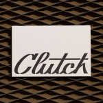
Clutch Automotive by Parker Studio
From à la mode Lick paint to gramable Aokka coffee, everything comes in a tin these days. The rise of metal packaging solutions in food and beverages, healthcare, household and consumer is expected to accelerate by 3.1% year-on-year from 2021 to 2030, driven by the demand for sustainable alternatives to plastic and lightweight substitutes for glass. Aesthetically speaking, the tin...
Panettoni Pavolucci by Requena Office
Panettone has origins as far back as ancient Rome, but its connection to Christmas was first established in the eighteenth century. This sweet bread – originally from Milan – has earned its place across the globe as a staple of the festive season. However, earlier this summer, Barcelona-based twins Chiara and Francesca Pavolucci opened a bakery to bring panettone to...
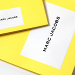
Marc Jacobs by Triboro
Fashion designer Marc Jacobs heads his own eponymous fashion brand, as well as diffusion lines The Marc Jacobs and Heaven by Marc Jacobs. He was also creative director at Louis Vuitton from 1997 to 2014, where he created the company’s first ready-to-wear clothing line. In his own words, Jacobs’ work is ‘a little preppy, a little grungy, a little couture’, and this...
Lookbooks by Studio Lowrie
Lookbooks is an online bookstore that specialises in fun and quirky publications of the past. Recent acquisitions include Old Bohemian and Moravian Jewish Cemeteries by Petr Ehl, Arno Parik & Jiri Fiedler, 1991 and 101 Cake Design by Mary Ford, 1987. There is a cultural value to many of these, reflecting a time and particular niche interest, and how these...