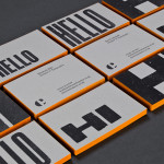
Negative Space Logos
The Counter Press by The Counter Press
The Counter Press is a letterpress studio and workshop located in an old chocolate factory in the East End of London. They work exclusively with hand set wood and hot metal type on antique presses to create contemporary typographic design, artwork and limited edition prints. While taking on small outside projects, founders David Marshall and Elizabeth Ellis are keen to stress they are not...
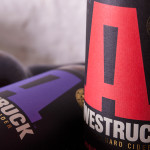
Awestruck Hard Cider by Buddy
Awestruck is a premium hard cider range from Gravity Ciders. It was created to offer America’s craft brew fanatics a refreshing alternative to beer. Awestruck is made from 100% fresh-pressed New York State apples and infused with unique flavours that reflect the company’s enthusiasm for experimentation. The range includes Lavender Hops, Hibiscus Ginger and Eastern Dry. Design studio Buddy were commissioned by Gravity...
Yksi elämä by Tsto
Yksi elämä is a Finnish project set-up with the intention of encouraging people to become more interested in their own well-being and to improve public health care on both a professional and organisational level, as well as society in general. The project is a collaborative endeavour between the Brain Association, Diabetes Association and Heart Association of Finland. Design studio Tsto were asked...
The Confidante by RE:
The Confidante is a group of CEOs who draw on their extensive networks to provide business leaders with tailored executive coaching and mentoring services. Designed by Re: Sydney, The Confidante’s new brand identity effectively visualises the confidential and discretionary nature of their work and the executive level of their service through a simple negative space keyhole logo that has been given...
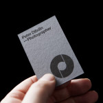
Peter Dibdin by O Street
Peter Dibdin is a photographer who brings creativity, technical knowledge, professionalism and a personal approach to both studio and location shoots for clients working within the commercial, private, arts and editorial sectors. Following a recent move to a studio in Edinburgh’s creative hub of Summerhall, Peter commissioned long-term collaborator O Street to refresh his brand identity in a way that would reflect his...
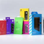
uBear by Hype Type Studio & Mash Creative
uBear is a high-end mobile phone, tablet and laptop accessories business located in Los Angeles, California. Their visual identity, developed by Hype Type Studio and Mash Creative, included a new logo, stationery set, packaging and responsive website. By utilising the bold graphic detail of diagonal stripes, sans-serif type, a bright and diverse colour palette, fine diagrammatic illustration, foils and varnishes and a simple bear...