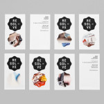
Resolve by Neue
Resolve is a Norweigen provider of a broad selection of cleaning and restoration services to both the commercial and private clients covering asbestos removal, fire and water damage mitigation and ventilation cleaning. Their new identity, designed by Oslo based Neue, rejects that hard industrial aesthetics of the sector in favour of a softer, people led proposition....
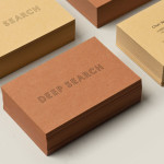
Deep Search by Bielke&Yang
Deep Search is a Norwegian shoe brand that devotes its time to the inquiry of nature, fundamental human activities and their practical impact on the aesthetic of shoes. Deep Search’s brand identity—which includes a logo, logotype, stationery and packaging solution created by Bielke&Yang—is a neat fine lined and geometric logo-type that sits over the tactile quality of the material choices...

Norwegian Shipowners’ Association by Neue
Norwegian Shipowners’ Association is a group of businesses that collectively employ over 55,000 seafarers and offshore workers from more than 50 different nations. The association’s new visual identity, created by Oslo based design agency Neue, captures the open sea and sense of knowledge and experience with a two colour square and traditional serif combination....