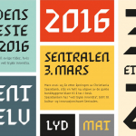
Sentralen by Metric Design
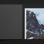
The former building of Norway’s first savings bank, which began as a social initiative to serve the working class people of Oslo, now houses Sentralen, a mixed-use cultural centre. Sentralen continues in the traditions of the bank, functioning as a hub for innovators concerned with and looking to address present day societal issues. The centre houses over 350 tenants working...
Solrug by Bielke & Yang
Solrug is a high-quality, ready-cut, Finnish sourdough rye bread created for the Norwegian market by Magnus Högnäs, a Finnish expat living in Norway, and in response to the county’s poor wholemeal choice. The bread is dense with a strong flavour, low in sugar and salt but high in fibre and protein, and produced by Finnish bakery Leipomo Rosten Oy using only...
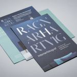
Ragnar Hartvig by Commando Group
Ragnar Hartvig is a renowned Norwegian photographer with over 20 years experience and a strong network of collaborators. Clients have included leading furniture manufacturers, magazines and books, as well as interior and product designers. Ragnar Hartvig worked with Oslo based graphic design studio Commando Group to develop a new brand identity that would convey some of his personality, skillset and experience...
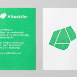
Altaskifer by Neue
Alta Quartzite is a natural building material quarried from the mountains of Norway’s Alta region with a unique green/grey colour, fine texture and hard wearing non-slip properties. These make it a good choice for both interior and exterior applications, from roofing, paving and staircases, to roads and walkways. Although it is material with a long history of use it is...
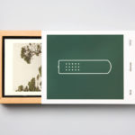
Hegel Music Systems by Neue
Hegel is a Norwegian amplifier, pre-amplifier and multi-media player business with a proprietary Error Correction System that limits harmonic distortion without compromising other parameters. Established in the early 1990’s, Hegel has grown to become a well-established supplier of high-end hi-fi products, nationally and internationally, and is committed to sound reproduction that adds nothing (or as little as possible). This is the foundation of their new packaging...
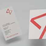
4B Arkitekter by Commando Group
4B Architects is an architecture studio with offices in Oslo, Norway, an experienced team and a holistic approach. It has a particular interest in low energy and sustainable projects, and has built a portfolio of restorations, public, cultural and commercial buildings, private housing and outdoor spaces. The studio’s team of founding partners (from its inception in 1971) and a generation of...
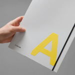
K. Apeland by Bielke&Yang, Norway
K. Apeland is a Norwegian independent civil engineering consultancy that specialises in construction technologies, and applies its experience to new builds, remodelling projects and renovation. It has a favour for steel-wood and concrete structures, which has won the consultancy a number of awards, and has a broad portfolio that covers public infrastructure, private offices and housing, as well as viewing platforms,...
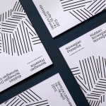
Norwegian Presence by Bielke&Yang
Norwegian Presence was an exhibition of handcraft and design, past and present, from Norway. It was held at Fuorisalone, which makes up part of Milan Design Week, and moved on to The Gifts & Interior trade fair in Oslo and 100% Norway in London. The exhibition featured 51 different products from 46 designers, with the intention of showcasing a diversity of approaches, innovations,...
Maaemo by Bielke&Yang
Design studio Bielke&Yang have worked with Norwegian two Michelin starred restaurant Maaemo to develop a holistic brand identity solution informed by the philosophies and creative practices of its unique dining experience and culinary expertise. The studio’s brand identity design, which encompassed website, custom typography, colour, the tone and content of images, and the tactile finishes of welcome notes, magazines, business cards, folders...
Fosnavåg Konserthus by Heydays
Fosnavåg is a city on the island of Bergsøya, situated off the west coast of Norway not far from the Altantic Ocean. It is home to a variety of maritime businesses including fishing, logistics and shipbuilding, and now the location of Fosnavaag Cultural Centre, a new concert hall founded by the local community. Fosnavaag Cultural Centre’s brand identity, created by Scandinavian graphic design studio...
Skovin by Heydays
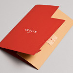
Skovin is Norwegian, high-end, solid wood floor specialist that combines ancient craftsmanship with modern technologies. By mixing a wood veneer business card and a traditional name drawn from the old word Skøyen, the area in Oslo where the company was founded, with geometric shapes and die cuts, panels of flat colour and sans-serif typography, Skovin’s identity, designed by Heydays, intends to...

Taco República by Bielke&Yang
Taco República is described by Bielke&Yang, the design studio behind its visual identity, as Norway’s very first genuine taqueria. Wanting to avoid some of the Mexican restaurant clichés, Bielke&Yang juxtaposed classic typography and a guacamole based color scheme with a colourful and contemporary illustrative panel created by Uglylogo, which offers a humorous take on the “enthusiasm and craziness” of the local community prior...