Overprint
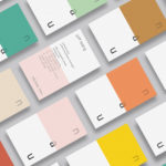
NAU by Toko
NAU is a new Australian furniture brand created by the premium designer furniture and lighting retailer Cult, and features work by futurist designer Gavin Harris and Adam Goodrum, a designer that believes an object justifies its existence through story and detail. Design by Toko worked with Cult to develop name, and create a logo and graphic identity for NAU that...
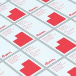
Maven by Design By Toko
Maven is described by Design By Toko, the Sydney-based design studio behind its recent rebranding, as a top-tier architecture recruitment agency operating worldwide. Drawing on the built environment and with the intention of expressing the agency’s prominence within the architecture industry Toko developed a brand identity of simplicity and impact through bold solid form and single colour that links business...
UAL 2017–18 Campaign by Spy
The University of the Arts London is Europe’s largest specialist arts and design university. It is made up of six colleges, each with its own unique character and programme, yet unified in their effort to deliver a high quality creative eduction. This united position is expressed through a visual identity system developed by Pentagram partner Domenic Lippa. Based around Helvetica, UAL’s visual identity affords each...
Goldsmiths, University of London by Spy
Goldsmiths is a world-renowned public research university founded in 1891 and located in south-east London. It provides a diverse programme of study, but specialises in creativity, and covers the arts, design, humanities, and social sciences. Goldsmiths’ heritage, which was reflected in its previous identity in a familiar and conventional manner, makes way for a far more current visual expression created by...
UAL 2016–17 Campaign by Spy
The University of the Arts London is Europe’s largest specialist arts and design university. It is made up of six colleges, each with its own unique character and programme, yet unified in their effort to deliver a high quality creative eduction. This united position is expressed through a visual identity system developed by Pentagram partner Domenic Lippa. Based around a robust, black and white...

The Beaufort by The Company You Keep
Design agency The Company You Keep (TCYK) have recently finished working with bartender Dave Kerr on the naming, branding, collateral design and signage for The Beaufort, a themed dive bar located on Melbourne’s Rathdowne St. The agency’s visual identity solution, a combination of a quirky, well rendered, bespoke logo-type – built from unusual but original uppercase characters inspired by iron dock...
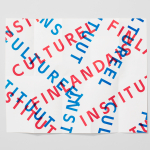
The Finnish Cultural Institute by Kokoro & Moi
The Finnish Cultural Institute for the Benelux (Fins Cultureel Instituut, Institut Culturel Finlandais) is a non-profit organisation that promotes Finnish arts and culture to the Benelux countries of the Netherlands, France and Belgium, with the intention of fostering collaborative opportunities for artists and organisations within the fields of music, literature, design, cinema and the performing and visual arts. The institute’s visual identity,...

Heart & Soul Interiors by Band
Heart & Soul is an Australian interior decoration firm, specialising in residential properties, with a holistic, adaptable and flexible philosophy. Adelaide-based design studio Band were commissioned by the firm to update their brand identity so that it would better reflect their contemporary approach. Based around the duality of a heart/ampersand marque, a sans-serif logotype and print that juxtaposes a modern bright red...