Eames Institute by Manual
American industrial designers Ray and Charles Eames fundamentally believed that good design should be available to everybody. It’s ironic, therefore, that today – in part due to institutional bodies, galleries, collectors and capitalism – their work has been elevated far beyond the reach of the common person. Design that was supposed to be accessible has become a symbol of taste,...
Logo
TonenGeneral Sekiyu K.K by Katsuichi Ito Design Office, 2000
An explosive initial impact is followed by dissipating details around the surface, and captures the solar energy released from oil. This works great as a black form, but gains further meaning in red and within the context of 日本, the Land of the Rising Sun...
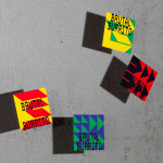
Brutal Burrito by Tres Tipos Gráficos
In 1984, the death of the wrestler Rodolfo Guzmán Huerta – commonly known as El Santo – sent shockwaves through Mexico. Over the course of five decades and 15,000 matches, the legendary fighter had captivated audiences, helping to fuel the growth of Lucha Libre around the world. Through his appearances in film, comic books and cartoons, he established himself as...
Logo
55th Karlovy Vary IFF by Studio Najbrt, 2021
The logo of the 55th Karlovy Vary International Film Festival follows the black and white typographic games played by Studio Najbrt and that have characterised the visual identity of the festival for the last few years. Here, a pair of eyes are playfully drawn out of the number 55, and developed further when patterned in print or in motion on...
Logo
Photography in Print & in Circulation by BankerWessel, 2016
A wonderful new meaning given to the ubiquitous form of the book. Through repetition and rotation the theme of the symposium, ‘Photography in Print & in Circulation’, is beautifully brought to life by BankerWessel....
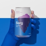
Berg by Marx Design
Marx Design worked with drinks company Lion to develop a brand identity for Berg, an alcoholic / hard seltzer free from artificial colours and preservatives aimed at “discerning drinkers who’ve been yearning for a more refined alternative.” Berg is available in three flavours, Berg Watermelon, Berg Lemon & Yuzu and berg Blackberry. While delivering a clarity and crispness of flavour, Berg is...
Ebb Dunedin by Maud
Design-savvy duo and father and son team Dylan and Frank worked alongside Gary Todd Architecture and interior design team INDYK Architects to develop Ebb, a contemporary boutique hotel located at the heart of Dunedin, a city on the South Island of New Zealand. Ebb is uniquely situated at the edge of the reclaimed Otago Harbour–a place where Polynesian travellers would...
Logo
The Disaster Resource Network by O+CO, 2003
A symbol of global cooperation to deliver coordinated disaster relief is beautifully expressed through a loop of inter-connected circles. The use of negative space delivers a focal point, a burst at the centre, perhaps a touch of the dramatic to evoke the theme of disaster in the reader....
Petit Planet by Studio fnt
The Hyundai is one of the three major department stores in South Korea, with its 15 branches across the regions of Seoul, Yeongnam and Hoseo accruing more than $6 billion in annual sales. Petit Planet is the Hyundai’s new specialised children’s division, presenting premium brands in an environment designed to stimulate young imaginations. This post includes Extended Insights for BP&O...
Logo
Busaba by Paul Belford Ltd., 2019
Rooted in the Thai restaurant’s Buddhist philosophy the logo works together two symbolic references; a flower and a heart. These draw on the name ‘Busaba’ which means ‘flower’ in Thai, and two philosophies that inform Busaba’s culture: ‘sookjai’ (happy heart) and ‘namjai’ (water heart). Paul Belford’s solution is an elegant and resolved singular form with a multiplicity of meaning....
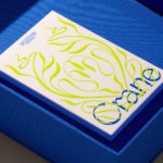
Crane by Collins
In 1775 Crane paper was used to print the first money for the American colonies, and by 1801 the company was the primary paper producer for local and regional banks. Later that century, equipped with an arsenal of innovative techniques from Europe, Crane won a contract with the Bureau of Engraving and Printing and became the supplier for the US...
Logo
Telewest by North, 2001
The “Imagine Symbol” created by North was a gesture of instantaneous “now” technology, echoing the ripples of information spreading outward from nodes in a network. This static single colour version, through differing line weights and circle sizes, manages to effortlessly capture, in a moment, the pulsing and constantly changing nature of the broadband network and distill the logo down to...