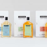
Kininvie by Here Design
The Kininvie distillery was established in 1990 as a third home for William Grant & Sons – it was initially built to relieve pressure on stock at neighbouring sites in Dufftown. Kininvie Works is a more recent development, created as an innovation arm to develop new recipes and processes. As such it is liberated from the rules and regulations that...
Logo
OneFootball by Design Studio, 2021
The numerical meets the strike of a ball in this logo for OneFootball, the leading football app for fans to share news, stats, scores, live matches and video content. As part of a broad refresh, the logo delivers on the name through a smart intersection of form language – two legs and ball – and the typographical form of a...
Logo
World Chess Championship by Pentagram, 2012
The simplicity of the board belies the intelligence and complexity of the game. This dichotomy is brought to life here, through a new logo, by employing a spatial quality realised using an optical illusion to capture the requirement of chess masters to process every possible move, counter-move and permutation. Each square, through this optical illusion, becomes a gesture of the...
Piedmont Art Walk by Mucho
Piedmont is a small city in California named after the European region in the shadow of the Alps (from the Italian piemonte, meaning ‘foothill’). Surrounded on all sides by Oakland, the neighbourhood has a population of roughly 10,000 people and an active charity scene. This includes the Piedmont Arts Fund, a nonprofit group that promotes and supports visual and performing...
Metamorphoses by A Practice For Everyday Life
Metamorphoses is a contemporary art gallery that curates unique pieces by makers who turn one thing into another. It takes a special interest in works that are inspired by the past while displaying keen attention to present issues. These pieces, selected by the gallery, are often drawn from a body of work by artists who reflect on aspects of cultural...
Cable Factory by Bond
Cable Factory (Kaapelitehdas) is one of Helsinki’s most famous buildings, originally designed by the Finnish industrial architect Wäinö Gustaf Palmqvist in 1939. For many decades it was the largest building in Finland with a footprint of 56,000 m², and it remains one of the most iconic. In 1991 the site was redeveloped to become the country’s biggest cultural centre, housing...
Logo
The Roman Quarter by Boy Bastiaens, 2020
In the southern part of Dutch city Heerlen is The Roman Quarter, the oldest Dutch Roman settlement and a crossroads between two major Roman thoroughfares. Just as the two roads intersected two ideas are brought together here by Boy Bastiaens. A Roman parquet tiled floor with a column at its centre also forms the ‘x’ of a crossroad within using...
Logo
Generation Press by Studio.Build , 2014
Design and print go hand in hand, so it’s no surprise that there’s a fantastic history of modernist logos for printers. Halftone and rollers are not uncommon but realised with varying degree of success. The latter has been rendered front on and in perspective, and there’s been numerous ways to visual the movement of paper through these. There’s also a...
Logo
Sing King by Nomad, 2020
Compounding. An enduring form-making technique. There are plenty of these types of logos to be found throughout the mid-century, some comfortable in their synergy, others crude and unresolved. This technique continues today as a viable route to uniqueness, but the challenge remains the same, how to find an elegant intersection of two unrelated forms? Positive and negative has almost become...
Logo
Daniel Juncadella by Mucho, 2013
This logo was part of Daniel Juncadella’s new personal brand identity as he became an official Mercedes driver for the DTM and test driver for The F1 Mercedes team. Part monogram, part racetrack, the visual language of racing and speed is beautifully infused into the “dj” letterforms through inline and arrow. Read the brand identity review here....
Logo
The Swedish Music Publishers Association by BankerWessel, 2018
A dynamically charged interpretation of a universal musical motif becomes a distinctive shorthand for Musikförläggarna — The Swedish Music Publishers’ Association. An “M”, a note and flash converge into a beautifully resolved single form, drawing uniqueness and immediacy from the common....
Logo
Sweet Protection by Neue, 2018
A lovely intersection of letterform and symbol, existing somewhere between an “S”, ski slope and a figure with ski poles. The final touch, a black diamond (an indicator of the steepest ski run in the area and one that may have more hazards) is a lovely reference within the context of protective ski equipment....