Tugg by Kurppa Hosk
The hamburger is an American icon. It conjures associations with all-American diners and drive-thrus, backyard cookouts and family gatherings; American values, such as entrepreneurship, as well as less positive attributes of Western countries, like obesity. The burger’s visual identity is inseparable from its history and has been solidified time and time again as the big fast food franchises conquered the...
Mode by Gretel
How to make a data business approachable yet hold gravitas? Can it be engaging yet authoritative, sage yet cool? These are the implicit tensions NY-based Gretel has grappled with in its branding of Mode, a data intelligence and technology business seeking to widen its appeal. Gretel has established a brand identity which is triumphant and clean. It balances the contradictions that so...
BP&O Voices
Paul Belford on Ads:
Intercity press ad
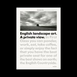
A guest article from Paul Belford on Saatchi & Saatchi’s 1992 press advert for Intercity. BP&O Voices presents the opinions of industry experts on a wide range of topics....
Logo
Sydney Waterfront Whale Tales by Interbrand, 2023
Sydney Waterfront Whale Tales is part of a collaborative effort by business, government and community to revitalise and celebrate Sydney’s Western Harbour Precinct. A trail of 30 uniquely painted ‘whale tail’ sculptures, each featuring a story celebrating Sydney, the Precinct itself, and the whales who appear each year, guides visitors along the waterfront. Stories marked by whale sculptures along a migratory path. A...
Seedsman by Here Design
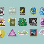
Water masquerading as an edgelord-baiting energy drink (Blackletter fonts, skulls, and a name straight out of the heavy rock canon); running shoes aping a chesty cough remedy; olive oil bottles that owe more to the science lab than the Mediterranean. Packaging at the moment, it seems, is frequently playing fancy dress. That’s no bad thing, of course: brands borrowing aesthetics...
Logo
Make by Garbett, 2022
The Dovetail joint is known for its high tensile strength. It takes experience and patience to master by hand but provides a glue-less and elegant joining solution. This combination of associations makes it an ideal symbol for custom furniture design and making business Make. Reduced down and, through the interplay of positive and negative space, Garbett also then forms a bold distinct...
Next Steps by Studio Dumbar/DEPT
Tired of kinetic type and motion identities? No? Me neither. I remember the early work of DIA, way back, asking whether this was a flash in the pan. Seemed like the Swiss modernists had been well and truly brought back and given a digital energy. To designers, it may feel like a peak, but globally speaking, it’s still an emerging...
Eurostar by Design Studio
Train related rebrands are often some of the most divisive when it comes to the design community Twittering classes. That’s perhaps unsurprising when you consider the ubiquity of Standards Manual books on design studio coffee tables – and the fact that they’re among the rare graphics projects that get broadsheet attention (for better or worse, as the swathes of National...
Urban Climb by Base Design
‘The weaker the brand character, the greater the need for distinctive visuals’. Said someone, at some stage. And of course, the principle works in reverse. It’s an important point: if the core is strong, the exterior can – and often should – be more malleable, softer, less obviously an exercise in ‘branding’. Countries, cities, communities; we all have a sense...
Logo
NYC Literary Action Coalition by Order, 2023
Couldn’t be simpler, a pen and a ! within the negative space. It takes a small liberty (a fountain pen like that would be useless, and let’s face it, we’re mostly writing on screen) but it delivers maximum effect. Writing with purpose, to enact change. This is beautifully resolved, effortless, ownable and practical, it’ll scale up and down all day...
BrewBird by Mucho
Global strategy, branding, packaging, and graphic design studio Mucho created this colourful new identity for coffee tech startup BrewBird, working with Scottish artist Craig Black. Mucho was appointed to create a new brand identity and ‘memorable’ packaging system to help BrewBird communicate its story around uniting cutting-edge tech, taste, and ‘the artisanal craft of coffee roasters’. According to Mucho, drip...
Logo
Forskningsrådet by ANTI, 2023
One of thousands of generative logos, presented in its most literal articulation as the initial ‘F’. Derived from a mathematical principle (also explored by Armin Hofmann) that seeks to connect points in an optimal way. From this, ANTI created a series of logos and developed a visual language of connections, variations and creativity for Forskningsrådet (The Norwegian Research Council). These brings...