Logo
Enter Arkitektur by Lundgren+Lindqvist, 2018
Viewed one way, an E and an arrow, and the other the universal motif of a house. The immediacy of the form language evokes that of the mid-century modernist, as does the simplicity and boldness of its realisation. I’m sure others of similar ilk could be found, but this is the one that came immediately to mind when thinking of...
Logo
Helsinki City Museum by Werklig, 2018
The personal and everyday experiences of people in Helsinki are brought vividly to life throughout an “emotionally charged” collection of objects and photographs. This invitation to discover intimate city life is beautifully realised as a symbol, placing a heart at the centre of an H. Read more about this project here....
Logo
The Netherlands by Studio Dumbar, 2019
Previously, The Netherlands’ status as a forward-thinking nation of entrepreneurs and innovators was poorly reflected by an impressionistic, hand-painted ‘Holland’ and tulip. Today, a well-known trinity; orange, a tulip, and an acronym, quintessentially Dutch and effortlessly woven together, generates a distinctive, immediate and internationally recognisable image....
Logo
Trip Advisor by Mother Design, 2020
A subtle but suitable update to the distinctive Trip Advisor owl. A new bold and consistent single line weight, an improved approach to the eyes and a single colour approach increase usability and impact whilst maintaining a clear continuity and maintaining visual equity. Other details, for the discerning eye, include a new co-ordinated relationship between ears and beak, created from...
Logo
Boom by Manual, 2019
Technical precision and elegance, luxury and modernity. These are the traits of a supersonic travel future imagined by Boom. This is beautifully expressed through the dynamic wing-like formation of lines and their gradation in opposite directions....
Logo
Port of Antwerp by Davy Dooms & Eric Leurquin, BBDO Design, 2018
Acknowledging the Port of Antwerp was a trusted and ubiquitous brand BBDO Design opted for evolution, fine-tuning the existing logo designed by Jey Janssen in 1975 (see second slide). By applying more rounded forms, removing the “A” but keeping the overall composition of forms, BBDO Design have managed to simplify and streamline this, making it more dynamic and useable across...
Logo
Canal & River Trust by Studio Blackburn, 2018
The use of positive and negative space, and the varying line thicknesses to create the impression of light and reflection, bridge and water is exceptional. It fulfils the modernist maxim of maximum meaning, minimum means, beautifully resolved within a circle....
Logo
Build by Build, 2014
As corporate identity solidified itself as a distinct practice, design studios rightly looked at their own as an expression of capability. The modernist mid-century generated a whole host of logos by design studios for design studios. There was plenty of eyes, hands, pencils and pens, and many unique interpretations of these. Designing for oneself presents a difficult challenge. It demands...
Logo
New Chapter by Paul Belford Ltd, 2018
The logo for New Chapter is a simple but smart graphic gesture. It neatly works together an arrow and the pages of a book, implying forward momentum and progress through literary therapy. There’s also something of a smart observational quality as it brings to mind and could have been easily pulled from a book of printer’s ornaments. Read the brand...
Logo
Mourmans Nypels Architecture by Boy Bastiaens, 2020
The “active and focused research” and cross-disciplinary approach of Mourmans Nypels Architecture And Design is beautifully realised through the intersection and layering of multiple paths into a focused point and coherent whole....
Logo
Pew Research Centre by Chermayeff & Geismar & Haviv, 2017
Pew Research Center seeks to shed light on important social and political trends through data. A sun motif of radiating lines and an interplay of positive and negative space (read: light and shadow) becomes an expression of “illumination” or intellectual enlightenment. Although abstract, the sun association is clear, universal and inclusive. Consistent bold line weights, circular construction and counter lend...
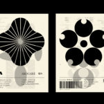
LogoArchive – Akogare 憧れ by Hugh Miller
LogoArchive returns with its fourth collaborative Extra Issue and first bi-lingual release, documenting the forms of Japanese logo design. Through the distinctive smaller format of the bound booklet LogoArchive seeks to surprise and delight with each new issue, introducing new collaborators to offer unexpected interpretations of the ubiquitous logo book. For this Extra Issue, Hugh Miller orchestrates graphic impact and...