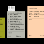
MOS Architects by Studio Lin
MOS is an American architectural practice that mixes playful experimentation with serious research. The practice, as it exists now, following two years of what seems to be an informal approach, was established in 2005, and has worked through a range of design experiments it describes as a make-believe of architectural fantasies, problems, and thoughts on what the practice would be building in the...
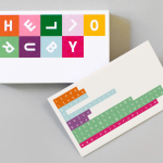
Hello Ruby by Kokoro & Moi
Hello Ruby is a Scandinavian company that offers an accessible and playful way for children to learn about technology, computing and coding, guided by Ruby, an illustrated character, and her animal friends. Founded in 2009, with the intention of being a small art project, and initially limited to a book, Hello Ruby has rapidly grown into a popular and comprehensive children’s computing...
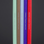
Strategy Thinking Issue 5 by Strategy
Strategy Thinking™ is an ongoing self-published series from New Zealand, Australia and Tokyo based graphic design studio Strategy. It provides the studio with a concise and compelling platform to showcase their work, communicate how they help their clients, and convey the insight and creative thinking that unites their five studios. The series also includes in-depth case studies and articles. The latest edition...

Soap Co. by Paul Belford Ltd
Soap Co. is a UK based social enterprise, luxury soap manufacturer and brand, that provides employment to people who are blind, disabled or disadvantaged. These individuals make up 70% of their team. All profits go back into the business to create and fund further job opportunities. Soap Co. recently launched a range of luxury handmade soaps, hand washes and hand lotions,...
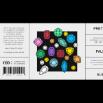
O/O Brewing by Lundgren+Lindqvist
O/O Brewing is a high-end craft brewery, set up in 2011 by Olle Andersson & Olof Andersson, with premises in the Swedish city of Gothenburg. O/O worked with Scandinavian graphic design studio Lundgren+Lindqvist, who had created labels for a variety of other O/O beer, to develop new packaging for their brews. The studio revised and simplified the design system from earlier releases but continued to...
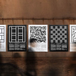
Edouard Malingue Gallery by Lundgren+Lindqvist
Edouard Malingue Gallery exhibits work by emerging and established artists from around the world across its 6000 sq ft space in central Hong Kong. Through collaborations with international curators, and its own publications, alongside solo exhibitions, the gallery looks to introduce art into public spaces and to stimulate public discourse. The gallery features an interior that juxtaposes the white unblemished walls and plinths you might...
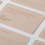
The Doctor’s Studio by A Friend Of Mine
The Doctor’s Studio provides non-invasive dermatological treatments and skin care procedures from its clinic in the Australian city of Melbourne. It has a philosophy that avoids feeding on insecurities and intends to facilitate positive change and foster a sense of well-being. The Doctor’s Studio worked with graphic design studio A Friend Of Mine to develop an interior and brand identity concept that would avoid the negative...
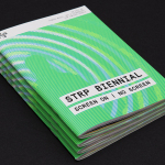
STRP Biennial 2015 by Raw Color
STRP brings together art, technology and experimental pop culture, and connects these to a broad audience, and through its light art, interactive art and robotic performances, lectures, workshops, music and film events, offers a glimpse into the future. This culminates with the STRP Biennial, an indoor art and technology festival that provides visitors with an opportunity to experience the extent to...
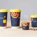
Pressbyrån by Bold
Pressbyrån is a Swedish convenience store with over 300 locations nationwide, and one of the country’s most recognised brands. It retails fresh pastry, sweets, coffee and hotdogs, alongside groceries, public transport tickets, magazines and papers, amongst a few other things. Stockholm based graphic design studio Bold worked with the store to create new packaging for its range of consumable products with the...
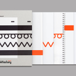
Bubu by Bob Design
Buchbinderei Burkhardt, now shortened to Bubu, is a family-owned binding specialist established in 1941. It is now run by third-generation family members and has locations in the Swiss cities of Zürich and Mönchaltorf. Bubu provides consultancy and prototyping services, curates an extensive binding library of over 2000 books, and offers a wide variety of soft and hardcover binding techniques. These include the familiar and utilitarian...

Torafuku by Brief
Torafuku has a simple yet adventurous menu that reinterprets pan asian flavours as modern shared dishes. These are made from good quality and locally sourced ingredients, which are complimented by a variety of contemporary cocktails, a carefully curated wine list and local craft beers. Torafuku is located on the border of Vancouver‘s historic Chinatown and features an open and reductive urban interior space of leather upholstered benches, light...
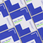
Basement Theatre by Studio Alexander
Basement Theatre is an independent, underground, community theatre located on Auckland’s Lower Greys Avenue. It was established in 2008 as a place to showcase new voices, fresh perspectives and emerging young talent, and to provide these with the space to develop their performances. The theatre has played host to dancers, visual artists, poets, musicians, comedians and everything in between. Taking their...