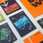
Goldsmiths, University of London by Spy
Goldsmiths is a world-renowned public research university founded in 1891 and located in south-east London. It provides a diverse programme of study, but specialises in creativity, and covers the arts, design, humanities, and social sciences. Goldsmiths’ heritage, which was reflected in its previous identity in a familiar and conventional manner, makes way for a far more current visual expression created by...
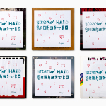
Second Hand Orchestra by Bedow
Second Hand Orchestra is a collection of tracks recorded for a documentary that was unfortunately and abruptly cancelled. Rather than let the work fall by the wayside, band leader Karl-Jonas Winqvist has released these as a limited edition album of 300 LPs. These feature a visual identity and packaging design of custom typography, individually numbered and block foiled sleeves, and screen printed t-shirts created by Stockholm...
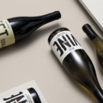
Estones de Mishima by Folch
Vins de Mas Sersal is a Spanish wine producer, founded by winemaker Salvi Moliner and sommelier Sergi Montalà in 2008. Inspired by the lyrics of Qui n’ha Begut from the album Set Tota La Vida (Thirsty The Whole Life) by singer, songwriter and friend of Salvi and Sergi, David Carabén of the indie band Mishima, the winery created a special...
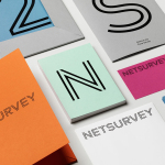
Netsurvey by The Studio
Netsurvey provides organisations with employee and customer relation evaluation services using a precise, individualised and proprietary set of tools, and then helps to implement change with the intention of enhancing employee engagement, strengthening leadership and improving employer branding. Netsurvey works across a variety of sectors, for both small and large businesses and has grown to become one of Sweden’s leading consultants within...
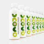
Unoco Raw Coconut Water by B&B Studio
UK based Unoco works with a community of smallholders in the Philippines to produce an unrefined, unpasteurised and untreated raw coconut water. This is drawn from young coconuts, characterised by their green rather than brown colour, picked at their nutritional prime and placed into bottles rather than tetra pak or cans using HPP. This process gives the water a distinctive pink colour, a result...
Studio Una by Studio Una
Studio Una is graphic design business, run by Sebastian Hager and Sebastian König, with an office in the German city of Hamburg. The duo works within the fields of visual communication and brand identity design, online and in print, and describe themselves as attaching great importance to the aesthetic effect of design, alongside strong concepts and strategic decisions. This positioning is conveyed...
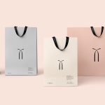
Twice Fashion by Socio Design
Twice Fashion is a Chinese luxury accessory brand established by Tina Tian and Dr Mirko Wormuth in 2007. Since then it has grown to become one of the country’s top accessory brands, with stores in Beijing, Tianjing and Chongqing. Twice Fashion is described by SocioDesign, the London based graphic design studio behind its rebrand, as having helped shaped China’s ‘fast’ fashion industry....
Upgrade to
BP&O Plus
Read more
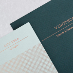
Vinoteca by dn&co
Vinoteca is a group of London based restaurants, founded by business partners and friends Brett Woonton and Charlie Young, that were inspired by the wine bars of Spain and Italy. Aside from the restaurant experience, and as a testament to the quality of their wine list, these restaurants also operate as local wine retailers. dn&co. were commissioned to refresh and formalise Vinoteca’s brand identity. With...
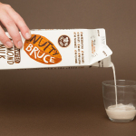
Bruce Juice by Marx Design
Bruce Juice is a 100% raw, cold pressed, fruit juice and plant milk brand new to the Australian market. It launched this year with five juice and vegetable blends, Red, Redder, Orange, Greener, Golden and Nutter, an almond milk, and a packaging and visual identity treatment by New Zealand based graphic design studio Marx Design. Using a mix of illustration and texture, loose hand drawn logotype and custom typography, bright...
Tina Frey Designs by Mucho
Tina Frey is an American homeware designer with a studio in San Francisco. She is inspired by the fluid lines of the sea, the curves and contours of nature, objects picked up while traveling, and the translucent colour of ice lollies and jelly beans. The design of each of her products—which include plates, bowls and utensils—is rooted in simplicity and functionality. These are sculpted...
EDL Laminates by Bravo
Working with manufacturers in Italy, Korea and Taiwan EDL provides high pressure laminates for architects and interior designers throughout Asia, and is dedicated to anticipating trends, adopting the latest technologies and introducing its own break-through innovations that amome from a decade of industry experience. To coincide with EDL’s tenth anniversary, and a push further into the international market, the company worked with Singapore and New York...