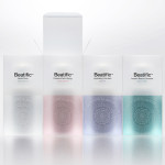
Beatific by Mousegraphics
Beatific is a new skincare range from Greek private medical service provider Hygeia Group “for women who are aware of the benefits of cosmeceuticals and can appreciate the results of thorough clinical research and high end care”. Created by Mousegraphics, the brand identity and packaging for Beatific takes the medical precision, exclusive care and expertise established by the Hygeia Group and a contemporary clinical experience...
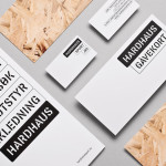
Hardhaus by Heydays
Hardhaus is a Norwegian specialist mountain sports retailer located in the alpine municipality of Sykkylven. Based around the concept of ‘technical durability’, Heydays developed a new brand identity solution for Hardhaus—which included a logo, stationery and website—that juxtaposes the utility of a heavy uppercase and stencil cut sans-serif—bold and ‘oversized’ in its execution in print—and the robust and hardy aesthetic of chipboard imagery, with...

Håndværk by Savvy
Håndværk is a New York based clothing brand that mixes craftmanship, minimal elegance, premium materials and innovative fabrics to produce high quality everyday essentials for both men and women. Designed by Savvy, Håndværk’s new brand identity—which includes a logo, swing tags and packaging solution with a blind emboss detail—conveys the brand’s elegant and elemental nature with what Savvy describe as clean lines and...

Mellbye by Heydays
Mellbye is a Norwegian architecture firm founded in 1954 with a “mindset anchored in modernism”. Design studio Heydays created a new brand identity for the firm based around a geometric M symbol built from the initials of their two main services, architecture and interiors. Executed as a combination of blind deboss and die cut detail across a earthy and urban...

Candela by RoAndCo
“Candela is a women’s footwear and ready-to-wear line created by Gabriela Perezutti. Influenced in part by her childhood spent on a horse ranch in Uruguay, the collection embodies Gabi’s soft femininity, adventurous gaucho spirit and South American roots. We [RoAndCo] conveyed this spirit throughout all iterations of the company’s branding—from business cards and lookbooks to art direction and campaigns—through elements...
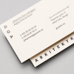
Goa Arkitektkontor by Heydays
Goa Arkitektkontor is an Oslo based architecture studio, established in 2012 by Johannes Ludvigsen Goa, that provides planning, regulation and architectural design services. The studio has a philosophy that sees restrictions such as economy, building regulations and social attitudes as opportunities, believes in simplicity and, a little unusually, is not afraid to be banal. These ideas are neatly resolved through...
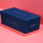
Oblique Paul Smith Edition by Graphical House
Graphical House and Derek Welsh Studio recently produced a special edition version of their distinctive domino set and collaborative project Oblique for Paul Smith. The dominoes, handcrafted in walnut using 45 processes, 8,400 hand drilled holes, 155m of walnut, 15m² of laminate, 75m² of 150 grit sandpaper, 20m² of 320 grit sandpaper and 18 hand files, come in a drawstring bag packed in...
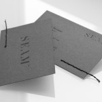
Seam by For Brands
Polish design agency For Brands were recently commissioned to create a new visual identity for Seam, a distributor of luxury clothing brands, that would convey a sense of craftsmanship and an eye for detail. For Brands mixes classic typographic detail with contemporary customisation delivered across tactile material choices with hand finished detail, fusing urban, craft and fashion sensibilities....
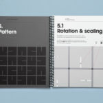
Cemento by S-T
Cemento is the UK distributor of an Italian lightweight concrete product that can be used for wall panelling and furniture. Inspired by brutalist design — a movement that grew out of early 20th century modernist architecture and described by Wikipedia as being “linear, fortresslike and blockish” — London based studio S-T developed a visual identity for Cemento that included logo, logotype, brand...
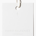
Minna Palmqvist by Bedow
Minna Palmqvist is described by Bedow, the studio behind her new visual identity as a “critical, Swedish fashion designer”. Following the completion of a masters degree at Stockholm’s Konstfack College of Arts in 2009 Minna launched her own label to further develop her ‘Intimately Social’ series, “an evolving constant challenging the traditional fashion seasons and exploring the obsession with the female body, by merging social...

Function Engineering by Sagmeister & Walsh
Function Engineering is described by Sagmeister & Walsh, the design studio behind their new brand identity, as specialising in “mechanical design and engineering for product development within, but not limited to consumer electronics, computing and networking, mobile, medical, robotics, entertainment, commercial and industrial equipment.” Narrowing in on Function’s expertise in designing hinge and linkage mechanisms, Sagmeister & Walsh designed a new...
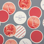
Ingierstrand Bad by Uniform
Ingierstrand Bad is a newly refurbished restaurant located on the shore of Norway’s Oslofjord that balances the area’s history as a 1930’s summer retreat with a contemporary dining experience. Oslo based design agency Uniform recently captured this juxtaposition of past and present through a new brand identity solution for the restaurant that mixes vintage photography, cream substrates, geometric forms, two inks...