Fonts in Use: Proxima Nova
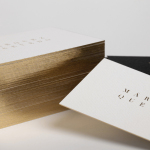
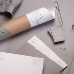
Marquez Quevedo by La Tortillería
Márquez Quevedo is a San Pedro based architectural practice that balances space, proportion, materials, form and colour to compose creative spaces filled with movement. Drawing on what is described as the practice’s sophisticated style and vision Mexican graphic design studio La Tortillería developed a new brand identity for Márquez Quevedo with a sense of space, structure and materiality, both in image and physical texture, that links business cards, stationery...
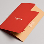
Skovin by Heydays
Skovin is Norwegian, high-end, solid wood floor specialist that combines ancient craftsmanship with modern technologies. By mixing a wood veneer business card and a traditional name drawn from the old word Skøyen, the area in Oslo where the company was founded, with geometric shapes and die cuts, panels of flat colour and sans-serif typography, Skovin’s identity, designed by Heydays, intends to...
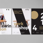
Carin Wilson by Studio Alexander
Carin Wilson is a renowned furniture maker, sculptor, design educator and leader of the New Zealand craft movement throughout the 1970s, 80s and 90s. As well as precisely crafted functional furniture, Carin also creates pieces that look to explore narrative through alternative form — check out his work Royal Pain in the Arse — and are influenced by his Maori heritage. Carin Wilson’s...
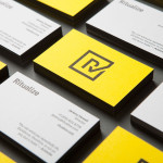
Ritualize by Shorthand
Ritualize is a cross-platform fitness and lifestyle app that utilises leaderboards, education, challenges and exercises to establish and track small habits that should lead to improved physical and mental health, and a sense of well-being over time. Shorthand, an independent brand identity and graphic design studio based in Newcastle, Australia, were recently commissioned to help bring the app to market. This included naming,...
Krohn by Commando Group
Krohn is a young but experienced Oslo based furniture, interior and architecture design studio that develops holistic solutions that strengthen and add value to businesses through interior environments. Krohn’s visual identity, website and stationery—created by visual communications agency Commando Group—captures the multi-disciplinary nature of the studio and juxtaposes bold architectural structure and simple interior spaces with fine, high quality detailing, through an abstract,...

Bricos by Anagrama
Bricos, originally named Mayoreo Electrico Monterry, is an electrical hardware store servicing the North East and Monterry regions of Mexico. As part of an expansion plan the company approached design agency Anagrama to create their new identity, packaging propositions and retail environments with the consistency expected from international customers....