Responsive Websites
Matheson Food Company by Wedge
If nostalgia is a powerful force, arguably ‘fauxstalgia’ – that sense of longing and yearning for something that we never actually experienced – is even more so. Fauxstalgia isn’t the same as trend cycles – the baffling realisation that Gen Z is suddenly, unironically, into Nu Metal, for instance – it’s an internal sensation rather than an external observation. It’s...
Frank Penny by Bedow
Frank Penny is a consultancy specialising in AML – anti-money laundering. Knowing next to nothing about financial matters, I had no idea such companies existed. But like pretty much any other business, to succeed and stand out against their competitors, at some point or another anti-AML consultants need to think about their brand identity. Stockholm studio Bedow was recently tasked...

Vineyard Theatre by NB Studio
Much like identity work for art galleries and publishing houses, master brand design for theatre is often neutral, leaving plenty of space for a programme of diverse productions and eclectic marketing images to ‘take the stage’. When everything is in constant flux, there are typically some constants: a straightforward, recognisable wordmark, a distinctive typographic personality, and a consistently tight grid...
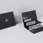
Sydney Design Festival by Re
Sydney Design Festival has been running for 20 years, making it one of the oldest design festivals in the world. It provides its visitors with an opportunity to understand design practice in all its forms, to bring to light problem, process and response, and to foster a closer connection with the designers and businesses helping to shape our collective futures. With a...
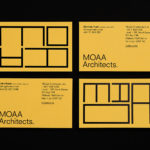
MOAA Architects by Inhouse
MOAA Architects was founded in 2010. It has an office in Hamilton, New Zealand, and a portfolio of new builds and renovations that span the residential, education, commercial and public sectors. Highlights include their work on St. Johns Church, a square plan rotated 9 degrees off the street grid, and Piako House, a renovation and extension of 1940s domestic planning to meet a 21st...

Roger Burkhard by Lundgren+Lindqvist
Roger Burkhard is a creative web development and interactive studio based in Bern, Switzerland, with a roster of clients throughout the creative industries. The studio worked with Scandinavian designers Lundgren+ Lindqvist on the development of a new brand identity. This included monogram, brand guidelines and website, as well as a stationery set that covered business card and promotional cards, letterhead,...

Printed by Somerset by Leo Burnett
Somerset is described as being Canada’s top printer, known for its precision, attention to detail and ability to pull off complex jobs. Alongside reproduction services, Somerset, a family-run business, also provides extensive print finishing services. Inspired by this, the stacked paper of the press, and with the intention of engaging a new generation of designers, Toronto based studio Leo Burnett developed a new brand identity...
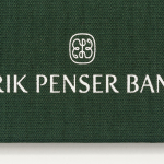
Erik Penser Bank Cookbook by Bedow
Erik Penser Bank provides its clients with independent financial advice and a high-level of personal service. While large banks do provide similar services, Erik Penser Bank is Sweden’s only dedicated private banking business. Professionalism, experience and an individualised service practice is expressed throughout the bank’s visual identity, created by Swedish studio Bedow, in the personable and less corporate association and aesthetic qualities of a new monogram. This then informs some...

Helbers by Only
Helbers is a Parisian menswear label created by Paul Helbers, the former Head of Menswear at Maison Margiela and ex-Menswear Director at Louis Vuitton. The label has a carefully curated lookbook of garments and footwear with an unpolished elegance, and feature a subtle contrast of materials. Helbers has secured early acclaim for his AW16 collection, and is due to appear in stores around the world in the coming weeks. Paul worked with Leeds-based...
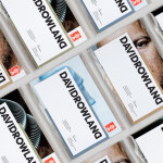
David Rowland by ico Design
David Rowland is an award-winning and straight-talking London-based photographer who has been capturing images for leading brands and agencies for over two decades. With a desire to remind existing and potential clients of his expertise and technical know-how David worked with graphic design studio and client ico Design to develop a new brand identity and supporting collateral. This included, alongside a new logotype, business...

Meg’s Tailoring by Studio South
Meg’s is a tailoring service, established by Megan Kenny, that began as a single store on Garfield Street in 1995. Meg’s now has two locations in Auckland, New Zealand, provides a broad range of services; from hems to full garment design, and works on large projects with high-end designers and labels such as Hugo Boss, Prada and Gucci, and on smaller jobs from High Street drop-ins....
Erik Penser Bank by Bedow
Erik Penser Bank provides its clients with independent financial advice and a high-level of personal service. While large banks do provide similar services, Erik Penser Bank is Sweden’s only dedicated private banking business. Professionalism, experience and an individualised service practice are expressed by the bank’s new brand identity, created by Stockholm-based graphic design studio Bedow, through the personable and less corporate qualities of a monogram, which...