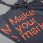
Here East by dn&co.
Here East is a 1.2 million sq ft commercial space developed by Delancey and housed within the former Olympic Press and Broadcast Centre near Hackney Wick in East London. Here East is described as an ecosystem looking to attract businesses from the design, technology and modern manufacturing sectors who are looking to scale, and those of scale looking to behave more creatively....
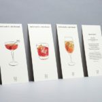
Merchants of Beverage by Manual
Merchants of Beverage is an online service that aims to make buying and gifting luxury items easy. Products include wines, spirits and Champagne’s, as well as hand-blown crystal stemware and professional barware. Each item has been handpicked and curated by a team of experts and sourced from a variety of international artisans. The service’s new brand identity, which included monogram, logotype,...
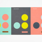
Coalition for Engaged Education by Blok
The Coalition for Engaged Education, formerly New Visions Foundation, is an LA based organisation, led by Dr Paul Cummins, that helps vulnerable children and young adults to realise their potential through an approach to education that respects and inspires them. CEE recently worked with design studio Blok to develop a new visual identity that would mark the organisation’s new national ambitions....
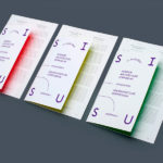
Interior Architecture Symposium by AKU
SISU was a symposium that took place in the summer of 2014 in the city of Tallinn. Organised by The Estonian Society of Interior Architects it was a place were recognised theoreticians and practitioners from Europe, Australia and Estonia met to discuss Dynamics of Theory and Practice within the field of interior architecture. The symposium’s identity, designed by AKU, leverages many...
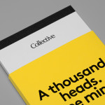
Collective by Hey
Collective is a new Istanbul based agency that is described loosely by Hey, the design studio behind its brand identity, as producing content, communication and design work. Its has an ideology, like the name suggests, based around a collaborative approach, developing projects with an extended network of people with a variety of skills. Hey recently created an visual identity treatment for...
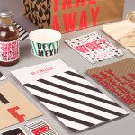
DF / Mexico by BuroCreative
DF / Mexico is the latest restaurant concept from the creators of Mexican market food experience Wahaca. Located on London’s Hanbury St. the restaurant combines an informal diner-style setting with Mexican fast-food and modern American influences. Its brand identity, a broad combination of print, signage, environmental graphics and website design by BuroCreative, is built around a simple mix of condensed type,...
Yksi elämä by Tsto
Yksi elämä is a Finnish project set-up with the intention of encouraging people to become more interested in their own well-being and to improve public health care on both a professional and organisational level, as well as society in general. The project is a collaborative endeavour between the Brain Association, Diabetes Association and Heart Association of Finland. Design studio Tsto were asked...
Ridley by RE:
Ridley is a pioneer of digital architectural services and operates as a central hub from which builders, developers and architects can collaborate. Originally established, and continuing to operate as an architectural documentation specialist, Ridley, from its premises in Australia and the Philippines, has also grown to become a leader in Virtual Design Construction. This is a practice that involves attaching live...
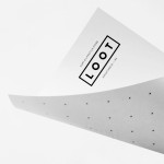
Loot by Savvy
Loot is a surf and lifestyle store retailing distinctive products for a modern and global consumer and offers an alternative to the more commercial items from retailers typically found in its touristic location in the Mexican city of Zihuatanejo. Loot’s brand identity, designed by Savvy, draws its character and distinction from Zihuatanejo’s past as a hotspot for pirates, and visualised as...
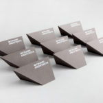
Mitsuori Architects by Hunt &Co.
Mitsuori Architects is an architectural design studio that creates high quality structures and spaces that merge aesthetic beauty with careful planning and thoughtful detailing. Their large scale project experience is combined with the flexibility of a smaller practice allowing them to provide big clients with a personalised service. Mitsuori’s visual identity, designed by Melbourne based Hunt & Co. and informed by a name that translates from Japanese as...
SSU by Snask
The Swedish Social Democratic Youth League, abbreviated to SSU, is a branch of the Swedish Social Democratic Party, associated with the Swedish Trade Union Confederation, and one of the largest youth leagues in the country with a membership of over 10,000. In response to an upcoming general election, which took place on September 14th, the SSU looked to readdress its visual identity which had...
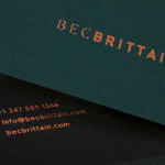
Bec Brittain by Lotta Nieminen
Bec Brittain is a New York based lighting and product designer who is driven by a “love for luxurious materials, intuitive forms and forward-thinking technology.” Working with her small team from a studio in Brooklyn, Bec Brittain creates products that explore and experiment with new production techniques and materials that push the boundaries of American-made centrepiece lighting design. Each piece is created and inspected by Bec and produced using a...