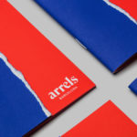
Arrels by Hey
Arrels (roots in English) is a Spanish shoe brand, established by cousins, friends and partners Javier & Pepe Llaudet, and inspired by the Mediterranean, its traditions, rhythm, colour and creative atmosphere. Javier & Pepe also draw on the city of Barcelona (the place they want to be), the countryside (where they are from), and their passion for music. These inspirations make their way into Arrels’ new brand identity,...
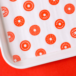
Bronuts by One Plus One Design
Bronuts sells handmade donuts and freshly brewed coffee to the local community of the Exchange District in Winnipeg, Canada, and, as the name suggests, is run by two brothers. Bronuts’ location draws a variety of customers, from young professionals and corporate offices to college students. It has a warm interior of light wood, white tiles, exposed architectural surfaces and low-hanging bulbs. Much like its interior, Bronuts’ brand identity,...
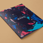
The Hugo by Studio Brave
The Hugo is a new residential property development, made up of 23 apartments, located in the Melbourne suburb of Foostcray. It is a hi-tech building with a distinctive perforated façade, and a design that leverages natural light and air flow. Its apartments were designed to be flexible and secure, with a particular focus on livability, functionality and beauty, and feature interiors...
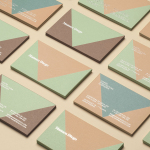
Mamen Diego by Atipo
Spanish graphic design company Atipo recently worked with Madrid based architecture and interior design studio Mamen Diego to create a new brand identity treatment that would extend across and unite a variety of print and digital assets. These included business cards, stationery, brochure and website. Although there is not much information about the philosophies or positioning of Mamen Diego—their new website is yet to launch...
Johnny Roxburgh by Bunch
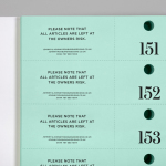
Johnny Roxburgh is an entertainer and party designer working with the rich and famous nationally and internationally. He has over thirty years of experience and has held a royal warrant for the last nine. In the words of The Scotsman, Johnny is capable of turning the whims and fancies of the world’s wealthiest one percent into glittering realities. These have included, but are certainly not limited...
Bottura by Foreign Policy
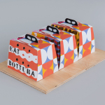
Bottura is an Italian restaurant and food store with space in Singapore’s Suntec City Mall. It has a contemporary interior of exposed utilities painted black, white suspended ceiling and surfaces, dark wood and steel furniture, glass, concrete and steel counters, warm spot and low-hanging lights and an open kitchen working from authentic family recipes rooted in the owner’s hometown of Bologna. This interior is punctuated...
The Hyundai Department Store by Studio fnt
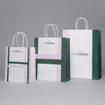
The Hyundai is a well-known, well-thought-of and well-established South Korean department store that this year will celebrate its 44th anniversary. To coincide with this, The Hyundai launched a new brand identity system developed by Seoul graphic design company Studio fnt. This builds on the logotype and colour palette created by New York’s Base Design earlier in 2015, and introduces a Korean logotype, patterns,...
Park Restaurant & Distillery by Glasfurd & Walker
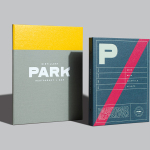
Park is a bar, restaurant and distillery located in the Canadian resort town of Banff, within the Banff National Park, and the province of Alberta. It is a region of diverse natural beauty which includes mountains, prairies, forests and desert badlands, and that attracts walkers, campers and skiers locally and internationally. The restaurant is a celebration of Banff’s alpine history and lifestyle. This runs...
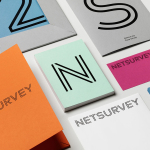
Netsurvey by The Studio
Netsurvey provides organisations with employee and customer relation evaluation services using a precise, individualised and proprietary set of tools, and then helps to implement change with the intention of enhancing employee engagement, strengthening leadership and improving employer branding. Netsurvey works across a variety of sectors, for both small and large businesses and has grown to become one of Sweden’s leading consultants within...
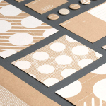
Studio Una by Studio Una
Studio Una is graphic design business, run by Sebastian Hager and Sebastian König, with an office in the German city of Hamburg. The duo works within the fields of visual communication and brand identity design, online and in print, and describe themselves as attaching great importance to the aesthetic effect of design, alongside strong concepts and strategic decisions. This positioning is conveyed...
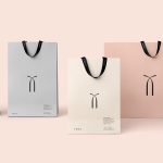
Twice Fashion by Socio Design
Twice Fashion is a Chinese luxury accessory brand established by Tina Tian and Dr Mirko Wormuth in 2007. Since then it has grown to become one of the country’s top accessory brands, with stores in Beijing, Tianjing and Chongqing. Twice Fashion is described by SocioDesign, the London based graphic design studio behind its rebrand, as having helped shaped China’s ‘fast’ fashion industry....
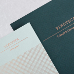
Vinoteca by dn&co
Vinoteca is a group of London based restaurants, founded by business partners and friends Brett Woonton and Charlie Young, that were inspired by the wine bars of Spain and Italy. Aside from the restaurant experience, and as a testament to the quality of their wine list, these restaurants also operate as local wine retailers. dn&co. were commissioned to refresh and formalise Vinoteca’s brand identity. With...