Serif Logotypes
Dark Arts Coffee by NOT Wieden+Kennedy
If a brand that fuses memes, hot takes, occultism, and coffee is going to succeed anywhere, it’s probably in east London. Dark Arts Coffee started out in 2014 in a Homerton railway arch, and managed to corner that distinct subgenre of goth/metal/biker-ish aesthetics which opts for craft ale over snakebite; Hackney over Camden; self-care over self-destruction. Where the old guard,...
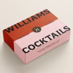
Williams Cocktails by Offff
In the last five years, canned cocktails have become ubiquitous, with offerings from MOTH: (packaging by Pentagram) and Whitebox (cans created in-house) among the strongest designs competing on the shelves of off-licenses, delis and bottle shops. Convenience and a post-pandemic demand for ‘on-the-go’ experiences have helped drive this trend, with Mintel data demonstrating that sales of spirit-based ready-to-drink beverages increased...
Imperia by Landor
As well as being a coastal city in south west Italy (formed in 1923 by none other than Benito Mussolini), Imperia is a pasta machine company that was formed from a ‘little artisan workshop’ in 1932. Imperia soon began to distribute pasta machines around the world; mainly catering to the US’ large Italian community. From its plant in Sant’Ambrogio, Turin,...
Tessas Eplegård by Olssøn Barbieri
One of the many brilliant things about the world of branding is that to work in it, write about it, or just take an interest in it forces you to learn something about pretty much everything. Maybe that’s how LEGO might actually be a better investment than gold; or that Murray’s Parmigiano Reggiano cheese pairs well with a nice New...
Frank Penny by Bedow
Frank Penny is a consultancy specialising in AML – anti-money laundering. Knowing next to nothing about financial matters, I had no idea such companies existed. But like pretty much any other business, to succeed and stand out against their competitors, at some point or another anti-AML consultants need to think about their brand identity. Stockholm studio Bedow was recently tasked...

Murray’s Cheese by Base Design
The ‘shoppy shop’ trend shows no sign of abating. For those not in the know, the term – popularised by New York Magazine’s Grub Street – indicates those small-to-medium businesses selling upmarket ‘provisions’ (charcuterie, legumes, sauces, tinned goods) with a veneer of heritage, authenticity, and (seemingly) innovative ingredients, as if they were the modern ‘general stores’ of olden days. On...
Blue Mountains by For The People
The Blue Mountains of New South Wales, Australia are not technically mountains at all. They are, rather, a complex labyrinth of dissected plateaus, gorges and valleys of sandstone, formed over 50 million years ago. So far, so deceptive. Fortunately, however, the Blue Mountains are most definitely blue. When the atmospheric temperature of the region rises, a superfine mist of fragrant...

TWYG by Seachange
At some point over the past half decade or so, someone somewhere decided that vowels were profoundly uncool: see Anthropologie’s wedding line BHLDN; “virtual sneaker” brand [what?!] and Nike acquisition RTFK; Blndr (yes, it’s a blender) and the likes of Tumblr, Pixlr, and Flickr, which dared to sneak in just the one. Reading such words feels a bit like learning...
New York Botanical Garden by Wolff Olins
It must be something of a dream project when an agency gets commissioned to work on those big-name cultural clients – museums, art galleries, orchestras, theatre companies, et al. You’d expect such projects to be a departure from the constraints and stakeholder-limitations of corporate clients; and perhaps a chance to be more creative than usual, thanks to the nature of...
Kettle Kids by Two Times Elliott
The once laudable claim to have started a thriving business with ‘a small loan’ from a doting family member may have been muddied beyond recognition by the truth-stretching of serial tax-offender and part-time Presidential candidate Donald Trump. Despite this, turning ‘one thousand pounds from nan’ into a luxury watch and diamond dealership with a sparkling flagship store in Mayfair remains...
Wype by Among Equals
London-based creative agency Among Equals recently worked with ‘below-the-waist wellness company’ Wype on its brand identity and art direction, aiming to help the company build a new brand that would set it up for its next phase of growth. Wype is a gel that was designed to ‘turn any toilet paper into an eco-friendly wet wipe, all at the squeeze...
FitzJohn’s by DutchScot
When my partner and I first moved to London in 2014, surviving on scarcely more than minimum wage, it obviously seemed like a sensible idea to rent in Hampstead. We’d heard of the Heath, and were familiar with the Northern Line. The flat, apparently once a Sex Pistols’ squat, was tiny and hadn’t improved much since the 70s. Back then...