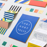
Torikorttelit by Kokoro & Moi
Torikorttelit is the old town district of Finland’s capital Helsinki. Its new visual identity, designed by Kokoro & Moi and based around bright colours, simple geometric patterns, a stacked typographic serif logo framed by a circle and paired with a modernist inspired secondary typeface neatly reflects the historic setting at the heart of a modern metropolis....
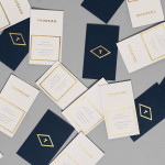
Tourean by Anagrama
Tourean is a British multinational venture capital firm that manages a variety of lifestyle subsidiaries within the music, design, events, social media and fashion industries. Their new visual identity, developed by design agency Anagrama and drawing inspiration from the Tourean name – a compounding of the words taurean and tour created to convey the values of strength, fortitude, courage and integrity as well as...
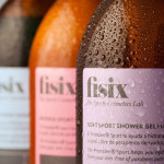
Fisix by Mucho
Fisix is a line of cosmetic products that includes shower gels, shampoos and hydrating skin balms, developed by four marathon running friends who ‘couldn’t find a range that met their needs as sportsmen’, branded and packaged by multidisciplinary design agency Mucho....
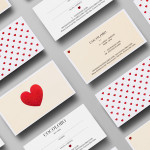
Cocolobo by Anagrama
Cocolobo is described by Anagrama – the multidisciplinary design agency behind their new visual identity – as a ‘high-end shopping boutique that caters exclusively to strong women with a confident and in vogue fashion sense’. For the name, Anagrama played with the patrons’ ‘characteristic duality’, with a ‘catchy and fun’ compounding of “Coco” (coconut in Spanish) and “lobo” (Spanish for...
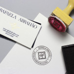
Rafaela Abrahão by BR/Bauen
Brazilian fashion blogger Rafaela Abrahao recently commissioned design agency BR/Bauen to develop a new visual identity that would extend across her website and stationery. Drawing on Rafaela’s favourite brands, Prada, Versace and Hermes, and an interest in English nobility for inspiration, BR/Bauen developed a solution that unites the fine illustrative detail and typographical flourish of a blackletter monogram executed with a contemporary and consistent...
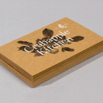
Crabapple Kitchen by Swear Words
Located on Hawthorn’s Glenferrie Road, Victoria, Crabapple Kitchen is a ‘high-end café/wine bar’ with an ever-changing menu of simple, rustic and seasonal Italian, French and Spanish cuisine created from local produce and served in a ‘homely and light-hearted environment’ – derived from the French and Italian countryside – made up of ‘beautiful fabrics, French pantries, hanging copper pots, comfy banquettes and...
NB Flowers by Karoshi
NB Flowers is a florist – founded by Neil Birks and located at London’s New Covent Garden Market – that specialises in corporate and private events, delivering value through a combination of ‘beautiful flowers, creativity, and a personable service’. Multi-disciplinary design agency Karoshi were commissioned to ‘rebrand and reposition NB Flowers as one of London’s leading luxury event florists and capture the essence of the...
The Beaufort by The Company You Keep
Design agency The Company You Keep (TCYK) have recently finished working with bartender Dave Kerr on the naming, branding, collateral design and signage for The Beaufort, a themed dive bar located on Melbourne’s Rathdowne St. The agency’s visual identity solution, a combination of a quirky, well rendered, bespoke logo-type – built from unusual but original uppercase characters inspired by iron dock...
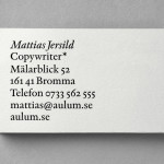
Mattias Jersild by BVD
Of all BVD’s recent projects, which includes their packaging for 7-Eleven – a blog favourite this and last week -, it is their work for Swedish copywriter Mattias Jersild that really stood out for me. It is an incredibly simple but wonderfully laid out, spaced and restrained solution that introduces variety through an interesting mix of lowercase, sentence case and uppercase typography set...
Iannilli by Savvy
Iannilli is a traditional Italian restaurant located in the Mexican city of Monterrey. Its visual identity, recently revised by design studio Savvy, contrasts classic and contemporary design cues to satisfy an established clientele – expecting traditional food and service – while also appealing to a younger generation....
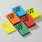
GR Communications by Ascend
GR Communications is a London based PR agency that is described as being made-up of a ‘close knit group of progressive and forward thinking experts’. Their visual identity, designed by independent brand, graphic and web design agency Ascend, captures the idea of unity, communication and creativity through a simple ligature detail, single quotation marks and a diverse, vibrant but complementary...
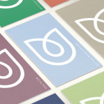
Naturepaint by B&B Studio
Naturepaint is a British brand of ‘earth-friendly’ powdered wall paint formulated from biodegradable, non-toxic, sustainable and locally sourced ingredients. London based studio B&B recently created a new visual identity and packaging solution for the brand which replaces the saturated visual cues of the original with a distinctive duality and contrast of contemporary form and classic type that better reflects the high quality and...