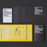
The Franklin Boutique Hotel by Band
The Franklin Boutique Hotel provides seven room accommodation at the heart of the city of Adelaide. Rooms feature interior detail such as white tiles, exposed utilities, chipboard panels, high quality finishes and original artwork from local artists, as well as modern conveniences that include en suite bathrooms, Nespresso machine, ipod dock radios, refrigerators and irons. Following a successful reinvention of the attached pub,...

Hotel Cycle by UMA
U2 is a cyclist-friendly retail and hospitality destination, located in the Japanese city of Onomichi, made up of shops, bakeries, restaurants and hotels. Design studio UMA were recently commissioned to develop a visual identity for U2’s Hotel Cycle as part of a larger brand identity project that covered a variety of spaces, packaging and signage within the complex. UMA’S brand identity solution...
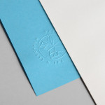
Papillon Blu by Sciencewerk
Papillon Blu is a privately owned spa and wellness centre located at the heart of Indonesia’s Surabaya City. Independent design studio Sciencewerk recently worked with the spa to develop a new brand identity, which included a logomark, logotype, print, environmental signage and website, based around the name blue butterfly....
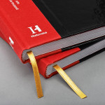
The Swedish History Museum by Bold
The Swedish History Museum is one of the country’s largest museums with a collection of over 10 million objects from a history that spans thousands of years. The museum also functions as a venue for lectures, concerts and a variety of activities. Stockholm-based design studio Bold were recently commissioned to develop a new brand identity for the museum that would...
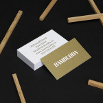
Bambudda by Post Projects
Bambudda is a contemporary Chinese restaurant, located in Vancouver’s Gastown district, with a menu that mixes Hong Kong and southern Chinese cuisine with a modern interpretation of Dim Sung. Design agency Post Projects recently developed a brand identity for the restaurant—which included a logo, menus, stationery and website design—based around a simple but unexpected logotype set in Timonium....
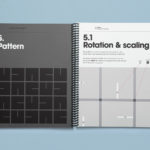
Cemento by S-T
Cemento is the UK distributor of an Italian lightweight concrete product that can be used for wall panelling and furniture. Inspired by brutalist design — a movement that grew out of early 20th century modernist architecture and described by Wikipedia as being “linear, fortresslike and blockish” — London based studio S-T developed a visual identity for Cemento that included logo, logotype, brand...
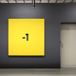
Pikseli by Werklig
Originally built in the 1980’s by wireless pioneer Digita Oy, Pikseli is a building, located in the Vallila district of Finland’s capital city Helsinki, that provides office space to companies working within the digital industries. Design agency Werklig, commissioned to develop a new visual identity for Pikseli to attract new tenants, created a solution that takes the tiny universal screen unit of a pixel and...
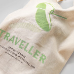
Traveller Espresso Bar by TCYK
Traveller is the Melbourne based espresso bar of speciality coffee roaster and cafe operator Seven Seeds. Design agency The Company You Keep (TCYK) recently worked with Seven Seeds to develop a new visual identity solution for the Traveller that reflects an interior architecture of details such as ‘moulded plywood, vinyl and soft curves’ inspired by ‘the golden age of caravanning’, through period typography,...

Meteorologisk Institutt by Neue
Meteorologisk Institutt provides meteorological data to Norway’s military, civil services and the general public with the intention of safe guarding life, property and the environment. Design agency Neue developed a new visual identity solution for the institute that mixes geometric shapes, material and print choices and the humanistic and environmental detail of photography to achieve communicative and aesthetic contrast and capture the data drawn from...
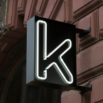
Kontoret by Werklig
Created by consultant Ray Lindberg with the intention of setting new standards for flexible work environments, Kontoret provides low-cost office space by the hour, with wireless internet, printers and coffee, to freelancers, chief executives, local businesses and international travellers in the centre of Helsinki. Inspired by the “essence and basic needs of office work and the aesthetics of the classic office...
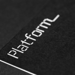
Platform by Pentagram
Platform is a not-for-profit organisation that aims to “increase the interest and participation of underrepresented groups in the fields of technology and entrepreneurship, with a particular focus on African-Americans, Latinos and women” and “to help influence and inspire the next generation of innovators, inventors and entrepreneurs” through its website, conferences and providing “access to current leaders and role models”. Platform’s visual identity, designed...
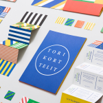
Torikorttelit by Kokoro & Moi
Torikorttelit is the old town district of Finland’s capital Helsinki. Its new visual identity, designed by Kokoro & Moi and based around bright colours, simple geometric patterns, a stacked typographic serif logo framed by a circle and paired with a modernist inspired secondary typeface neatly reflects the historic setting at the heart of a modern metropolis....