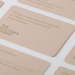
The Doctor’s Studio by A Friend Of Mine
The Doctor’s Studio provides non-invasive dermatological treatments and skin care procedures from its clinic in the Australian city of Melbourne. It has a philosophy that avoids feeding on insecurities and intends to facilitate positive change and foster a sense of well-being. The Doctor’s Studio worked with graphic design studio A Friend Of Mine to develop an interior and brand identity concept that would avoid the negative...

Torafuku by Brief
Torafuku has a simple yet adventurous menu that reinterprets pan asian flavours as modern shared dishes. These are made from good quality and locally sourced ingredients, which are complimented by a variety of contemporary cocktails, a carefully curated wine list and local craft beers. Torafuku is located on the border of Vancouver‘s historic Chinatown and features an open and reductive urban interior space of leather upholstered benches, light...
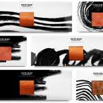
Springs’ Smokery by Distil Studio
Springs’ Smokery has been producing high quality smoked salmon for three generations from its location in South Downs, UK, using Sussex oak and a traditional dry-salting process which has remained unchanged for 50 years. Springs’ recently worked with graphic design studio Distil to develop a new visual identity and package design. Distil’s treatment is an exercise in aesthetic impact derived from colour...
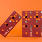
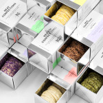
Fedrigoni Sirio Color by Design Project
Leeds based studio Design Project were commissioned by Fedrigoni, one of Europe’s leading paper manufacturers, to develop a material sample solution that would help them to promote their flagship paper brand ‘Sirio Color’ within the UK market. With the intention of allowing customers to experience the tactile characteristics and diverse colour palette of the range first-hand, Design Project developed a flat-pack...
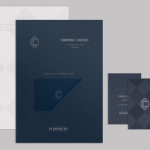
CC Bar by Freytag Anderson
Glasgow based design studio Freytag Anderson recently worked with Fraher Architects to develop the brand identity and collateral for Champagne & Cocktails at the Hilton Hotel, 22 Park Lane, London. Based around a monogram, midnight blue colour palette, hand crafted finishes of wood cut and etched glass detail, and both visual and material texture, Freytag Anderson delivered what they describe as a luxurious and old-world aesthetic that is...
Neat Confections by Anagrama
Neat Confections is a San Pedro-based pastry shop creating handmade biscuits and cakes using organic spices and fruits, are absent decoration and specifically developed as a wine or tea accompaniment. Neat Confectionery’s brand identity and packaging solution, designed by Anagrama, draws its inspiration from the theme of perfection and craft, which is then visualised through what the studio describe as a “pureness” of their...
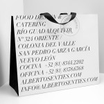
Alberto Senties Catering by Anagrama
Alberto Senties Catering is a Mexican ‘food experience’ company established by chef Alberto Sentíes that designs and prepares large and small banquet menus, offers cooking classes, provides bar tending, equipment rental and consultation services, and has built up a reputation for culinary excellence over its ten years of business. Design studio Anagrama recently worked with Alberto Senties to develop a new brand identity, which went on to...
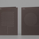
Coma by Mucho
Coma is an independent analysis, strategy and executive coaching business located in Spain. It provides support to individuals, businesses and institutions with the aim of fostering talent and leadership. Coma’s philosophy is focused on forward momentum and progress. This philosophy is expressed by the firm’s new brand identity, developed by global design studio Mucho, through illustrative paths that finish on a comma. These link...
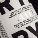
Kyrö Distillery Company by Werklig
Kyrö is a Finnish distillery, housed in a former dairy in the region of Isokyrö, that will yield a high quality 100% rye whisky in 2017 for national and international markets and currently batch produces a root variety for cocktails. Design studio Werklig was hired by the distillery to create their brand identity, which went on to include a logotype and custom typeface,...
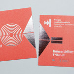
Norwegian Academy of Music by Neue
Located in the Majorstuen district of Oslo The Norwegian Academy of Music is Norway’s largest music academy. It offers both undergraduate and post-graduate courses, has educated some of Norway’s most prolific musicians, and, according to Wikipedia, ‘attempts to lay the foundation for research within the various fields of music’. Based around the concept of an ‘endless visual pulse’, design agency Neue developed a new generative...
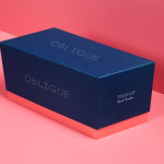
Oblique Paul Smith Edition by Graphical House
Graphical House and Derek Welsh Studio recently produced a special edition version of their distinctive domino set and collaborative project Oblique for Paul Smith. The dominoes, handcrafted in walnut using 45 processes, 8,400 hand drilled holes, 155m of walnut, 15m² of laminate, 75m² of 150 grit sandpaper, 20m² of 320 grit sandpaper and 18 hand files, come in a drawstring bag packed in...