Snack Packaging Design
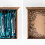
Biggans Böcklingpastej by Bedow
Böcklingpastej is a smoked herring fish paste from Biggans, a small family owned company creating products for the Swedish market since 1952. The company recently worked with Stockholm-based graphic design studio Bedow, who had previously helped them with the packaging for their range of sauces, to develop product packaging and POS for Böcklingpastej. This replaces a heavily branded logo-centric design with one of...
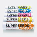
Superseeds by B&B Studio
Superseeds is a range of flavoured seeds available in five varieties, all of which are 100% organic, gluten and dairy free. These include Chili Smoke, Maca Caramel and Japanese Tamari. It is the first product from UK health food business Punch Foods, which looks to balance artisanal practice with optimal nutrition and punchy flavour. Taking their inspirations from the origins of each variety, and the...
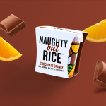
Naughty But Rice by Robot Food
Naughty But Rice is a rice pudding range created by The Hain Daniels Group in response to an increase in the dessert’s popularity in the United Kingdom. Unlike the product’s of established and mainstream brands, Naughty But Rice, as the name suggests, offers consumers a modern and indulgent twist on the traditional favourite, with flavours that include Coconut & Raspberry, Salted Caramel and Chocolate...
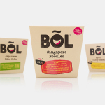
BOL by B&B Studio
BOL is a range of vegetable pots made from fresh natural ingredients using recipes inspired by local chefs and street market stalls from a variety of international destinations, packed and presented with a modern on-the-go convenience in mind. BOL was created by Paul Brown, the former general manager of Innocent’s food division, following the company’s exit from the category, and features...
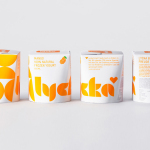
Lycka by BVD
Lycka is a 100% natural hand filled frozen yoghurt brand from Germany that donates 11 cents from each sale to Welthungerhilfe, a humanitarian aid project tackling issues such as world hunger, land grabbing in Cambodia and displacement across Syria and Iraq, amongst many other issues. Lycka’s brand identity and packaging, a mix of bright geometric forms which appears to draw some of...
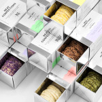
Neat Confections by Anagrama
Neat Confections is a San Pedro-based pastry shop creating handmade biscuits and cakes using organic spices and fruits, are absent decoration and specifically developed as a wine or tea accompaniment. Neat Confectionery’s brand identity and packaging solution, designed by Anagrama, draws its inspiration from the theme of perfection and craft, which is then visualised through what the studio describe as a “pureness” of their...
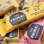
The Primal Kitchen by Midday
The Primal Kitchen is a UK based health food brand founded by nutritionist Suzie Walker with the intention of making the paleo lifestyle, a modern nutritional plan based on the presumed diet of Paleolithic humans, easier and more accessible. The Primal Kitchen commissioned design studio Midday to create a visual identity for the brand which would extend across the packaging for its cold pressed...
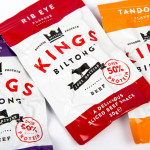
Kings Biltong by Robot Food
Capitalising on the increasing demand for healthy protein-rich snacks and sports supplements Kings Biltong, a business established by three former England rugby professionals, have launched a three flavour, cured and sliced, grass-fed British-beef range that offers athletes an “alternative to chalky protein bars and other supplement snacks that miss the mark in terms of both taste and quality perceptions.” Designed...
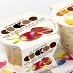
Cuckoo Muesli by B&B Studio
Cuckoo is a ‘modern’ wheat-free bircher muesli range that blends oats, yoghurt and fruit. Individual flavours include ‘Choco Sour Cherry with a smooth layer of Madagascan Vanilla’, Mango & Coconut with a tropical twist of Lime and Ginger’ and ‘Elderflower & Cranberry with a Blueberry & Blackcurrant compote’. London-based design agency B&B Studio, inspired by Swiss graphic posters, developed a new...
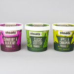
Stoats Porridge by Robot Food
Stoats is a Scottish oats company that began life in 2005 as a converted American hot dog sales stand serving porridge at summer music festivals around the UK, and now has a range of packed, ready to eat retail products that include flavoured porridge and porridge bars. Stoats recently commissioned Leeds-based independent design studio Robot Food, as part of a complete rebranding exercise,...

Popchips by Marx
Popchips is a four flavour range of potato chips from Ping which have been popped—much like popcorn—rather than backed or fried to create a healthier snack. New Zealand-based Marx Design were responsible for developing a new mascot for Ping that could work across multiple products in the snack food category and a packaging solution for the Popchips brand that would “avoid the clichés...