Technology Logos
Fello by Bold Scandinavia
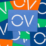
When it comes to brand design, of all the sectors, mobile networks seem to play it pretty safe: functional, practical, all in all, pretty dry – or at the very least, unadventurous. Some are better than others, of course: I for one think that Giff Gaff’s wordmark is actually alright – I’m far from opposed to the quirk in joining...
Blueberry by Studio NARI
“Mind. Blown”, as someone in Gen Alpha might have said a long time ago, maybe while performing some flossing at a velocity so rapid as to be barely perceptible to the naked Millennial eye. But they probably wouldn’t say that any more, such is the rapacious speed at which all things ‘young person’ change. Gen Alpha inhabits a world so...
Compound by DesignStudio
What does ‘healthcare’ look like today, especially when we’re increasingly talking about preventative treatment? For Parsley Health and GlycanAge, which promote functional medicine, it’s serene – all blush pink, forest green and rounded corners; for Modern Age, which focuses on longevity, it’s more clinical, with high-resolution botanical imagery and classical icons; Ezra, which offers full-body MRIs as cancer prevention, goes...
Mr Yum by Re Design
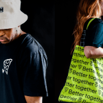
Sometimes a project comes along that doesn’t just make you think about how nice its typography is, or ponder if millennial pink is making a comeback (or indeed,, if it ever went away), or why suddenly a branded bucket hat seems to be a key facet of any company/product/concept’s ‘swag’. Sometimes, it makes you think about what ‘branding’ even means,...
Hages by The Studio
Hages began selling shortwave radios in Stockholm during the 1940s and is one of the oldest of its kind in Sweden. While the retailing of electronic goods has changed dramatically, sold increasingly online and on price by large chains, Hages has remained true to an independent spirit and established and developed a solid reputation. To coincide with the opening of their second store,...
Holvi by Werklig, Finland
Holvi is a digital bank account created for entrepreneurs and micro-businesses with the intention of making banking, paperless bookkeeping and invoicing simpler and more efficient. Holvi is positioned as more than just a digital bank account, and comes with a plethora of integrated features. These include the seamless syncing of information between different systems, sending invoices in a few clicks, a...
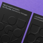
Loupedeck by Bond
Loupedeck is a Finnish startup and photo editing console designed to make the process of image manipulation faster in Adobe Lightroom for both Windows and Mac users. It is described as being an intuitive replacement for keyboard and mouse, is mapped exactly to Lightroom to encourage creative spontaneity and experimentation, and suited to beginners and professionals alike. To help establish and...
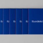
Bundlelist by Bunch
Bundlelist is an online platform that simplifies and draws together international mobile bundle costs, with a specific focus on mobile retail data, and facilitates comparisons between countries and mobile operators. Design studio Bunch worked to develop UX, UI and visual identity for the platform, which included logotype and a bundle of promotional notebooks....
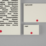
Capt by Bunch
Capt is a San Francisco-based start-up that connects creators wanting to monetize their videos with brands looking for new content and talent. The platform is made up of an app that allows creators to shoot, upload and license their videos, and a website that acts as a market place for buyers. This website also serves as a place to connect creatives with those...
OpenView by Pentagram
OpenView is a Boston-based business dedicated to investing in and helping to grow what are described as expansion-stage companies that are working in the software development sector. OpenView has a unique hands-on approach, and worked with Pentagram’s Natasha Jen to express this through positioning, tone of voice and visual identity design. This included custom typography, stationery, business cards, website and...
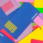
Freewheel by Collins
Freewheel is a dedicated Wi-Fi only mobile phone service launched by American cable television company Cablevision. Freewheel allows people to break free from contracts by providing unrivalled communications accessibility without large and expensive data plans and hidden fees. This is made possible by a network of over a million Wi-Fi hotspots. Freewheel’s egalitarian intention and connectivity is effectively expressed by its visual identity, created by New York based studio...
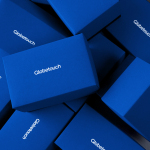
Globetouch by Bunch
Globetouch is a UK communications business and platform owned by operators and providing a wide range of mobile devices with access to a global and cloud-based ecosystem through an extensive network of offices and data centres. This extensive network and global reach is expressed throughout Globetouch’s brand identity, created by Bunch, using a modern pared-down colour palette inspired by migratory birds, a G that matches...