Playground by Character
Playground is an American venture fund and start-up studio that takes a hands-on approach to mentoring the next generation of entrepreneurs. It was established with the intention of removing typical operational burdens associated with product development, drawing on the first-hand experiences of its four founders, freeing entrepreneurs to focus on what makes their idea great. Playground not only funds new ventures but offers...
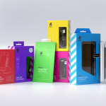
uBear by Hype Type Studio & Mash Creative
uBear is a high-end mobile phone, tablet and laptop accessories business located in Los Angeles, California. Their visual identity, developed by Hype Type Studio and Mash Creative, included a new logo, stationery set, packaging and responsive website. By utilising the bold graphic detail of diagonal stripes, sans-serif type, a bright and diverse colour palette, fine diagrammatic illustration, foils and varnishes and a simple bear...
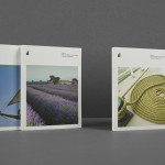
Raiffeisen Rechenzentrum by Moodley
The Raiffeisen Rechenzentrum is a customised IT infrastructure service provider and subsidiary of Raiffeisen Landesbank with a modern, ‘high availability’ and maximum security data centre located in Austria. Design agency Moodley recently developed RRZ’s brand identity—which included a logo, business cards, brochure and website—based around a single sans-serif, a contrast of humanistic and technological imagery and a white, black and bright...
Metronet by Work In Progress
Metronet is an Oslo-based consultancy that provides strategic SEO, PPC, e-commerce, social media, web analytic, design and development services to a wide range of international clients. The consultancy’s visual identity, developed by Work In Progress, mixes the established technological conventions of simple geometric forms, fine line weights, grids and a mono-spaced typeface with abstract interior artwork and a retrospective undertone to convey digital networks,...
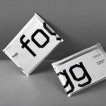
Fogg by Bunch & Kurppa Hosk
By purchasing overcapacity from international telecom networks, Fogg Mobile provides a fixed cost mobile data traffic service for people who want to avoid unexpected roaming bills when travelling abroad. Through the animate and evolving qualities of computer generated imagery and a combination of unbleached paper, stitching, flat coated colour and silver polypropylene, Fogg’s visual identity, created by Kurppa Hosk and developed by Bunch, delivers...
ITI Computers and Diventa by Bunch
ITI Computers is a Croatian-based software company that specialises in the development of IT solutions for the leisure, tourism and hospitality sectors. Bound by a consistent typographic and monogrammatic design solution but divided by an organic and systematic contrast of context, creative agency Bunch developed a new logo and print solution for ITI and its leading management product Diventa, which delivers an interesting richness...