The Best Logo Designs of 2015
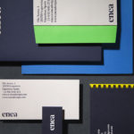
Enea by Clase bcn
Enea is a contemporary furniture manufacturer, located in Spain’s Basque Country, collaborating with respected designers such as Josep Lluscá, Gabriel Teixidó and the trio Lievore Alhterr Molina. Enea has a distinctive catalogue of versatile, comfortable and durable products, developed for both the private and commercial markets, with unique character in their play with form, colour and texture. With a desire to differentiate...
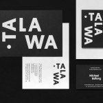
Talawa by Spy
Talawa, Jamaican patois for “small but feisty”, is an all black theatre company that looked to address the lack of opportunities for minorities and their marginalisation at the time of its founding in 1986. Since then it has established itself as one of the most successful theatres of its type in the United Kingdom. “Our work is informed by the wealth...
Bord 13 by Snask
Bord 13 is a restaurant, located on Malmö’s Engelbrektsgatan, with a menu that steers clear of the overfished, the modified and unnatural. It is a collaboration between chefs Robert Jacobson and Besnik Gashi, a former Souschef and a Head Sommelier from world-renowned Noma, and features a brand identity and interior design by Scandinavian studio Snask. This extended to material, lighting and furniture...
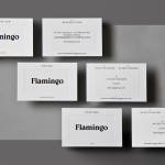
Flamingo by Bibliothèque
Flamingo is an insight and strategy consultancy, founded by Kirsty Fuller and Maggie Collier in 1997, that works with businesses, and at the intersection of people, culture and brands, to help enrich lives by shaping culture and evolving behaviours. The consultancy is described as a group and not just a network, collaborating and sharing across its seven offices throughout Europe, Asia, India and South America....
Helsinki Philharmonic Orchestra by Bond
Helsinki Philharmonic Orchestra is a 102 strong ensemble, currently led by chief conductor John Storgårds, with its primary venue being the Helsinki Music Centre. It has a significant history, beginning as the Helsinki Orchestral Society in 1882 and acquiring its current name following a merger with the Helsinki Symphony Orchestra in 1914. In 2016 the orchestra will have its first female chief conductor following...
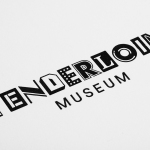
Tenderloin Museum by Mucho
The Tenderloin Museum tells the story of, and celebrates, the people and rich history of the Tenderloin district, a 31 block region of San Francisco. The museum’s permanent exhibition covers the area’s rebuilding, from 1906, following the great earthquake, until the present, and captures its diversity. It is a neighbourhood that has been filled with, what Mucho, the graphic design studio behind the...
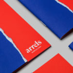
Arrels by Hey
Arrels (roots in English) is a Spanish shoe brand, established by cousins, friends and partners Javier & Pepe Llaudet, and inspired by the Mediterranean, its traditions, rhythm, colour and creative atmosphere. Javier & Pepe also draw on the city of Barcelona (the place they want to be), the countryside (where they are from), and their passion for music. These inspirations make their way into Arrels’ new brand identity,...
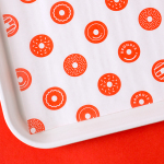
Bronuts by One Plus One Design
Bronuts sells handmade donuts and freshly brewed coffee to the local community of the Exchange District in Winnipeg, Canada, and, as the name suggests, is run by two brothers. Bronuts’ location draws a variety of customers, from young professionals and corporate offices to college students. It has a warm interior of light wood, white tiles, exposed architectural surfaces and low-hanging bulbs. Much like its interior, Bronuts’ brand identity,...
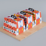
Bottura by Foreign Policy
Bottura is an Italian restaurant and food store with space in Singapore’s Suntec City Mall. It has a contemporary interior of exposed utilities painted black, white suspended ceiling and surfaces, dark wood and steel furniture, glass, concrete and steel counters, warm spot and low-hanging lights and an open kitchen working from authentic family recipes rooted in the owner’s hometown of Bologna. This interior is punctuated...
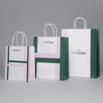
The Hyundai Department Store by Studio fnt
The Hyundai is a well-known, well-thought-of and well-established South Korean department store that this year will celebrate its 44th anniversary. To coincide with this, The Hyundai launched a new brand identity system developed by Seoul graphic design company Studio fnt. This builds on the logotype and colour palette created by New York’s Base Design earlier in 2015, and introduces a Korean logotype, patterns,...
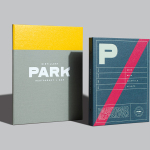
Park Restaurant & Distillery by Glasfurd & Walker
Park is a bar, restaurant and distillery located in the Canadian resort town of Banff, within the Banff National Park, and the province of Alberta. It is a region of diverse natural beauty which includes mountains, prairies, forests and desert badlands, and that attracts walkers, campers and skiers locally and internationally. The restaurant is a celebration of Banff’s alpine history and lifestyle. This runs...
Second Hand Orchestra by Bedow
Second Hand Orchestra is a collection of tracks recorded for a documentary that was unfortunately and abruptly cancelled. Rather than let the work fall by the wayside, band leader Karl-Jonas Winqvist has released these as a limited edition album of 300 LPs. These feature a visual identity and packaging design of custom typography, individually numbered and block foiled sleeves, and screen printed t-shirts created by Stockholm...