The Best Logo Designs of 2016
Common Lot by Perky Bros
Common Lot is restaurant located near the Papermill Playhouse in Millburn, New Jersey. It has a menu of seasonal dishes made from locally foraged produce and fresh ingredients, and features an interior design described as being minimalist with unexpected finishes, natural materials, texture and light. The restaurant was created by Australian chef Ehren Ryan and draws upon his globally diverse culinary background and free spirit....
Helsinki City Museum by Werklig
Helsinki City Museum, through its collection of objects and images, provides visitors with historical insight into the everyday lives and personal experiences of the people of Helsinki. It is free to enter and features 2400 sqm of exhibitions and public spaces, a cafe, inner courtyard, areas to relax and conference rooms. To coincide with a move to a new space;...
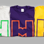
YO! by Paul Belford Ltd
London-based graphic design studio Paul Belford Ltd. worked with UK restaurant chain YO! Sushi, now Yo!, to rebrand, as it expands into the US, the Middle East and further into Europe. This included an updated logo together with an extensive 200 page brand book, presented in a bespoke Japanese bento box, that covered a variety of new assets. The brand book covers menus, packaging,...
Sauvage by Triboro
Sauvage is a Brooklyn-based cafe and cocktail bar from Joshua Boissy and Krystof Zizka, the duo behind Maison Premiere. It is described as being reflective of the staple establishments of New York and Paris, and has a menu of French-accented American dishes. This is also reflected throughout its interior design, a mix of mosaic flooring, brass rimmed circular tables, bent wood furniture,...
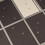
L’Observatoire International by Triboro
L’Observatoire International is a American lighting design studio co-founded in 1993 by Hervé Descottes. The studio is made up of architects, interior designers, engineers, artists and lighting designers working on a variety of projects, illuminating and accentuating both modern and classical architecture and spaces. These include retail premises and museums, airports, landscapes and concert halls. L’Observatoire International worked with New York-based design...
Collect by Spin
Collect is an international art fair that will take place between the 2–6 of February 2017 at London’s Saatchi Gallery. Presented by the Crafts Council, Collect will give visitors the chance to see and buy museum-quality and contemporary ceramics, glass, jewellery, wood, metal and textiles created by established and emerging artists and makers represented by over thirty of the world’s best...
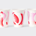
Moi Helsinki by Bond
Moi Helsinki welcomes visitors to the Finnish city of Helsinki, and offers a place to relax after a long journey, with an extensive menu of beers and snacks from its location in the arrivals lobby at Helsinki-Vantaa Airport. The bar features an interior design of light wood and bright neon signage, alongside dark walls, furniture and tiles. Where there are...
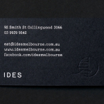
IDES by Swear Words
IDES began as a monthly pop-up restaurant with an inventive approach to cuisine, created by former Attica sous chef Peter Gunn. A year into the business, and to coincide with the development of a permanent space in the Melbourne suburb of Fitzroy, Peter Gunn worked with graphic design studio Swear Words to develop a new visual identity that would more effectively express the level of...
Kimski by Franklyn
Kimski is a Korean-Polish street food restaurant, created by Ed Marszewski and chef Won Kim, located in the Bridgeport area of Chicago. The restaurant has a distinctive interior of geometric wood panelling, bright yellow stools, utilitarian booth seating, wood panelled ceiling and concrete floor with a warehouse quality in its space, shape and box-like exterior. In contrast, Kimski’s brand identity, developed by New...

Embla by A Friend Of Mine
Embla is a new wine bar and restaurant located in Melbourne’s inner city, created by Christian McCabe, the man behind The Town Mouse. It has an interior of wood surfaces, exposed floor beams and brick walls, warm low hanging lighting and a large frameless glass front. Embla’s brand identity, designed by local graphic design studio A Friend Of Mine and based around a...
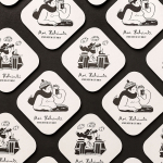
Rattis Books by The Counter Press
Rattis Books is a new London-based independent publisher that celebrates the convergence of traditional and modern print processes and has a firm belief that the book is an art object. To help convey this, the publisher worked with design studio, private press and typography workshop The Counter Press to create their brand identity, and the design for their first book Tiro, a collection of football writings....
M11 studio by Inhouse
M11 studio is a luxe salon, located in the heart of the fashion, shopping and entertainment district of Newmarket, Auckland, that references the refinery of a Tom Ford fashion boutique. It has a well-proportioned, spacious, linear and light filled interior of large mirrors, strip and spot lighting, white and black walls, gold fixtures, concrete surfaces and robust furniture developed by...