The Very Best Brand Identities of 2019
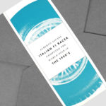
Ascari by Blok Design
Ascari is an Italian restaurant which two locations, one on Queens Street East and another newly opened establishment on King St West. Toronto, Canada. It is named after the proprietor’s hero, Formula 1 legend, Alberto Ascari, (who was also known for his love of food). To reflect both the passion for good simple food and racing, design studio Blok developed an identity that brings together...
Atlantic Theater 2019 – ’20 Season by Pentagram
Atlantic Theater Company was founded in 1985 by playwright David Mamet and actor William H. Macy and, since then, has established itself as an influential Off-Broadway theatre group. It is also known for having a bold and original voice, producing groundbreaking new works by both emerging and established playwrights. This bold and original voice was central to the design of the theatre’s...
We Compost by Seachange
When organic waste breaks down in landfill, methane, a potent greenhouse gas, is released. This has been identified as a significant contributor to climate change. Through composting, this organic waste can be repurposed as a soil nutrient which can then play a role in developing local and sustainable methods of regional food production. The challenge of turning this into a...
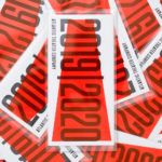
Supertrash by Seachange
Supertrash is a family-run New Zealand-based refuse collection service that helps to divert waste from landfill by employing circular solutions; these are typically recycling, reusing or repurposing. Although small they have big ambitions and are innovative and disruptive in their approach and ideology. Since 2012 Supertrash has diverted almost 6m kg of waste away from landfill. It is a challenge posed...
New Victory Theatre by Pentagram
The New Victory Theatre, located on New York’s 42nd Street, is described as the city’s first and only not for profit performing arts venue for kids and families. It has a programme that covers a multitude of artistic disciplines and draws on traditions from a variety of cultures. Alongside performances and family workshops the theatre also seeks to offer performing arts...
PLATF9RM by Studio Makgill
PLATF9RM is a co-working and office space in Brighton and Hove. It features an interior design by We Like Today that blends the utilitarian with moments of bright warm colour. Studio Makgill, working closely with PLAT9RM Founder, Seb Royle and Creative Director, Emilie Lashmar, designed a graphic identity for the space that would capture and express a spirited approach to...
CareerTrackers Awards by Garbett
CareerTrackers is an Australian charitable organisation that addresses Indigenous disadvantage by developing professional career pathways, internship programs and links with private sector employers for Indigenous university students. It does this through a model adapted from an African-American internship program that has been tackling disadvantage for over 45 years. This model sees students intern with sponsoring companies with the intention of converting them...
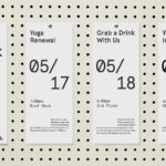
Shakespeare In The Park 2019 by Pentagram
Shakespeare In The Park is an annual event and duo of free performances presented by New York’s The Public that takes place at the Delacorte Theater in Central Park in May and June. 2019 saw performances of Much Ado About Nothing and Coriolanus under the theme “Rumours and Rebels”. The event was promoted through a city-wide campaign developed by Pentagram’s...
The Golden Hour by Triboro
The Golden Hour is an outdoor seasonal restaurant located in New York’s The High Line Hotel. It is a place to experience the softening of sunlight with unobstructed views of the Chelsea skyline. The restaurant intends to draw to mind the casual elegance of a coastal soirée rather than the rushing of pre-dinner drinks. The restaurant space is described as being...
The Architect’s Bookshop by Garbett
The Architect’s Bookshop is a new design-focused retailer, located in Sydney’s Surrey Hills, devoted to the books of architecture and interior design, landscaping and urban development. The space was conceptualised as being more than a bookshop but a place to take time out to browse, a chance to engage with the material and form of the books, and as a place...
WeWork by Gretel
Founded in 2010 and headquartered in New York, WeWork began as a workspace provider and has grown to offer a broader infrastructure of community management and support, event programming and virtual network management for small and large businesses, entrepreneurs and freelancers. With significant and rapid growth WeWork worked with Gretel to align its visual identity with its purpose. “Framework”, a graphic route that...

Aurlands by Heydays
Aurlands is the oldest running workshop for handcrafted shoes in Norway. It was founded in 1907 by shoemaker Nils G. Tveranger who, following time in America training as a shoemaker, went on to create the world’s first Penny Loafer in 1926. This, subsequently, became an enduring unisex fashion icon across Europe and America. Aurlands continues to build on this legacy,...