Wadha by Two Times Elliott
Opinion by Richard Baird Posted 9 May 2016

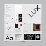
Wadha is a Islamic fashion brand for women, established in 2010 in the city of Doha, Qatar, by Wadha Al Hajri. Garments by Wadha are characterised by unique fabrics and cuts, contemporary, clean and slightly irregular shapes, and single colour. This aesthetic is reflected throughout Wadha’s brand identity, designed by British graphic design studio Two Times Elliott, not only in typographic form and a solid colour palette but also in material choice, print finish and structure. This links assets such as notecards, bags, tags and business cards.

Two Times Elliott find a subtle but pleasant balance between the high value often associated with European fashion brands and the diagonal lines and geometric forms of Islamic patterns, and expresses their similarities through bold geometric sans-serif logotype, similarly styled mark, which takes its inspiration from stitching, and asymmetrical cuts and folds across tags and bags.
The logotype does not stray too far from Wadha’s original. Extended characters are replaced with regular, while all uppercase, geometric and monolinear forms remain. The changes are slight but far more current. A new and distinctive W, and its use as a mark, draws further visual equity from a fairly familiar and international typesetting standard within the industry. There are some difficult pairs to kern, but it appears largely well-balanced.


As you would expect from a high fashion brand, where there is restraint in graphic expression there is more in the way of material texture and print finish. These include uncoated and embossed surfaces, the natural tones of dyed papers and boards, die cuts and white ink. These never feel in conflict with the garments themselves but a complimentary detail that reflects the aesthetic sensitivities of the designer.
These details are held together by a colour palette that moves between a soft and low contrast mix of white, off-white and cool grey, with the occasional contrast of a classic black and off-white across the bags.

The work is sophisticated and restrained, drawing its distinctive value not from graphic design, which is well-resolved, reassuringly high fashion and international, but from forms and folds. There is a clear continuity in type, mark and die cuts, and a classical quality and a little of the architectural in colour choice. This cool grey also feels rather fitting for the shapes and structure of Wadha’s garments. Although its Islamic origins a nuanced, name carries a lot, with brand history and influences better carried through pieces in Vogue rather than cluttering visual identity. More from Two Times Elliott on BP&O.
Design: Two Times Elliott. Opinion: Richard Baird. Fonts Used: Calibre & Josefin Sans.