Type Play
Recchiuti by Manual
Recchiuti Confections is a San Francisco-based gourmet chocolatier that creates chocolates with unique flavour combinations. Using traditional European techniques, with locally sourced ingredients from Northern Californian farms and markets, Recchiuti’s chocolates have earned a loyal customer base and several accolades. After 25 years in business, Recchiuti sought the expertise of Manual – a local design studio – for a brand...
New Victory Theatre by Pentagram
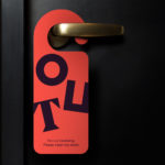
The New Victory Theatre, located on New York’s 42nd Street, is described as the city’s first and only not for profit performing arts venue for kids and families. It has a programme that covers a multitude of artistic disciplines and draws on traditions from a variety of cultures. Alongside performances and family workshops the theatre also seeks to offer performing arts...
Shakespeare In The Park 2019 by Pentagram
Shakespeare In The Park is an annual event and duo of free performances presented by New York’s The Public that takes place at the Delacorte Theater in Central Park in May and June. 2019 saw performances of Much Ado About Nothing and Coriolanus under the theme “Rumours and Rebels”. The event was promoted through a city-wide campaign developed by Pentagram’s...
Assembly by Ragged Edge
Assembly is a new hotel from Criterion Capital located on London’s Charing Cross Road. It throws out expensive amenities to instead focus on delivering fun yet sophisticated rooms in a central location. These rooms are aimed at experience-hungry young travellers and competitively priced with interiors inspired by London fashion icons and furnished with best in class beds, showers, sound-proofing and wi-fi. Brand...
Osofor by Paul Belford Ltd.
Osofor will be a digital-first and lab-grown diamond jewellery business able to create stones of any shape and cut. It will offer a modern and sustainable luxury brand to those who desire the material qualities of diamonds without the environmental and sociological impact. Osofor intends to distinguish itself further by fusing enduring aesthetic desirability and artisanal practice with experimental materials, unexpected production processes,...
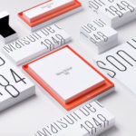
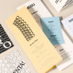
Maison De Greef 1848 by Base Design
Maison De Greef 1848 is a high-end luxury jewellery brand, expert watchmaker and retailer that opened its first shop in 1848 at 24 Rue au Beurr, Brussels. Shortly after De Greef became the official clockmaker for the Belgian National Railway Company and then the supplier of pocket watches for the Belgian Navy. The brand has built an enduring legacy and weathered many...
Shakespeare In The Park 2018 by Pentagram
Shakespeare In The Park is an annual event and series of free performances presented by New York’s The Public Theatre that will take place at the Delacorte Theater in Central Park during May and throughout June. This year will see performances of Othello and Twelfth Night. These are being promoted by a campaign developed by Pentagram’s Paula Scher, with assets...
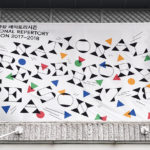
National Theatre of Korea Repertory 2017/18 by Studio fnt
The National Theater of Korea is the first nationally managed theatre in Asia. It is something of a brutalist building of textured and geometric concrete located in the neighbourhood of Jung-gu, South Korea. Each season it plays host to a broad and diverse contemporary art program of dance, music and performance, one-off events and festivals. To celebrate and announce the new season...
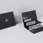
Sydney Design Festival by Re
Sydney Design Festival has been running for 20 years, making it one of the oldest design festivals in the world. It provides its visitors with an opportunity to understand design practice in all its forms, to bring to light problem, process and response, and to foster a closer connection with the designers and businesses helping to shape our collective futures. With a...
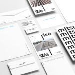
Mitsulift Elevators by Base Design
As the built environment expands, as it seeks new places to fill and accommodate a growing populace, time spent in and our reliance on modern conveyance systems develop in tandem. Reliability is central to this experience. Mitsulift is an elevator specialist tackling this need, balancing what is described as a Japanese technical expertise with exceptional Middle-Eastern service. Its graphic identity, however,...
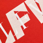
London Fashion Week by Pentagram
Twice a year the British Fashion Council exhibits the very best in British fashion to national and international audiences. It does this through three events, each held at Store Studios on the Strand. London Fashion Week (LFW) and London Fashion Week Men’s (LFWM) offer the industry a look at upcoming womenswear and menswear collections, while London Fashion Week Festival (LFWF) provides...
Di Beppe by Glasfurd & Walker
Di Beppe is a casual Italian caffé and ristorante, located in Vancouver’s Gastown neighbourhood, “inspired by the Italian immigrant’s desire to share a piece of home while living abroad”. Di Beppe is said to honour the sense of deep pride and self-assured nature associated within Italian culture through a classic and authentic Italian dining experience and in the design of its graphic identity,...