Uncoated Papers & Cards
Black Bee Honey by OMSE
It was yesterday I made a run to the local supermarket to pick up some essentials. I had two choices, turn left to Waitrose or right to Morrisons. Despite being somewhat price conscious, I enjoy looking at the packaging at the higher-priced Waitrose, so went left–let’s say it’s the cost of being a designer. Anyway, honey was on the list....

The Wool Pot by Seachange Studio
More plants, less plastic. A noble mission. Over the last decade, revelation has followed revelation with regards to the environmental impact of what seemed like the most innocuous of objects. Now it’s the turn of the humble flower pot. Yep, that. Stacked and sitting empty in the shed, or at the bottom of the garden. It turns out that these...
Soft Services by Decade
Skin is the human body’s largest organ while skincare is the fastest growing segment of the beauty industry. Yet with all their promises of ‘dewy’, ‘glowing’ and ‘blemish free’, most products on the market, are focused on the face. Direct-to-consumer business Soft Services creates skincare products for specific body skin problems, such as acne, ingrown hairs, stretch marks and fungal...
Ebb Dunedin by Maud
Design-savvy duo and father and son team Dylan and Frank worked alongside Gary Todd Architecture and interior design team INDYK Architects to develop Ebb, a contemporary boutique hotel located at the heart of Dunedin, a city on the South Island of New Zealand. Ebb is uniquely situated at the edge of the reclaimed Otago Harbour–a place where Polynesian travellers would...
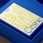
Crane by Collins
In 1775 Crane paper was used to print the first money for the American colonies, and by 1801 the company was the primary paper producer for local and regional banks. Later that century, equipped with an arsenal of innovative techniques from Europe, Crane won a contract with the Bureau of Engraving and Printing and became the supplier for the US...
Metamorphoses by A Practice For Everyday Life
Metamorphoses is a contemporary art gallery that curates unique pieces by makers who turn one thing into another. It takes a special interest in works that are inspired by the past while displaying keen attention to present issues. These pieces, selected by the gallery, are often drawn from a body of work by artists who reflect on aspects of cultural...
Cable Factory by Bond
Cable Factory (Kaapelitehdas) is one of Helsinki’s most famous buildings, originally designed by the Finnish industrial architect Wäinö Gustaf Palmqvist in 1939. For many decades it was the largest building in Finland with a footprint of 56,000 m², and it remains one of the most iconic. In 1991 the site was redeveloped to become the country’s biggest cultural centre, housing...
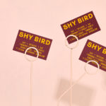
Shy Bird by Perky Bros
Shy Bird is a all-day café, rotisserie and bar in Cambridge, Massachusetts. Its core mission is to elevate chicken, and the experience of eating chicken into the realms of the exceptional through gastronomic know-how, a beautiful interior and a visual identity designed by American studio Perky Bros. Drawing their inspiration from the red junglefowl, the “original chicken” and descendant of the domestic chicken, and...
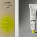
Tangent GC Organic Soap by Carl Nas Associates
Tangent GC began as a Scandinavian organic garment and shoe care company developing products that intended to increase the life of clothing and footwear, and entered the organic skincare market in 2016. The concern given to the longevity of skin becomes an understandable extension of that original intention. Carl Nas Associates, who have been working with Tangent GC on their packaging treatments for...
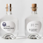
Monachus Distillery by Bedow
Atop of Croatia’s Istria peninsula, just where the land slips into the Adriatic sea sits the tiny small-batch gin distillery of Monachus. Stone shores, botanical covered hillsides, the smell of pine and scattered pin cones characterises the landscape. Drawing on this, the natural history of Istria and the name Monachus, borrowed from Monachus Monachus an endangered Mediterranean monk seal, Swedish design studio Bedow created a...

Tangent GC Organic Detergents by Carl Nas Associates
Tangent GC began as a Scandinavian organic garment and shoe care company developing products that intended to increase the life of clothing and footwear, and entered the organic skincare market in 2016. The longevity of skin being an understandable extension of that original intention. The company’s graphic identity, a typographical system designed by Essen International under the creative direction of Carl Nas, established...
Northstar Film Alliance by Bond
North Star Film Alliance (NSFA) is a joint venture between Estonia, Latvia and Finland. The Alliance intends to develop and promote themselves as one filmmaking region to international film and TV productions. It is a competitive marketplace, with other countries provide low tax rates and incentives to film big-budget spectacles on their stages using local crews. Together, the three countries...