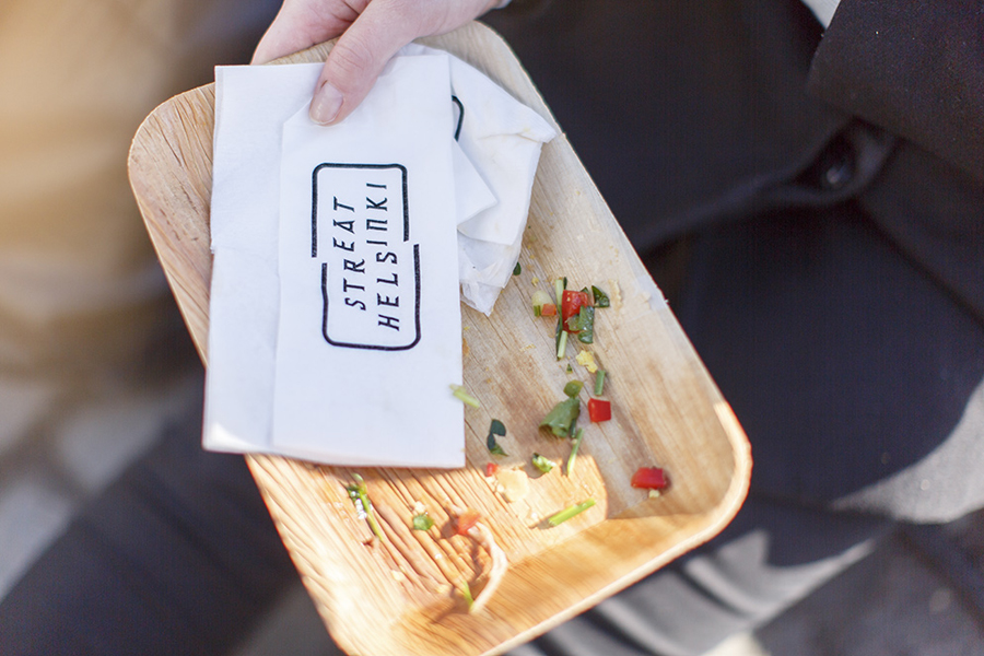
Streat Helsinki by Kokoro & Moi
Opinion by Richard Baird Posted 7 November 2014

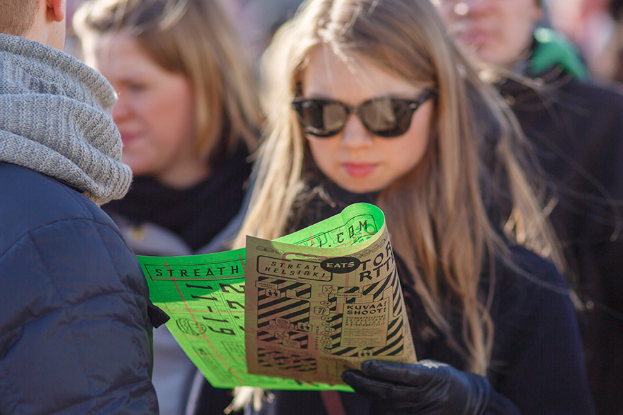
Streat Helsinki is a festival that looks to explore and question what street food can and should be. It began this year with three events — a series of talks, opportunities to eat and time to party — held at different venues across the city. Eats, the largest of the three, was held in the Tori Quarters and included 40 food truck and restaurant experiences from across Scandinavia and drew crowds of over 20,000.
The festival’s brand identity, which included logotype, typeface and print, was developed by Finnish graphic design studio Kokoro & Moi. Using bold color choices, busy layouts, custom typography, rough materials, illustrations and what the studio describe as a DIY attitude and a 90s vibe, their solution reflects the authentic ingredients and experimental spirit of Streat Helsinki. The project extended to posters, flyers, menus and bags.
The logotype’s generously spaced characters — an unusual mix of flat, sharp and curved terminals, square and rounded junctions — is a little awkward but distinctive with a diagonal split that functions well to draw out the word eat and has a sign-like frame that complements the street theme.
Custom typography with brush stroke terminals, an irregular baseline and inconsistent spacing has a subtle and retro hand drawn cartoon aesthetic which is well-rendered and a weight that introduces contrast to the lighter elements of the logotype. This mix of typographic weight contributes to the division of information across what is an intentionally chaotic and unstructured approach to print.


The print work is busy. Its quiet appropriation of Homer Simpson and Sponge Bob, and the use of burgers, doughnuts and beer glass loosely illustrated is repetitive, almost stamp-like but playful and avoids corporate associations. Layered over a street map set of blocks, a mix of orientation, an absence of traditional hierarchy, a contrast of fine lines and heavy fills, and a compact festival guide, make for a rich aesthetic at distance and a slightly chaotic communicative structure up close, but together appear reflective of the busy streets, home-made foods, stalls and stands of the festival.

The contrast of bright fluorescent green printed over unbleached, uncoated paper on one side delivers the biggest impact both aesthetically and communicatively. There is a clear duality of what is perceived to be a traditional and authentic craft aesthetic and a more urban energy you might associate with club posters or contemporary cultural events. The two could not be more disparate or contradictory, one largely untreated and the other not far off synthetic, however, the union of the two feels distinctive and rather appropriate for the event.
Design: Kokomo & Moi
Opinion: Richard Baird