Torafuku by Brief
Opinion by Richard Baird Posted 25 August 2015
Torafuku has a simple yet adventurous menu that reinterprets pan asian flavours as modern shared dishes. These are made from good quality and locally sourced ingredients, which are complimented by a variety of contemporary cocktails, a carefully curated wine list and local craft beers. Torafuku is located on the border of Vancouver‘s historic Chinatown and features an open and reductive urban interior space of leather upholstered benches, light wood stools and tables, a long cast concrete surface, panels of material texture and white walls. This is punctuated by a bright and multi-coloured visual identity, which included business card, packaging and menu design, developed by Canadian graphic design studio Brief.

Taken as a complete experience, one that encompasses interior, food and brand identity, Torafuku manages to balance the urban, the earthy and the convivial respectively. Contrast is significant, largely delivered through colour and texture, both visually, as a series of patterns used across business cards, menus and website, and physically throughout the restaurant’s menu and furnishing.


The identity is bright, in opposition to interior, bold and structured alongside the finer organic detail of the dishes. This gives the experience an unusual and distinctive layered quality, one that intentionally and effectively leverages disparity and marks a simple project out as something more interesting. This is not an identity that should be judged in isolation.
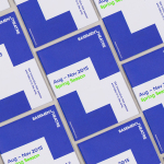
In print, Brief confidently juxtaposes the perceived value of block foils alongside the youthful exuberance and contemporary impact of a vivid colour palette. This links assets such as trays, chopstick sleeves, business cards and menus that move freely within a muted environment, and draws on a menu of quality, colour and flavour. Although intense in its presentation here, these assets are likely to provide unexpected bursts of colour inside, without being overwhelming, and function as a memorable identity outside.

Although there is a simplicity to the work, the choice of finishes and the use of dyed papers and boards rather than an excess of ink, makes sure that there is a quality to each piece in line with menu and interior. Much like the colour palette, the heavy, condensed, sans-serif characters of the bilingual logotype secures a bold and impactful quality that sits well over both the patterns or within the context of flat panels of colour as a silver or gold block foil.
Design: Brief
Interior: Scott & Scott Architects
Interior & Food Photography: Fahim Kassam
Opinion: Richard Baird
Fonts Used: Churchward Heading & Caecilia