Naughty But Rice by Robot Food
Opinion by Richard Baird Posted 12 November 2015

Naughty But Rice is a rice pudding range created by The Hain Daniels Group in response to an increase in the dessert’s popularity in the United Kingdom. Unlike the product’s of established and mainstream brands, Naughty But Rice, as the name suggests, offers consumers a modern and indulgent twist on the traditional favourite, with flavours that include Coconut & Raspberry, Salted Caramel and Chocolate Orange.
The range features a brand identity and package design, developed by Leeds based graphic design studio Robot Food, that leaves behind what the studio describe as tired category conventions, and instead, embraces the striking and high-contrast, in structure, type, colour, space and illustration. Since its launch, Naughty But Nice has secured shelf space in supermarkets such as Asda, Morrisons, Sainsbury’s and Booths.

Robot Food’s direction is big on impact. The juxtaposition of round and robust plastic pot and the flat panels of a die cut card sleeve, condensed all-uppercase sans-serif characters and all-lowercase script, bright colour and plenty of white, illustrative flourish alongside typographical directness, does a good job of securing distinction from a distance and detail up close.
Such an obvious and extensive use of contrast is clearly and appropriately rooted in the duality of the name, the contemporary interpretation of a classic, and the indulgent flavour infused into a wholesome and simple mix of milk and rice. The expense of a full colour pot, curved die cut sleeve and printed interior walls, while convivial, lend the product a sense of high-quality without appearing too expensive.


The logotype’s condensed sans-serif characters and script mix the loud and personable, while an overall simplicity, the absence of excessive styling or customisation, works well to leverage and emphasise a name that is both memorable and clear in product positioning. This continues in the choice of language, typesetting, and layout across pack.
The light strokes, colour and placement of “but”, alongside the dominant height, weight and black ink of the characters above and below, from a distance, reads as “Naughty Rice”. This is an amusing and perhaps slightly knowing detail that manages to get even more from an already playful pun. It would be easy to imagine the name being abbreviated to this on shopping lists.

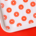
A mix of heavy black lines, organic and geometric form, waves, stripes, dots and flat colour, appear expressive and unexpected, full of personality, youthful but not childish. A connection is frequently made between vivid colour and the synthetic, however, this is tempered by the white of the sleeve, and contributes to an enthusiastic and unique brand character and suited to a product with a depth of flavour.
Wrapping the illustrations around a structure that is often given to openly showcasing product quality through transparency is unusual, yet well-suited to that without much visual character, unlike say a single-serve mixed vegetable soup or stir-fry pot.
The illustrations are a bold and indulgent aesthetic flourish, however, alongside a milk and rice-white sleeve, are grounded by a clear communicative intention.


Copy Opinion by Seth Rowden
This is not your regular tub of Ambrosia. For those of us that bemoan the lack of choice in the dessert aisle, this re-invention of a comforting classic is a welcome surprise. There has been a post-recession trend in consumers splurging on little ‘permissible treats’, and tasty upmarket food brands do just the trick. The brand name is excellent – capitalising on this insight with tongue-in-cheek humour, whilst still appealing to mainstream consumers. So how convincing is the tone of voice?
The strapline perfectly captures the main promise and brand positioning in one bold, no-nonsense statement. It’s confident without being arrogant, and the back of pack copy brings a joviality and playfulness that gives the brand a healthy spoonful of personality. There’s effective use of alliteration with “dinky dessert” and “favourite fabulous flavours”, and a clever choice of nouns and adjectives to create a voice that is cheeky but friendly – one that essentially whispers, “go on, have another …”.
Naughty but Rice is a great example of well-considered product innovation backed up with a contemporary and insight-driven brand personality. But the real treat here is a tone of voice that has finally moved on from that cloying, smothering food brand tone we all know so well into something altogether more mature and engaging.

The result finds a good balance between a trend for simplicity (and the premiumisation of the previously low-cost) and unique brand personality. Each choice is well-founded, communicatively precise and understandable. Type and illustration plays with bold contemporary flavour as well as the personable and accessible, while an absence of colour across the sleeve touches upon the dairy and rice content. Disparity and the contrast that arises from this effectively emphasises these, product positioning and brand message, which is elaborated on through tone of voice. More from Robot Food on BP&O.
Design. Robot Food. Opinion: Richard Baird & Seth Rowden. Fonts Used: Knockout & Rukola Regular.