Aman by Construct
Opinion by Richard Baird Posted 16 February 2016
Aman is a collection of resorts, hotels and luxury residencies that offer access to a wide variety of remote and urban destinations. Its first resort, Amanpuri, was opened in Thailand in 1988. Since then it has expanded across the world, seeking out transformative experiences and awe-inspiring locations throughout Asia, Indonesia, China, Japan, the Americas, North Africa, Europe and the Mediterranean.
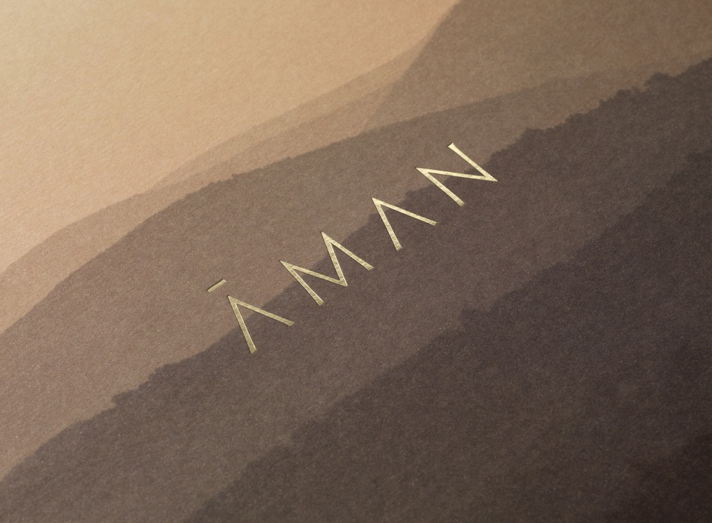
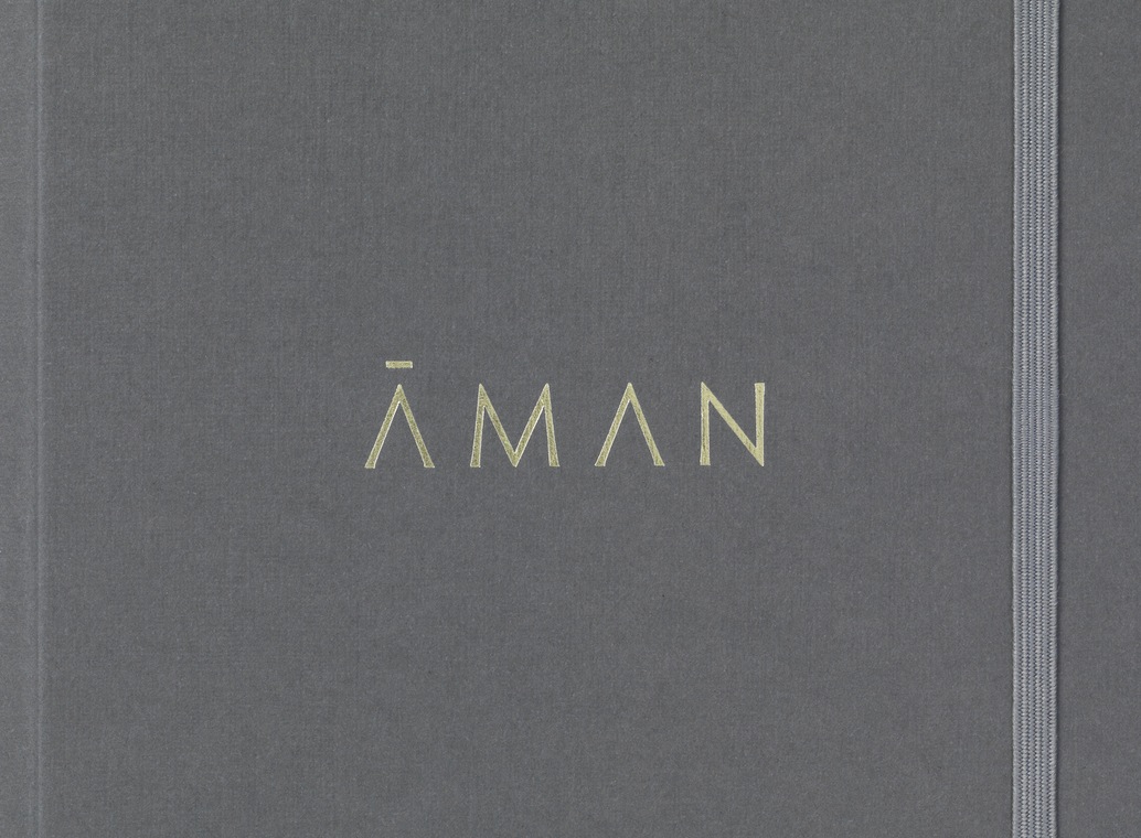
Inspired by the earliest forms of alphabets and mark-making, London based graphic design studio Construct developed a new brand identity for Aman that would reflect its values and the high quality of its experiences. This is expressed through custom typography, earthy colour palette, tactile material texture and high quality print finish that links press-pack, business cards and menus.
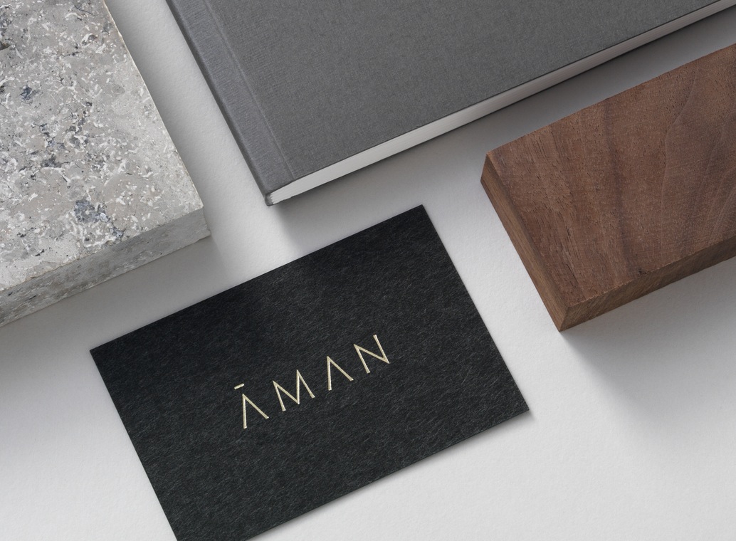
“The Aman Master Brand Logo is a sophisticated evolution of the earliest form of script; a series of strokes that exemplify a physical sense of ‘above and below’, the natural connection and flow of mountains and valleys, of waves and ocean floor, an inclusion in a natural landscape which directly reflects Aman’s relationship with place.” – Construct.
Where BP&O often favours the contemporary, or a contemporary take on the traditional, Aman feels ancient and slightly mystical in its blend of type and image.
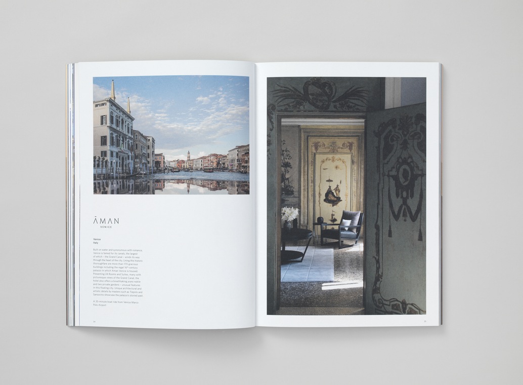
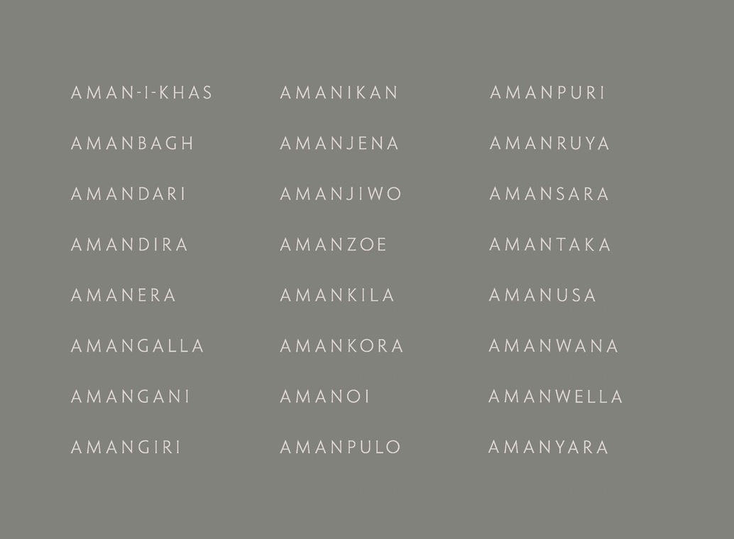
Construct’s references; early alphabets, Futhark and stone carving, and its favour for both reduction and a human component are clearly evident in the build and drawing of logotype; the flaring of terminals and the lightness of line weight. It is well-spaced and balanced, benefits from the repetitive and simple forms intrinsic to the letters and name, and takes a block foil well. This is then extended to the names of over 31 different Aman locations. While ancient in its references, its implementation, the use of space, and choice of colour, appears sophisticated and luxury.
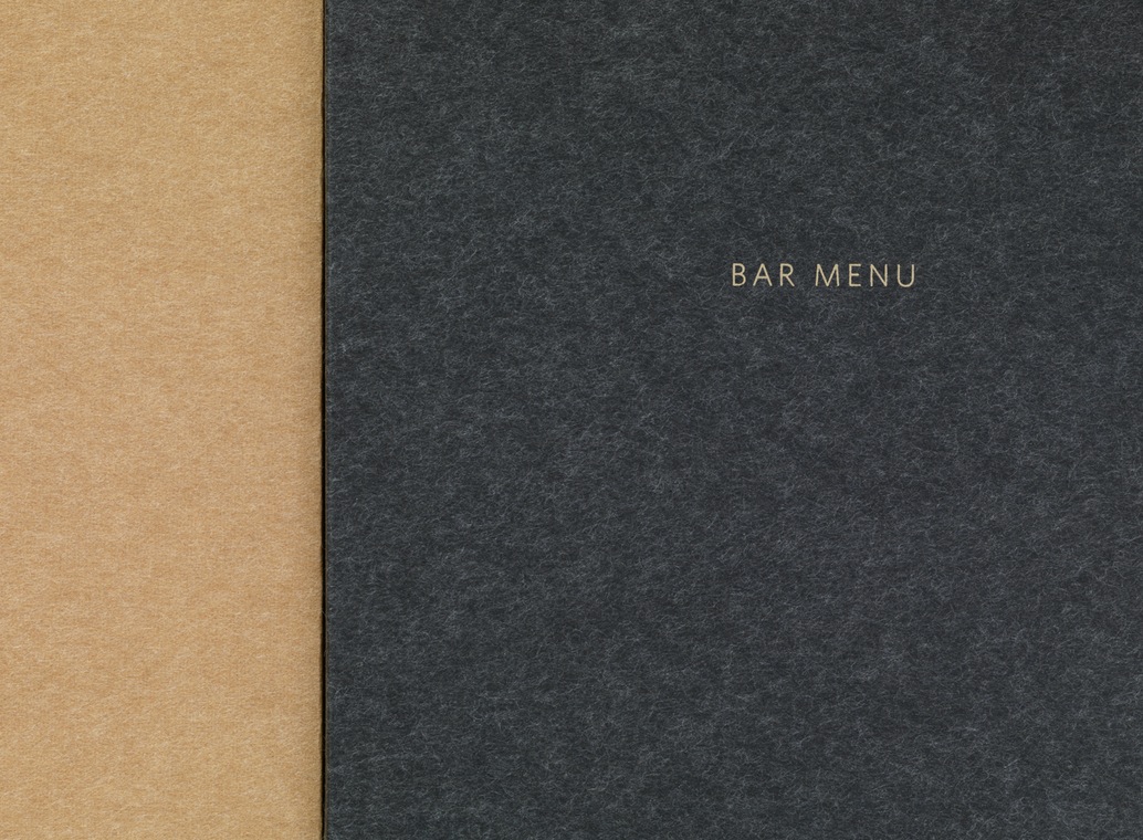
Material choices and the pencils of the press pack layer identity with a very physical and tactile quality hinted at in the carved qualities of type, while a colour palette of sand, soil and clay, are distinctly earthy. Dyed uncoated papers, embossed boards and a gold foil print finish convey a quality and value without appearing excessive. This simple combination manages to say a lot with just a few assets.
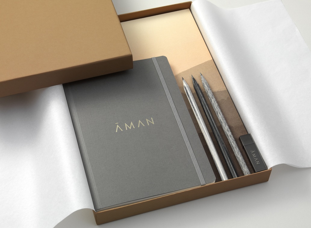
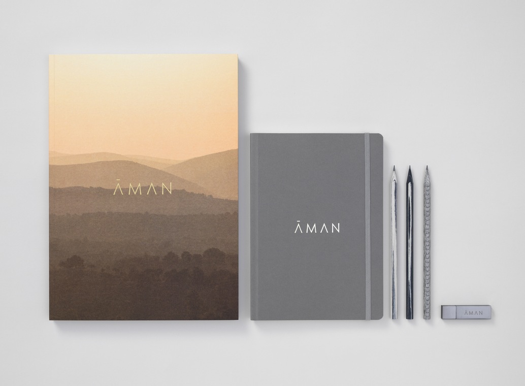
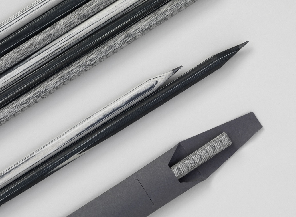
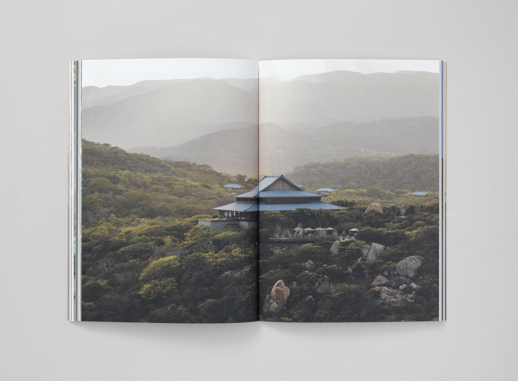
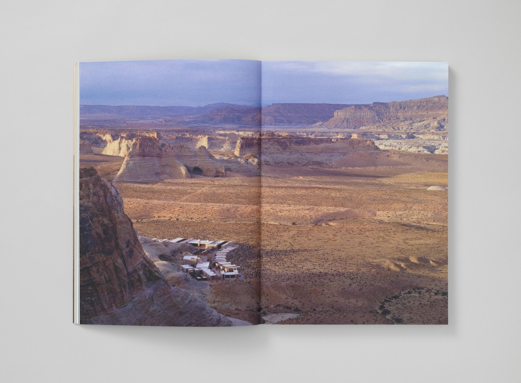
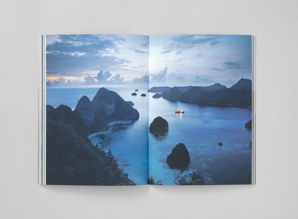
The earthy quality of colour and material texture is explored further and more explicitly in the warm misty landscape of the brochure cover, and inside with brighter but natural tones. Diversity and disparity of image, a contrast of colour, texture and content function well to emphasise the extent of the destinations that Aman offers, and are compelling and impactful in their full bleed double page spreads. Man is clearly selling destinations, rather than a resort experience.
Aesthetically the work is really well-resolved, but it is the connection made between man and enduring environment, and the extent and difference of the destinations, as conveyed through type, texture and image, that really stands out as thoughtful, and ideally-suited to a resort with excess to places throughout the world.
Design: Construct. Opinion Richard Baird.
