Globetouch by Bunch
Opinion by Richard Baird Posted 31 March 2016

Globetouch is a UK communications business and platform owned by operators and providing a wide range of mobile devices with access to a global and cloud-based ecosystem through an extensive network of offices and data centres.
This extensive network and global reach is expressed throughout Globetouch’s brand identity, created by Bunch, using a modern pared-down colour palette inspired by migratory birds, a G that matches the tilt of the earth, patterns that draw on binary code, and a photographic library that touches upon exploration, travel and data.
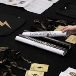
These assets connect a variety of print and digital communications including, but certainly not limited to, brand guidelines, business cards, stationery, brochures, packaging and website.


Bunch’s press release is filled with insight and a lot of rationale. There is a relevance and intention that underpins every choice. Form, type and colour language, as well as material and print finish, are all effectively used to give Globetouch an impactful and appropriate visual identity.
Although some of the rationale is far from explicit—particularly the blue, white and black of the Arctic tern, a migratory bird, and the 23 degree tilt of the G, matching that of the earth—Globetouch clearly reads as modern, universal, data and network-driven.
Assets are all well-composed and typeset, pulling distinction from familiar industry tropes. The dots and lines of data transfer and communication networks become memorable and unique planes and vortexes, black and white draws out and provides breadth to a lovely tech blue, and the arrow of the G brings recognition to a corporate monolinear sans-serif.


Coloured boards and white inks, foil vacuum packed tech and blind embosses play with a universal sense of value. These give digital, data-centric technology and services a tactile and physical quality grounded in clear intentions that never feels excessive.
Like many of the graphic components, these make the most of some familiar and universal perceptions and associations, the foil vacuum packed cables are perhaps the most obvious (space! tech! utility! future!), but it works, and it is in the combination of these that Globetouch’s brand identity derives its distinction, impact and communicative value.


As you would expect from Bunch, assets are confidently weaved together well with a good sense of balance in colour, proportion, visual texture and space, a general restraint and precision. Where type is reductive, patterns add detail, depth and visual interest in their variety, and are drawn out further through raised surface treatments. These all share a grid-based quality grounded in the networks of Globetouch. These are a particular highlight, alongside the image library, and look fantastic animated online.

Below is a small snapshot of a large and compelling image library. These move between the organic and the built environment, and touch upon technology and nature. The planes and vortexes, their detail, depth and simplicity, white on black finish and use of space and shape, work remarkably well within the context of rich image, expanding on the communicative intentions laid out by type, colour and material choice, in a compelling and alternative way. More from Bunch on BP&O.
Design: Bunch. Opinion: Richard Baird. Fonts Used: Plain.