Freewheel by Collins
Opinion by Richard Baird Posted 14 April 2016

Freewheel is a dedicated Wi-Fi only mobile phone service launched by American cable television company Cablevision. Freewheel allows people to break free from contracts by providing unrivalled communications accessibility without large and expensive data plans and hidden fees. This is made possible by a network of over a million Wi-Fi hotspots.
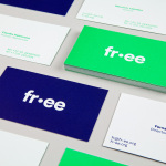
Freewheel’s egalitarian intention and connectivity is effectively expressed by its visual identity, created by New York based studio Collins, through a unifying flag-based graphic device, which then expands into a bold, dynamic and multi-coloured visual language of lines and intersections and a similarly styled logotype. These go on to link print communication, packaging and website with a youthful and empowering quality.

It is a simple but compelling concept, with unity (flag and diverse spot colour), connections (lines) and universality (neutral type) at its heart, resolved with plenty of visual character that, in some ways, particularly in colour choice and combination, as well as imagery online, has the personality of a young fashion brand. There is a pleasant and clear continuity between type, logo and pattern, with each adding a further layer of detail.

It is tempting to make a connection between the split of the F (which looks like an equals sign) and the equality of a low-cost data infrastructure, however, this might be a bit of reach on my part, and an unintentional (but relevant) conflation, unlikely to be discerned or deciphered by the market. Set within the flag, this does make for an interesting and rather current logo, clearly with a US origin, and manages to lend a fairly generic logotype of monolinear sans-serif characters a small but identifiable visual flourish that connects it to logo and packaging.

Contrast maximises the impact of each asset. Bright colour is emphasised by plenty of white space, heavy lines by finer type, and a robust and upright logotype by the angles of lines across the surface of the packaging. The patterns break free from the flag device, although clearly tied to it, in favour of the themes of connections, networks and strong wi-fi signals. These ideas are implicit rather than explicit, but easily inferred.


The fold out guide, a departure from the conventional booklet, provides a nice big canvas for graphic expression, taking on the qualities of a poster by blending striking image of oversized and cropped type with finer technical detail and a contrasting serif. This dials down the bright hues of the packaging, in favour of pastels, prioritising legibility, but uses a light paper choice, perhaps a small economy, that allows type and lines to blend together making the most of a few assets to build up texture and image.


Although, at present, or at least as documented here, brand identity effectively links just a few assets experienced post-purchase as well as a website, it is easy to imagine this, paired with some strong copywriting, delivering impact across large format posters or in motion on screen within the context of a campaign. While Freewheel provides a low-cost mobile phone solution, its visual identity draws high-value from an economy of assets through a relevant concept and a smart and contemporary combination of colour and simple but recognisable form. More from Collins on BP&O.
Design: Collins. Opinion: Richard Baird.