Lux Capital by Mucho
Opinion by Richard Baird Posted 6 May 2016

Lux Capital is an American venture capital firm investing in the fields of science and technology, partnering with inventors who challenge the status quo and what we currently understand as the laws of nature to bring futuristic ideas to life.
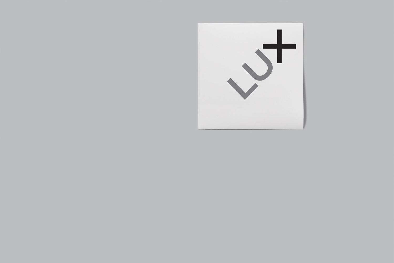
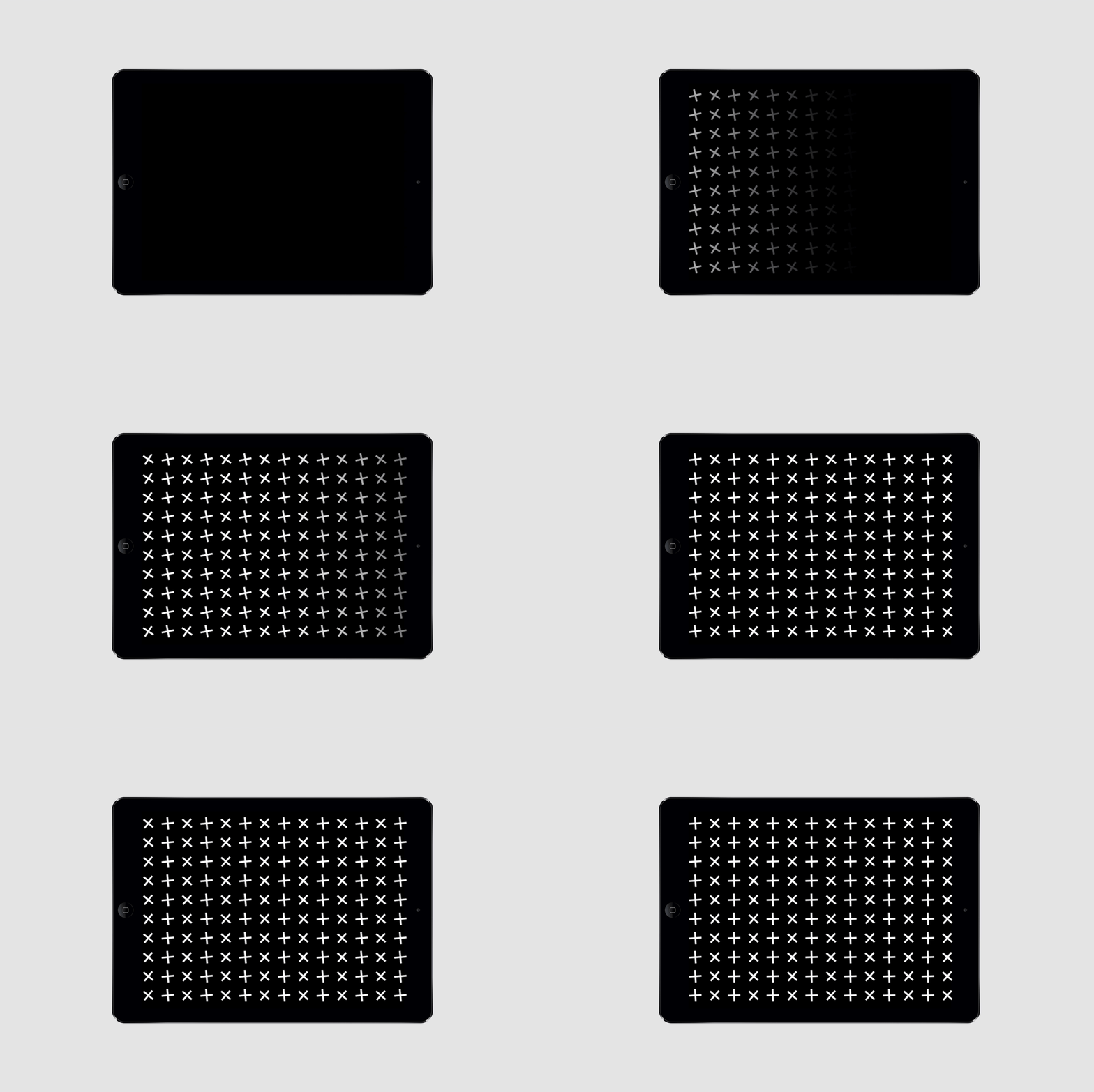
Graphic design studio Mucho developed a simple brand identity for Lux Capital that expresses the collaborative nature of today’s innovations, and the remixing of ideas, by drawing out and emphasising the × and + within the name through the angle of the logotype. It is a simple typographical observation given a relevant conceptual basis. This then extends across business cards, note cards, stationery and website.
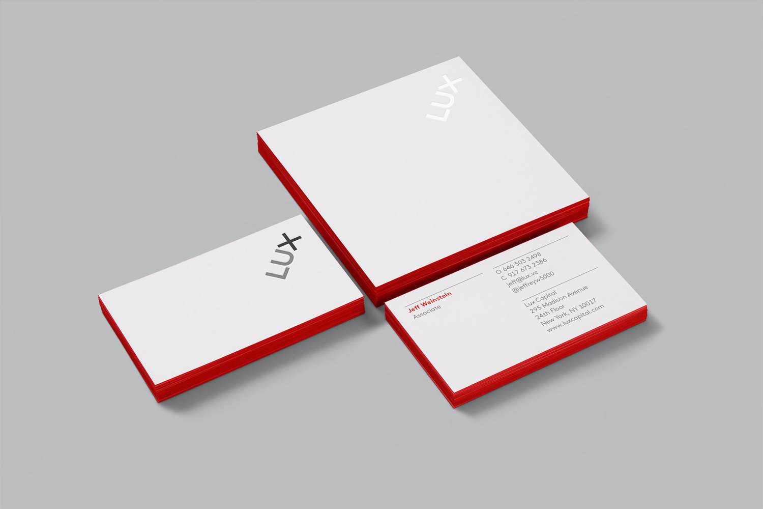
It is a small (within the context of printed assets) but neat project with a relevant concept that plays out across stationery, and explored further through static pattern and animation. Layouts and typography are conservative but professional in appearance, moving between the technical and corporate, with some pleasant material choices and print finishes adding a little extra detail and value.
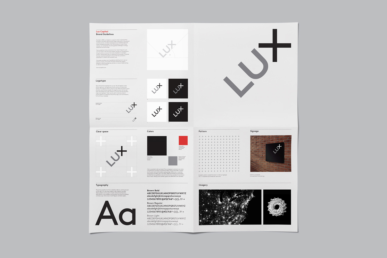
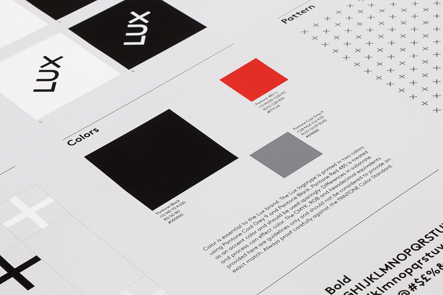
The brand guidelines, a single fold out sheet, is economical and practical, in keeping with the straightforward delivery of concept and the pragmatism of research and development. Online the × becomes a bold visual expression, dominating the frame, acting as window to video that blends science and technological imagery. More from Mucho on BP&O.
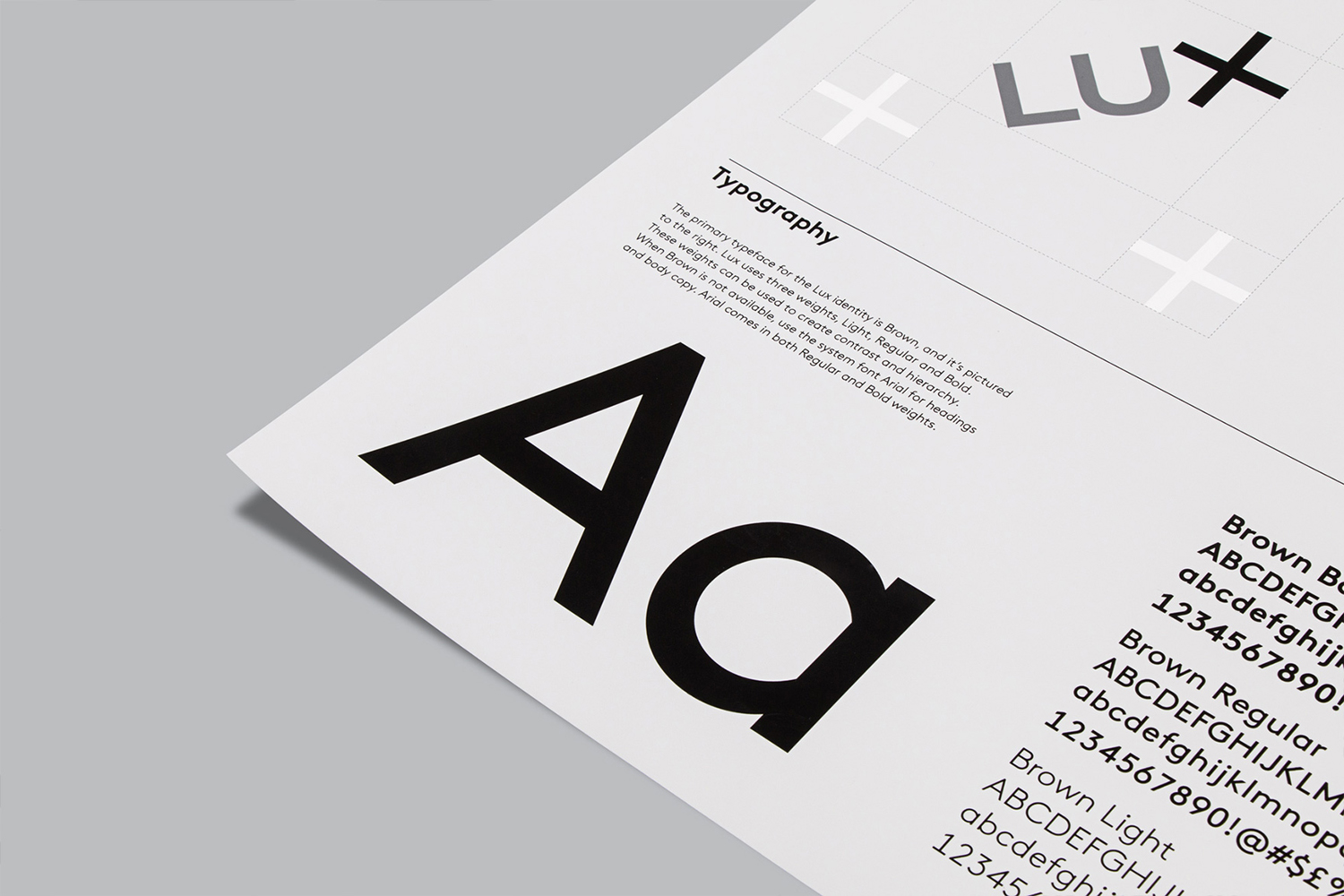
Design: Mucho. Opinion: Richard Baird. Fonts Used: Brown.
