Hubbards Creamy Porridge by Coats
Opinion by Richard Baird Posted 13 June 2016
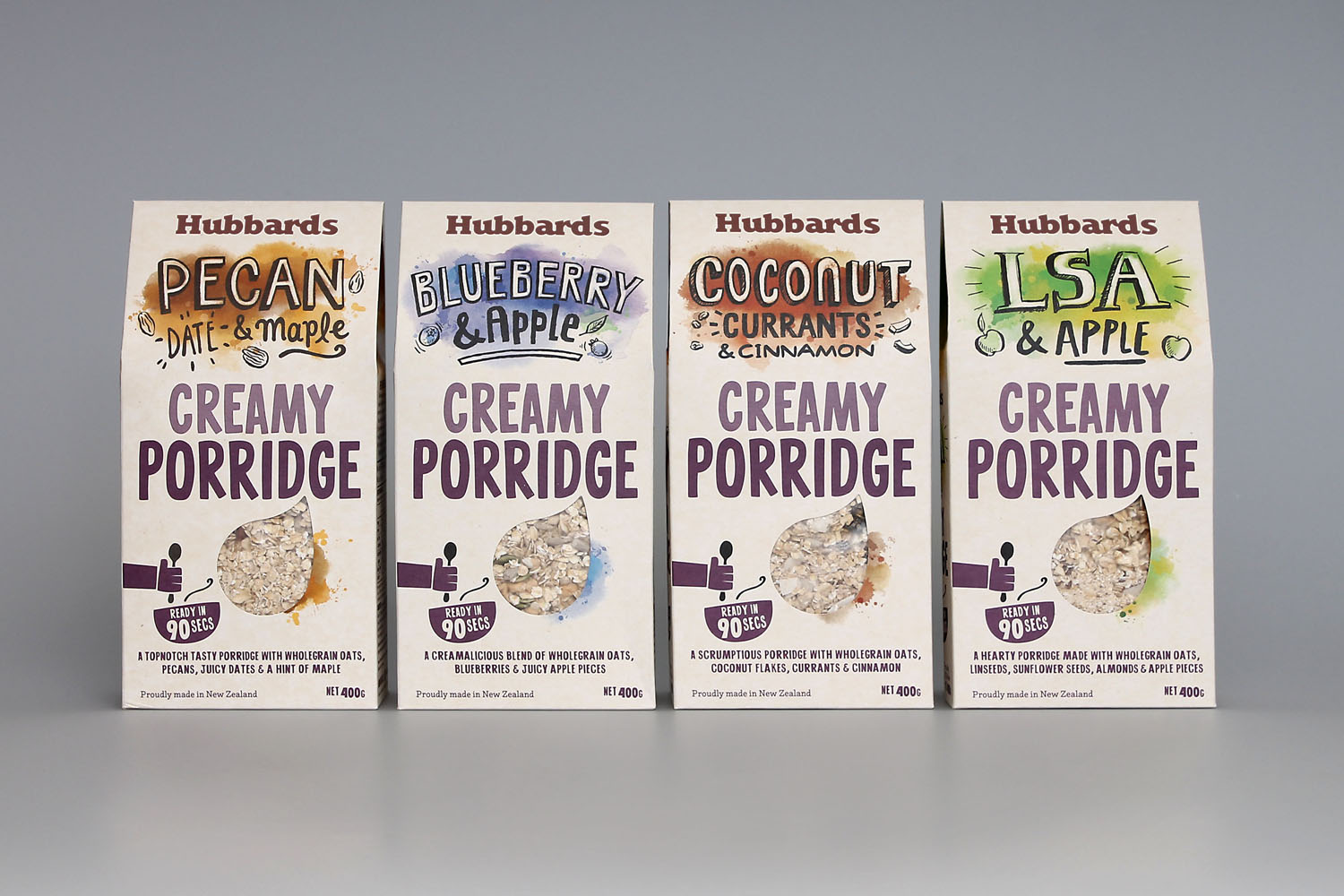
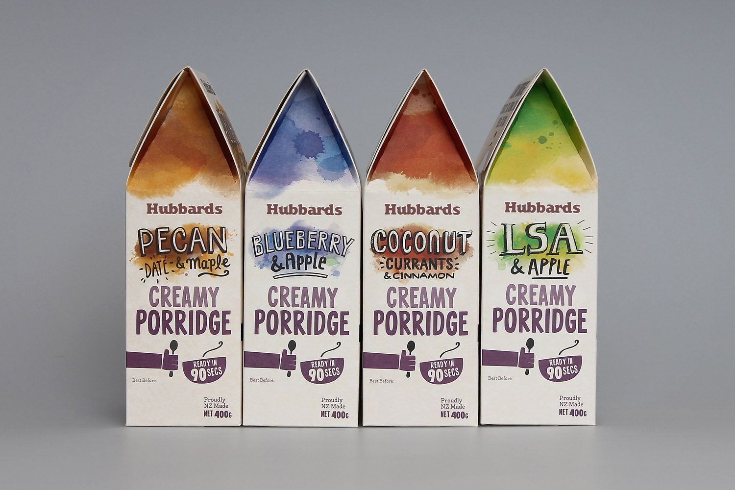
Auckland-based studio Coats continue to collaborate with health food company Hubbards, following up their work on Toppers with packaging for their new Creamy Porridge range. Coats was tasked with conveying the range’s modern flavour combinations, avoiding the rustic and traditional messages often favoured by the category, and working within a brand language that is quirky, engaging, honest and down-to-earth. Much like their work on Toppers, Coats does this through bold custom lettering, a bright but natural colour palette, and convivial tone of voice.
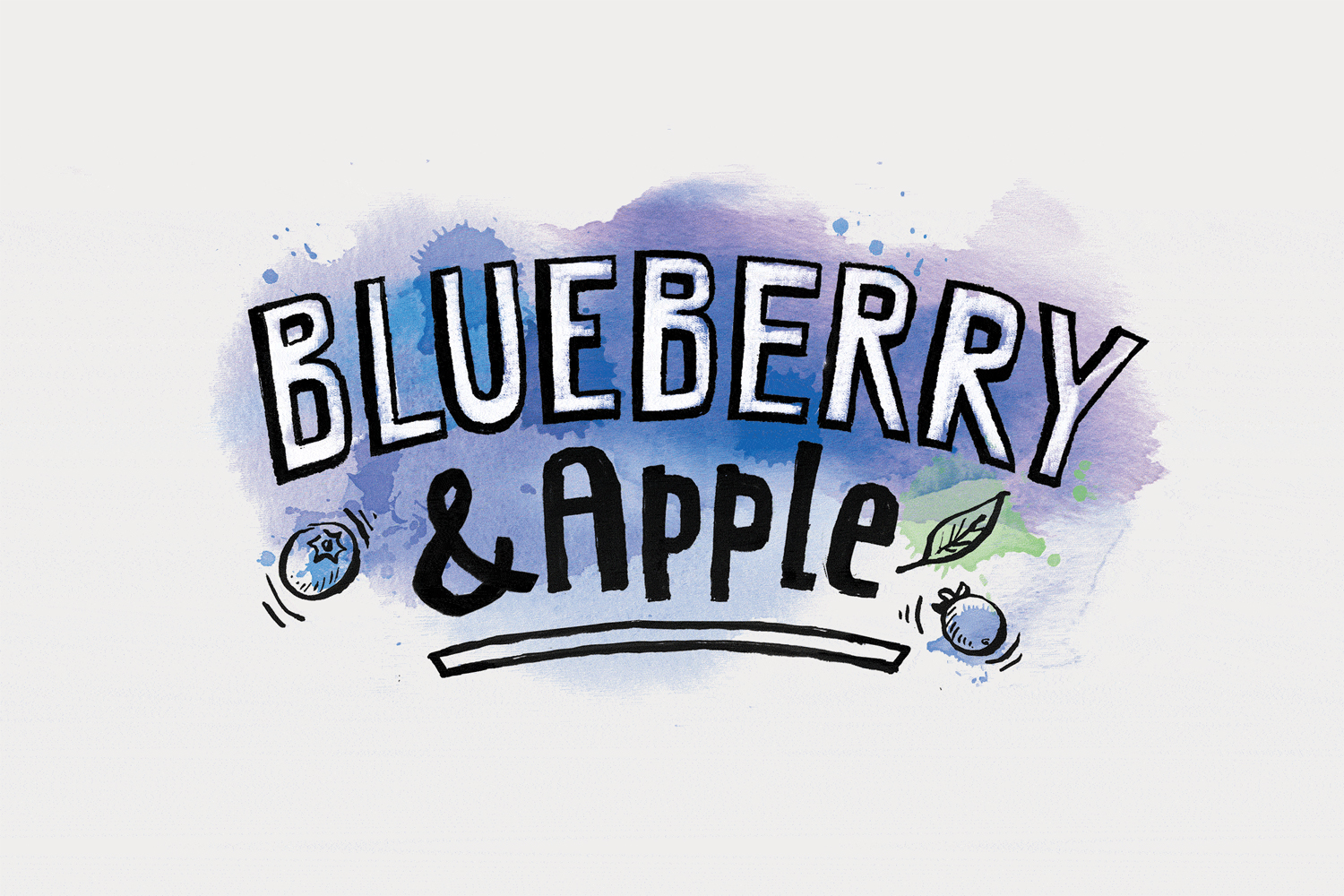
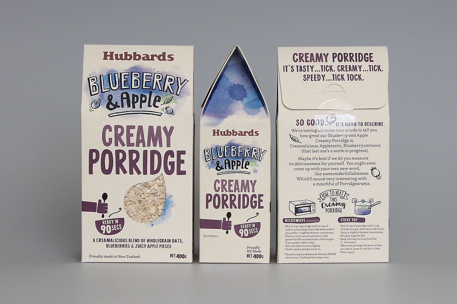
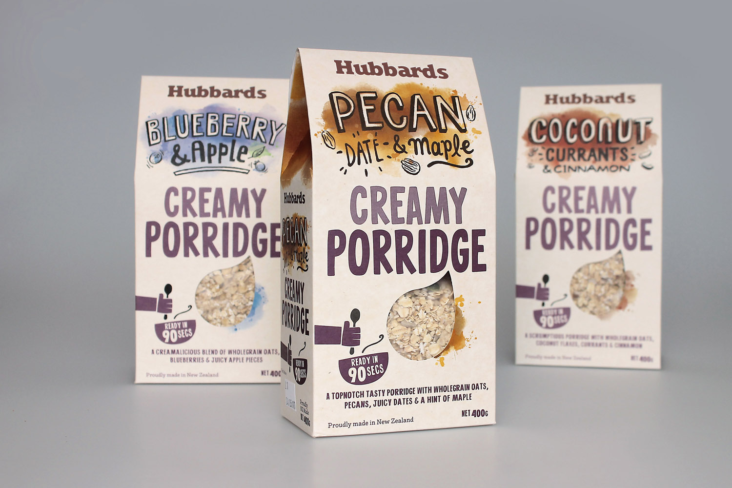
Coats leverage many of the same techniques used across the Topper range to secure continuity between the two products. These include the personable qualities of hand lettering, storytelling component, a die cut window that brings product quality to the forefront, a bright but natural colour palette, clear pack architecture front and a scrapbook feel on the back. Many of these are well-established within the health-food, cereal and snacking categories yet remain effective, visually and communicatively.
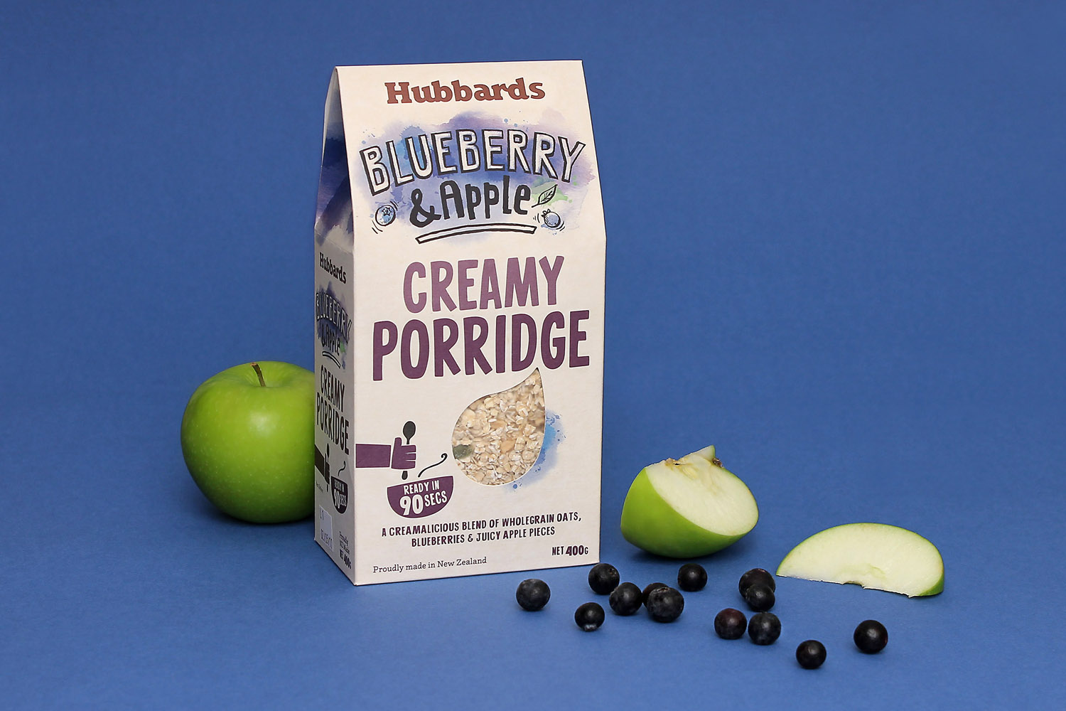
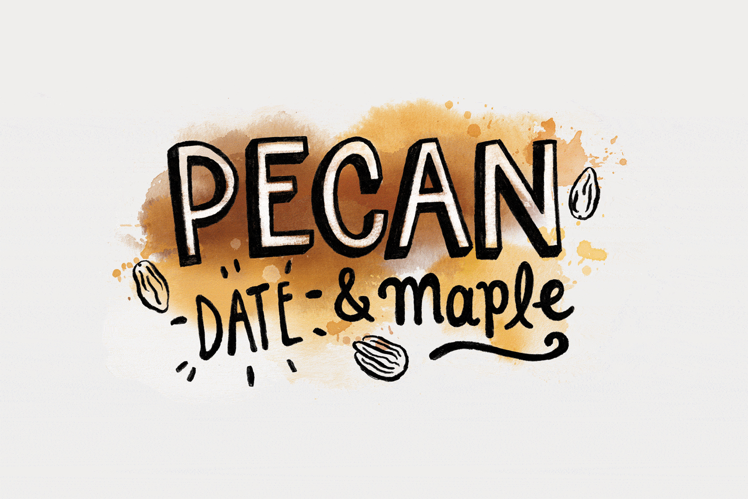
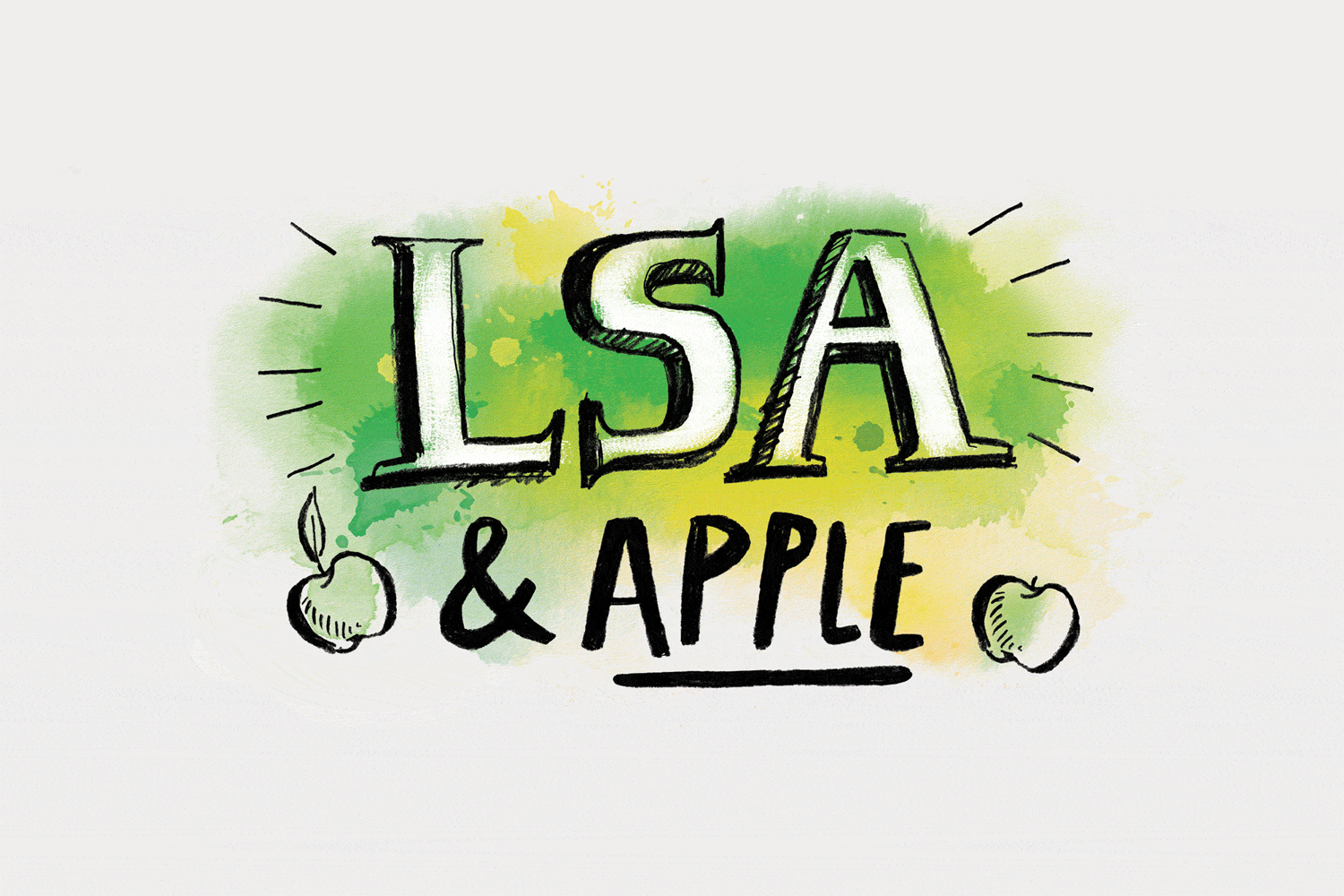
The approach comfortably mixes personable brand character with familiar high-quality and craft cues. Although both Toppers and Porridge share a hand drawn aesthetic, lettering, created by Jo Tronc, is distinctive to the range, in shape, background and ornament, with a pleasant sense of depth, contrast between ingredients and difference in recurring letters.
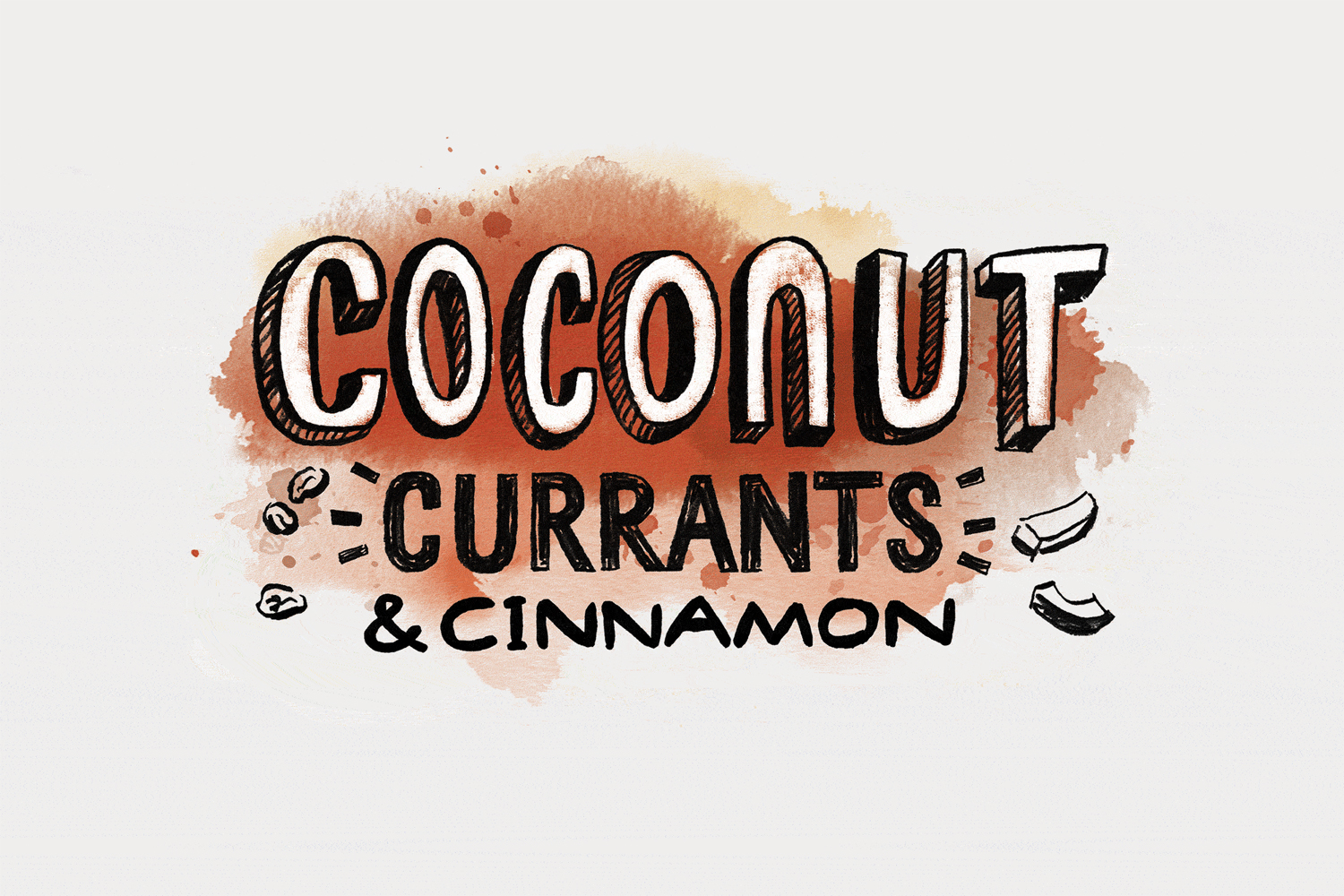
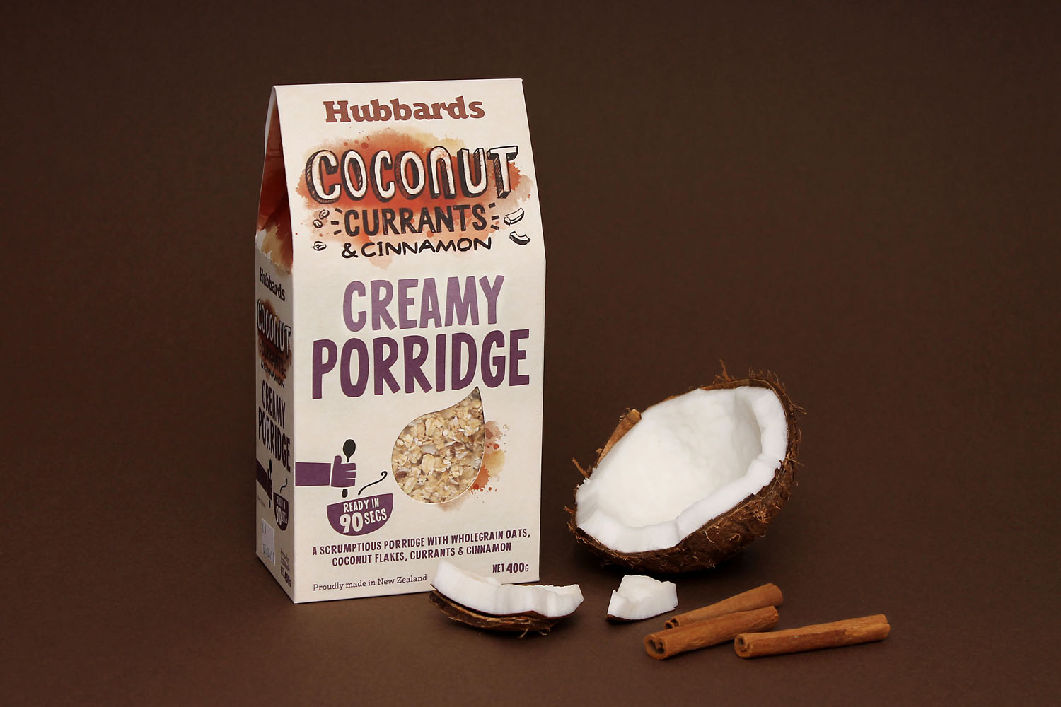
Instead of the more defined brush strokes of the Toppers range, Coats favour the more irregular form and texture of watercolour throughout Hubbards Porridge. It is a another familiar stylistic approach but one that is well-done, reassuring and straightforward in its crafted communicative intention. There is a clear continuation of the Hubbards aesthetic and positioning that also has individual qualities that differentiate. This is reinforced by a custom structural design with a gable top that gives back a nice profile, emphasised by more colour and texture.
Design: Coats. Lettering: Jo Tronc. Opinion: Richard Baird.
