Jalm & B by Kontrapunkt
Opinion by Richard Baird Posted 24 June 2016

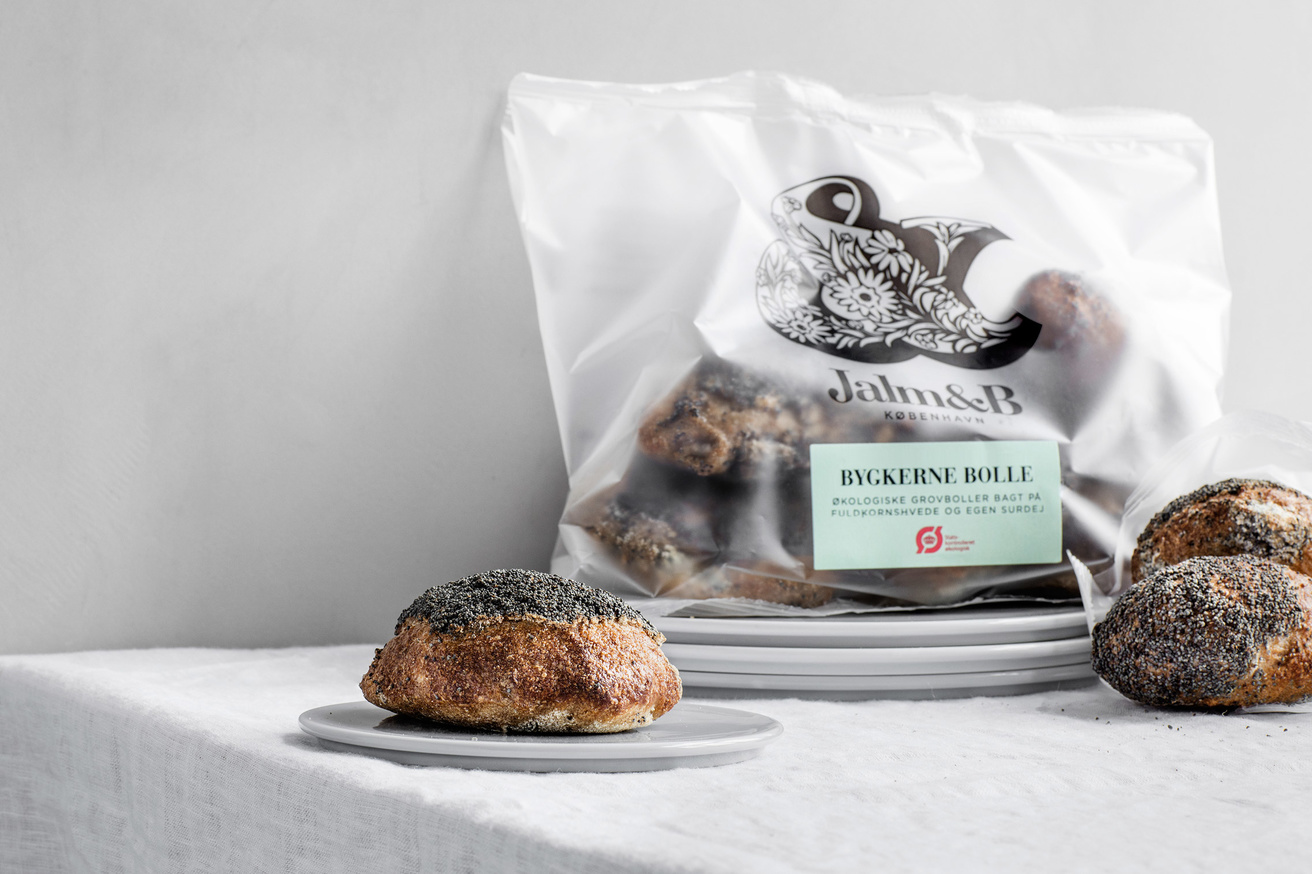
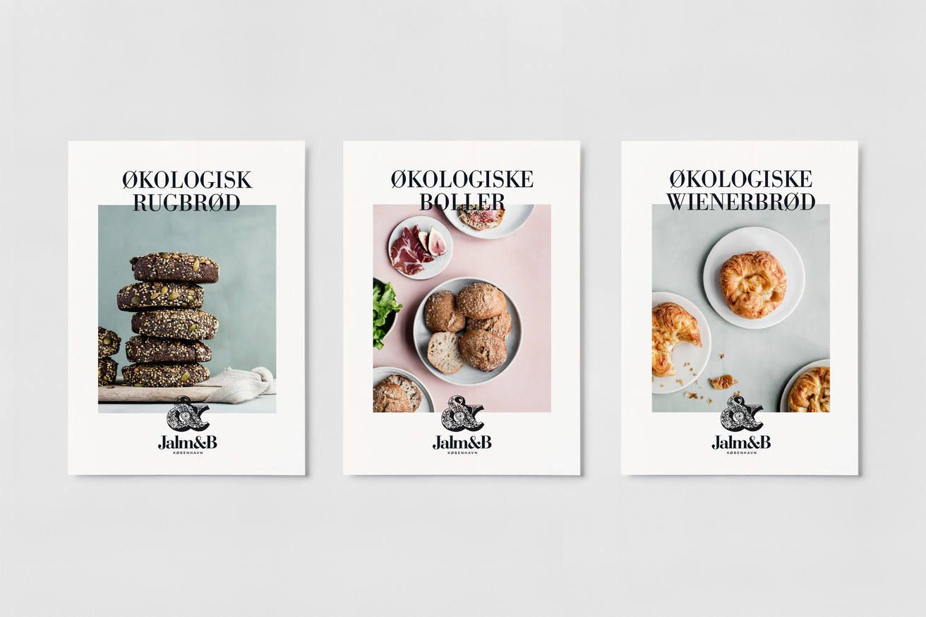
Jalm & B is a collaborative effort between baking experts Il Fornaio and Trianon to bring the taste and quality of big city bakeries to people throughout Denmark with a range of premium frozen products that can be freshly baked at home. Copenhagen and Tokyo-based graphic design studio and packaging specialist Kontrapunkt worked with the brand to convey the baking heritage of those behind it through naming, and the craft and quality of the range through image, illustration, type, colour, layout and structure.
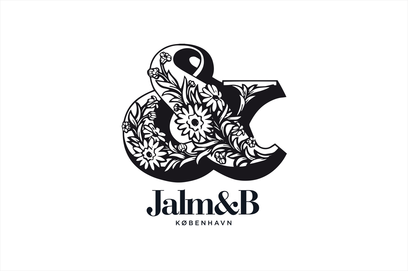
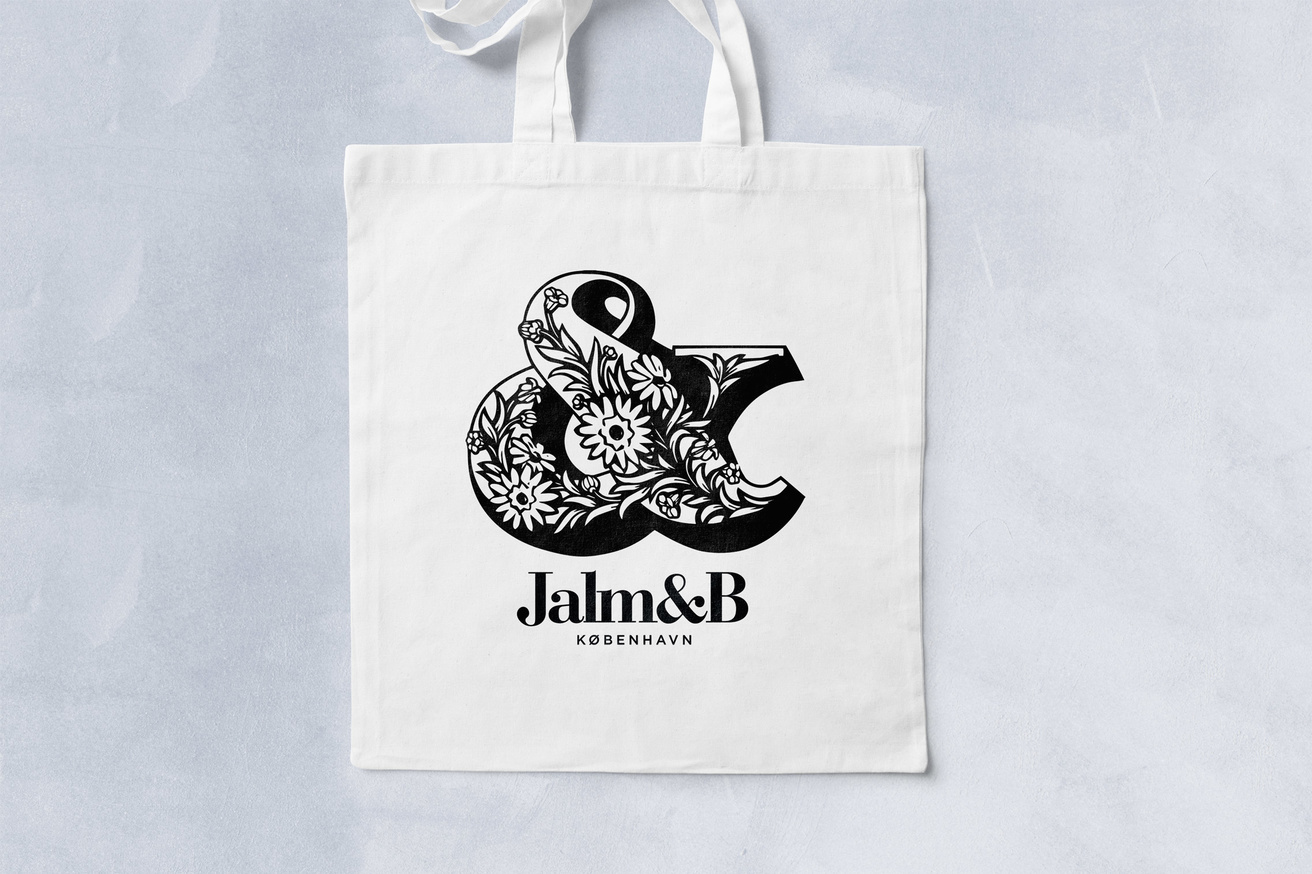
The logo manages to effectively work together three key ideas, handcraft in the irregular and ornamental qualities of what looks like carved wooden type block, high-quality in the more refined nature of the logotype, heritage in naming (a reference to the founder of Trianon Bakery), and an element of modernity in the use of an uppercase monolinear sans-serif.
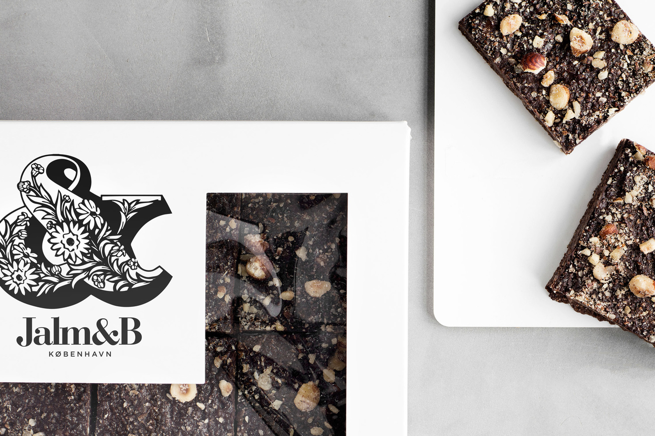
Proportion works well to prioritise communicative intention and deliver a strong and sophisticated visual impact to packaging, particularly within the frozen food category. It is curious to see the ampersand as the key image, rather than a monogram, but it is a form that is not often used, holds detail well and functions as a memorable and consistent mark on packaging that exists in different locations throughout a store.
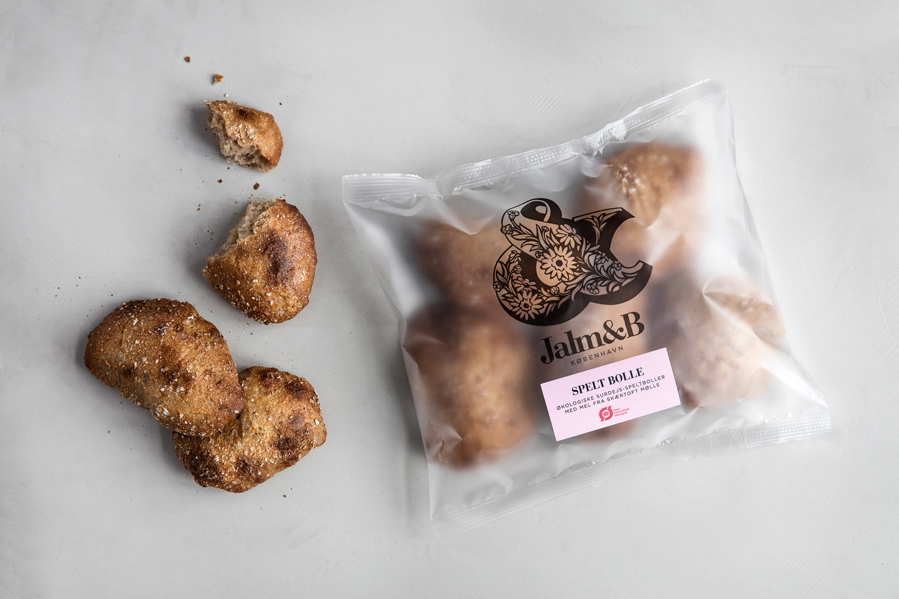
Structural design and material choices successfully set a premium quality through weight and texture, while large windows across boxes are reassuring in their clear display of product.
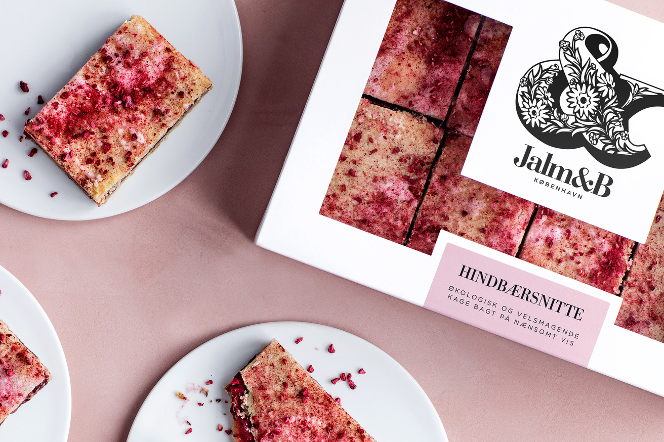
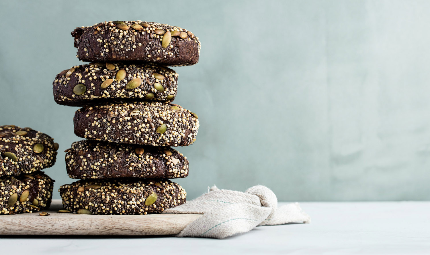
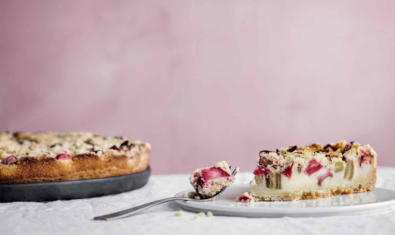
Plenty of white space (which works well to draw out colour and detail of product), the use of pastels, stickers and uncoated boards make the most of what is associated with professional kitchens and contemporary craft, and serve a practical purpose, keeping packaging variations to a minimum. The pastel colours link packaging with some really lovely product photos that draw out texture online. More from Kontrapunkt on BP&O.
Design: Kontrapunkt. Opinion: Richard Baird. Fonts Used: Bauer Bodoni (Customised) & Gotham.
